was war, was ist, was kommen wird. "my subject matter is energy: temperature, magnetism, radioactivity and electricity are the points of departure for many of my works that make the invisible visible..."
man sagt mir oft, ich solle es mir nicht so schwer machen mit diesem brief, ganz schnell, sachlich und ausreichend beschrieben mit wikipedia, ich sehe nach, es stimmt, so ist dies jetzt mein eindruck und gedanken zu diesen werken und der ausstellung von jan van munster.
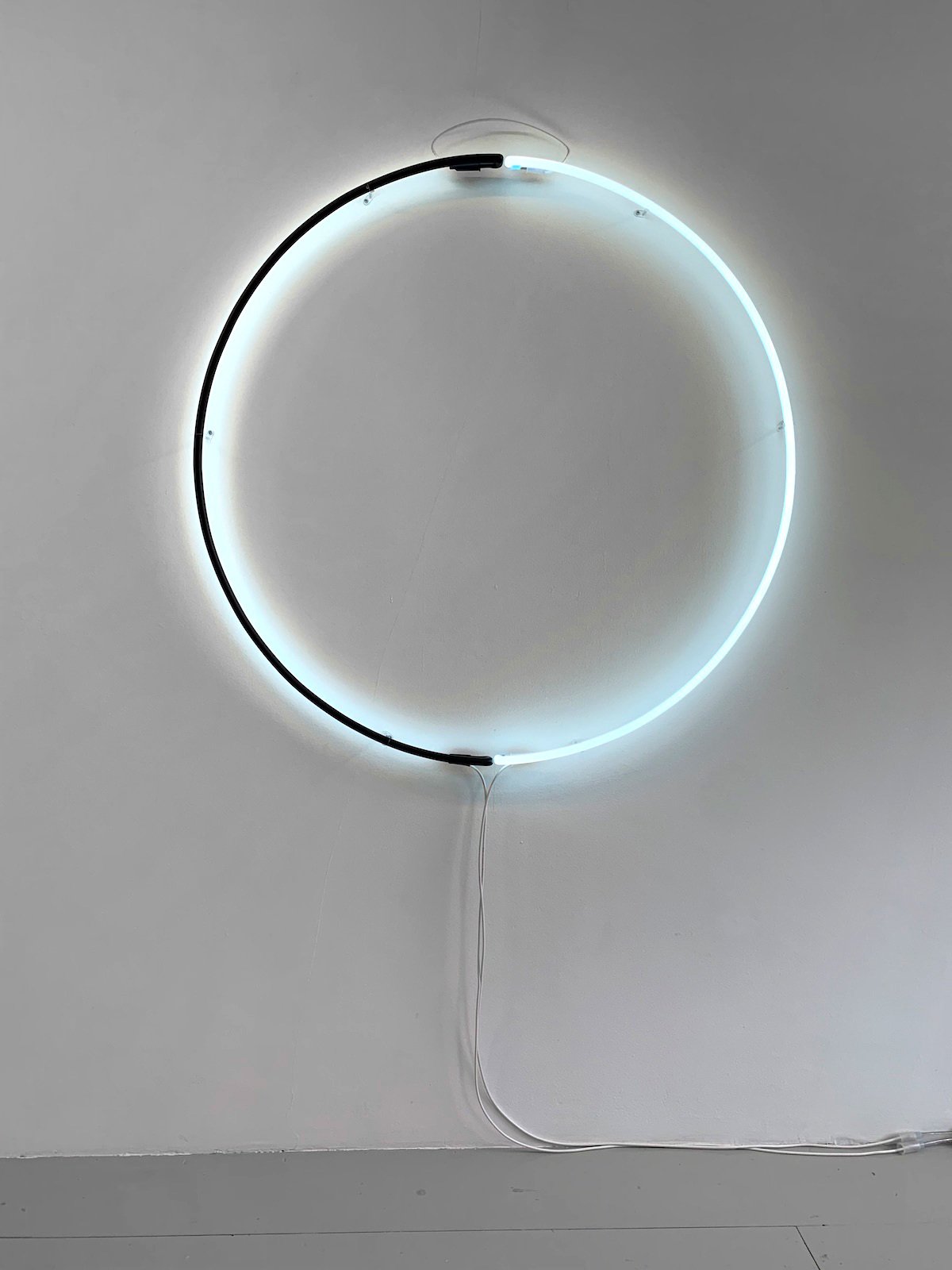
sozusagen mit unschuldigem blick betrete ich die halle, bin beeindruckt und glücklich. es stimmt, die werke passen hier rein und können hier bleiben. die objekte sind groß und klar, sind oftmals aus zwei hälften zusammengesetzt. ein kleines kabel verbindet die hälften, das hat was mit dem strom zu tun. die dünnen, hohlen glasröhren leuchten, manchmal auch farbig, blau oder grün als gegenpol zur anderen leuchtend weißen hälfte. die formen sind geometrisch, elementar und klar, man kann sie sich gut merken, auch einem anderen beschreiben. man ist ruhig und zufrieden. das sieht man auch in den gesichtern der anderen besucher. im zweiten rundgang zur ausstellung von jan van munster gehe ich jetzt zu den etiketten an der wand, um das jahr der erfindung dieses lichtobjekts zu sehen und die titel. oftmals heißen solche werke ja: o.t., dann wird die größe meist genau dazugenannt, als unterscheidung. es sind sehr alte lichtobjekte dabei und ganz neue, eine spanne von circa 50 jahren. aber es hat sich gelohnt, die werke sind nicht eintönig, keine masche. die preise sind „auf anfrage“, das stört mich noch nicht, die sprache ist eintönig, eben die standardsprache solcher etiketten.
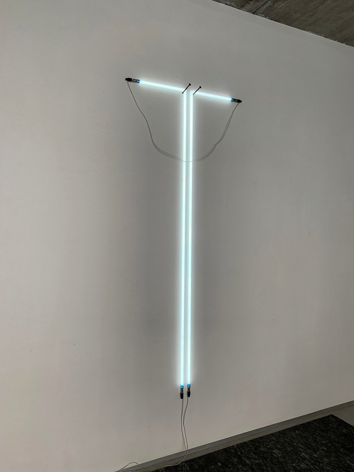
jan van munster, "two elements" (1978), fluorescent tube and transformator, h: 340 cm
die objekte: alles ist einfach, groß, verständlich, irgendwie geometrisch, hängt an der wand und leuchtet. bei den titeln stutze ich für einen kurzen moment (spinne ich jetzt oder der?): „ein rundes zwei-eck“, „ein rundes dreieck“, „ein rundes viereck“. was meint er damit? ein anständiges viereck hat 4 seiten mit gleichen längen, 4 rechte winkel, vielleicht aus leuchtendem aluminium, es ist stabil, hat mögichst gleiche wandstärken und materialien. ein quadrat, so haben wir das gelernt, als gute, schnelle ingenieure, möglichst gründliches lernen aus geometriebüchern. das weiß ich, ein für alle mal. aber hier, was meint er mit rundem viereck? von rechtem winkel hat er eigentlich nichts gesagt, es könnte auch ein gezerrtes quadrat mit gleichen längen sein, auch ein viereck mit einer kurzen und 3 langen seiten, ein viereck mit gleich langen seiten, eingedrückt, zackig, so gibt es vielleicht auch ein rundes viereck? viele dieser objekte erfordern vorstellungskraft, auch um sie zu schließen, die lücke macht sie aber lebendig. am extremsten das objekt mit einer leuchtenden ecke, dann aber die form ergänzt durch harte punkte, für starke nägel, um die sich ein seil spannt, etwas zu kurz, und das so zur vollendung noch auf der wand als zeichnung ergänzt wird.
durch diese infragestellung eines so sicheren begriffs wie das viereck, durch das runde viereck, hat jan eine weite möglichkeit gegeben für die fantasie. ich gehe jetzt noch zu einem seiner kataloge und sehe, daß er auch in vielen anderen gebieten wege geöffnet hat für anderes, wie erde und himmel, heiß und kalt, glühend und eis, + und -, stramm stehen und tanzen im lichtballet. er hat häuser gebaut mit dem wort ik. er hat eine große spiegelfläche auf den platz gesetzt, die ruhig dort liegt, aber in sich die bewegung der reflektierten wolken und des himmels zeigt, ich kann in den himmel schauen, seine höhe, die bewegung der wolken, aber keine reflektierende fläche. utopien, alle ganz klar und einfach zu schauen. offensichtlich, wir laden sie hierzu herzlich ein!
warum halten sie diese einladung, hoffentlich mit interesse, in der hand? weil sie sich für kunst interessieren? wer war diesmal das team: jan van munster und bea weuthen, adelheid und camille hoffmann, stephan, der meine schreibfehler findet, alexander der fotograf, mathias, der sich in der kunst und den grafikschubladen am besten auskennt, hat ferien, jan-daniel, der public relations machen soll, was im moment aus dem an- und abholen der kunstobjekte für die ausstellung der künstler besteht, und thomas, der alle dinge zusammen mit camille repariert, seine liebe zu nicole in der buchhaltung und eva, die putzt und einen der kocht und einen, der die post ganz allgemein und die grafik pflegt, und achim, der die einladung gestaltet und herr ahmadiyan von der druckerei nejedly, der seit langem druckt, und stefan, der die computerzusammenbrüche übersieht. und richard für die organisation der newsletter und der website, und deeple, das diesmal übersetzt, emmy und kathrin, die alles eintüten, wenn mathias die aufkleber gedruckt hat, und haljan, der das brot bäckt.
und das alles für ein viereck, das auf einem nagel an der wand hängt und leuchtet!
what was, what is, what is to come. "my subject matter is energy: temperature, magnetism, radioactivity and electricity are the points of departure for many of my works that make the invisible visible..."
i am often told not to make it so difficult for myself with this letter, very quickly, factually and sufficiently described with wikipedia, i look it up, it's true, so this is now my impression and thoughts on these works and the exhibition of jan van munster.
i enter the hall with an innocent look, so to speak, and am impressed and happy. it's true, the works fit in here and can stay here. the objects are large and clear, are often composed of two halves. a small cable connects the halves, that has something to do with electricity. the thin hollow glass tubes glow, sometimes also coloured, blue or green as an antipole to the other bright white half. the shapes are geometric, elementary and clear, you can remember them well, also describe them to someone else. one is calm and satisfied. this is also visible in the faces of the other visitors. in the second tour of the exhibition of jan van munster, i now go to the labels on the wall to see the year of the invention of this light object and the titles. often such works are called: o.t. (ohne titel = untitled), then the size is usually named exactly, as a distinction. there are very old light objects and very new ones, a span of about 50 years. but it was worth it, the works are not monotonous, not a scam. the prices are "on request", that doesn't bother me yet, the language is monotonous, just the standard language of such labels.
the objects: everything is simple, large, understandable, somehow geometric, hangs on the wall and shines. i stumble for a moment at the titles (am i crazy or is he?): "a round bicorner", “a round triangle”, “a round square”. what does he mean by that? a decent square has 4 sides with equal lengths, 4 right angles, perhaps made of shining aluminium, it is stable, preferably with equal wall thicknesses and materials. a square, that's what we learned as good, quick engineers, learned as thoroughly as possible from geometry books. i know that, once and for all. but here, what does he mean by round square? he didn't actually say anything about a right angle, it could also be a squared square with equal lengths, also a square with one short and 3 long sides, a square with equal long sides, indented, jagged, so maybe there is also a round square? many of these objects require imagination, also to close them, but the gap makes them alive. most extreme is the object with a luminous corner, but then the form is completed by hard dots, for strong nails, around which a rope is stretched, a little too short, and so to complete it is added to as the wall as a drawing.
through this questioning of such a secure concept as the square, through the round square, jan has given awide possibility for the imagination. i now go to one of his catalogues and see that he has also opened up paths for others in many other areas, such as earth and sky, hot and cold, glowing and ice, + and -, standing at attention and dancing in the ballet of light. he has built houses with the word ik. he has placed a large mirror surface on the square, lying there quietly, but showing in itself the movement of the reflected clouds and the sky, i can look up into the sky, its height, the movement of the clouds, but no reflecting surface. utopias, all quite clear and easy to look at, obvious. we cordially invite you to this!
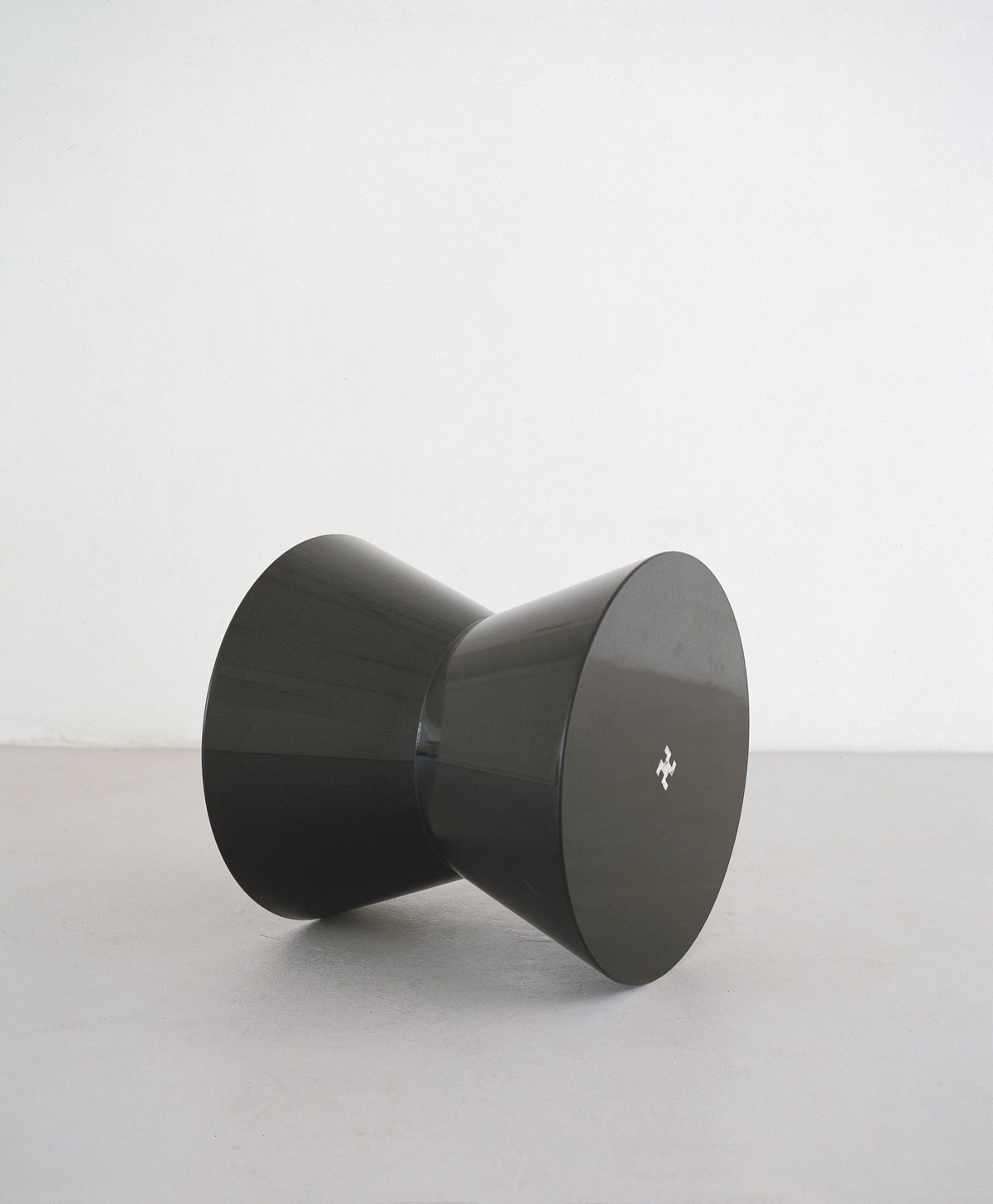
jan van munster, "danger dangerous" (1994), granit, 55 × 53 × 53 cm
why are you holding this invitation in your hand, hopefully with interest? because you are interested in art? who was the team this time: jan van munster and bea weuthen, adelheid and camille hoffmann, stephan, who finds my writing mistakes, alexander the photographer, mathias, who knows the most about art and graphic drawers, is on holiday, jan-daniel, who is supposed to do public relations, which at the moment consists of delivering and picking up art objects for the artists' exhibition, and thomas, who fixes all the things, together with camille, his love for nicole who does the accounting and eva who cleans and one who cooks and one who takes care of the mail in general and the graphics, and achim who designs the invitation and mr. ahmadiyan from the printer nejedly who prints for a long time and stefan who overlooks the computer breakdowns. and richard for organising the newsletter and the website and deeple for translating this time, emmy and kathrin who bag everything when mathias has printed the address stickers, and haljan who bakes the bread.
and all this for a square that hangs on a nail on the wall and glows!
jan van munster, "edged square" (2018), fluorescent tube and transformator, 125 × 125 cm
aktuelle und kommende termine / current and forthcoming dates