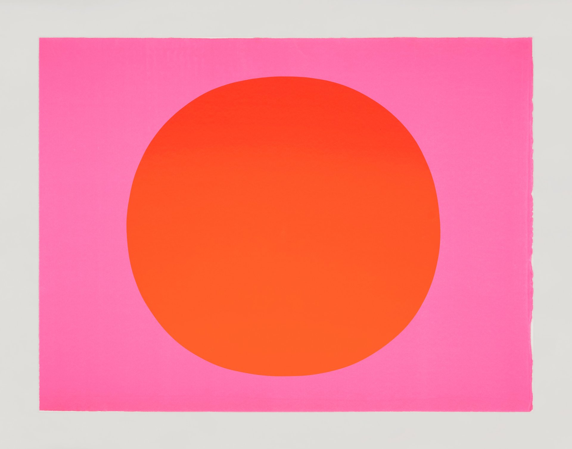
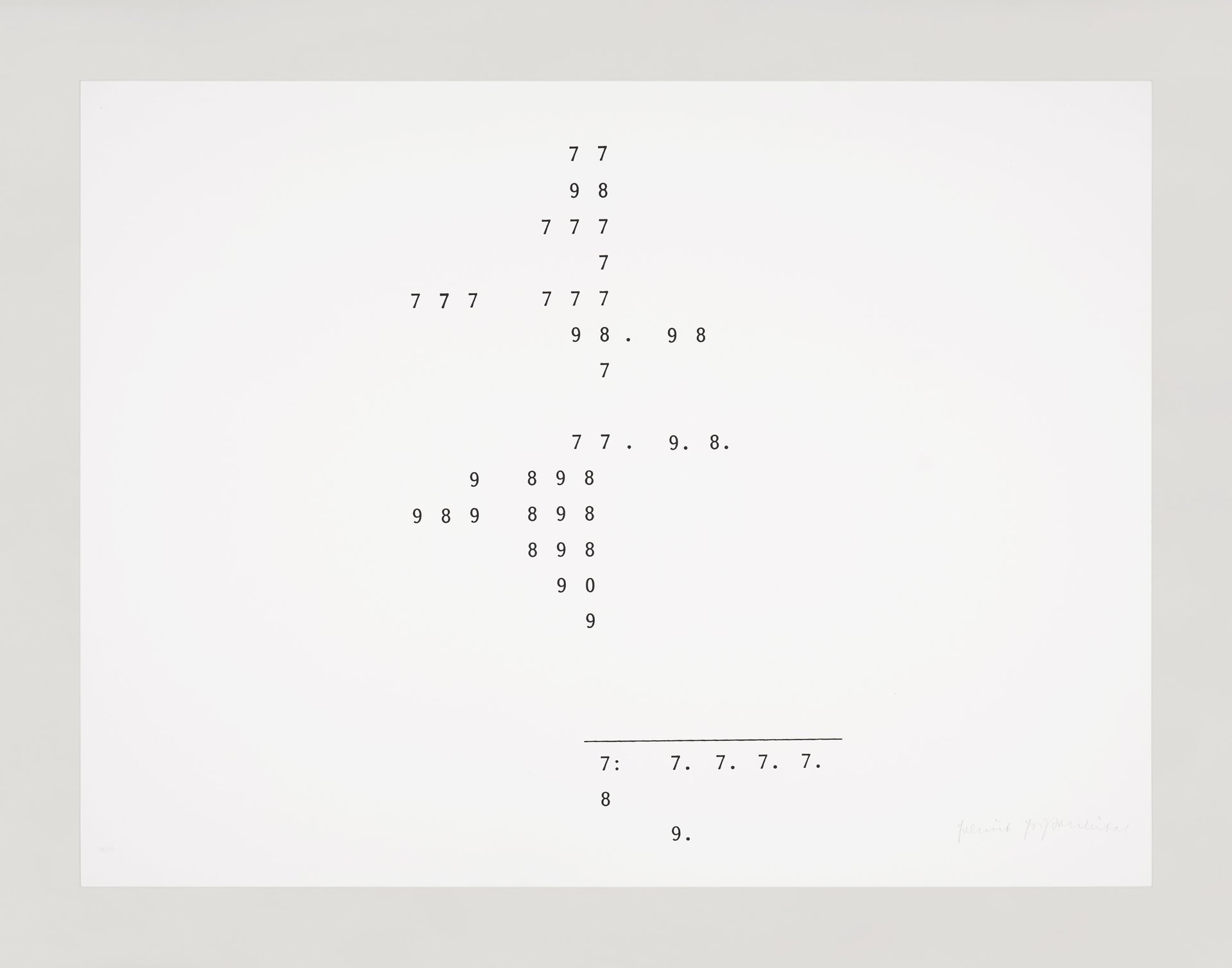
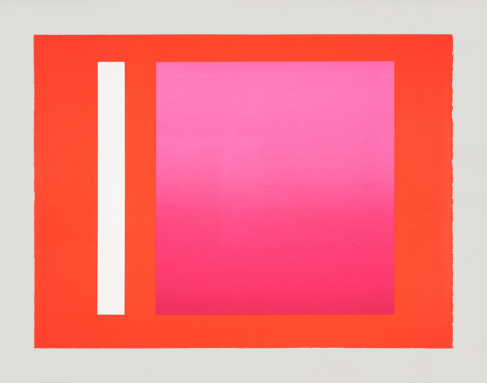
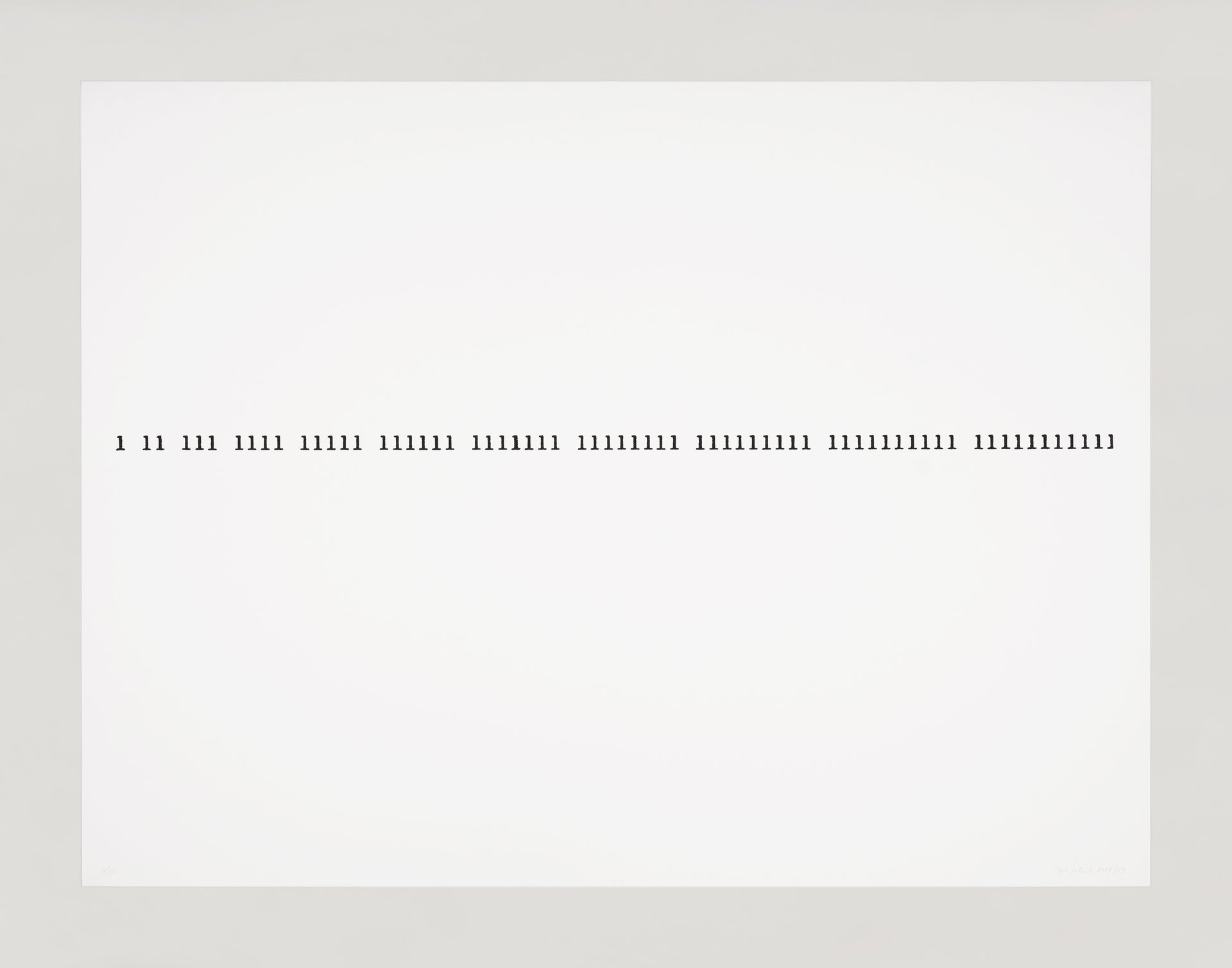
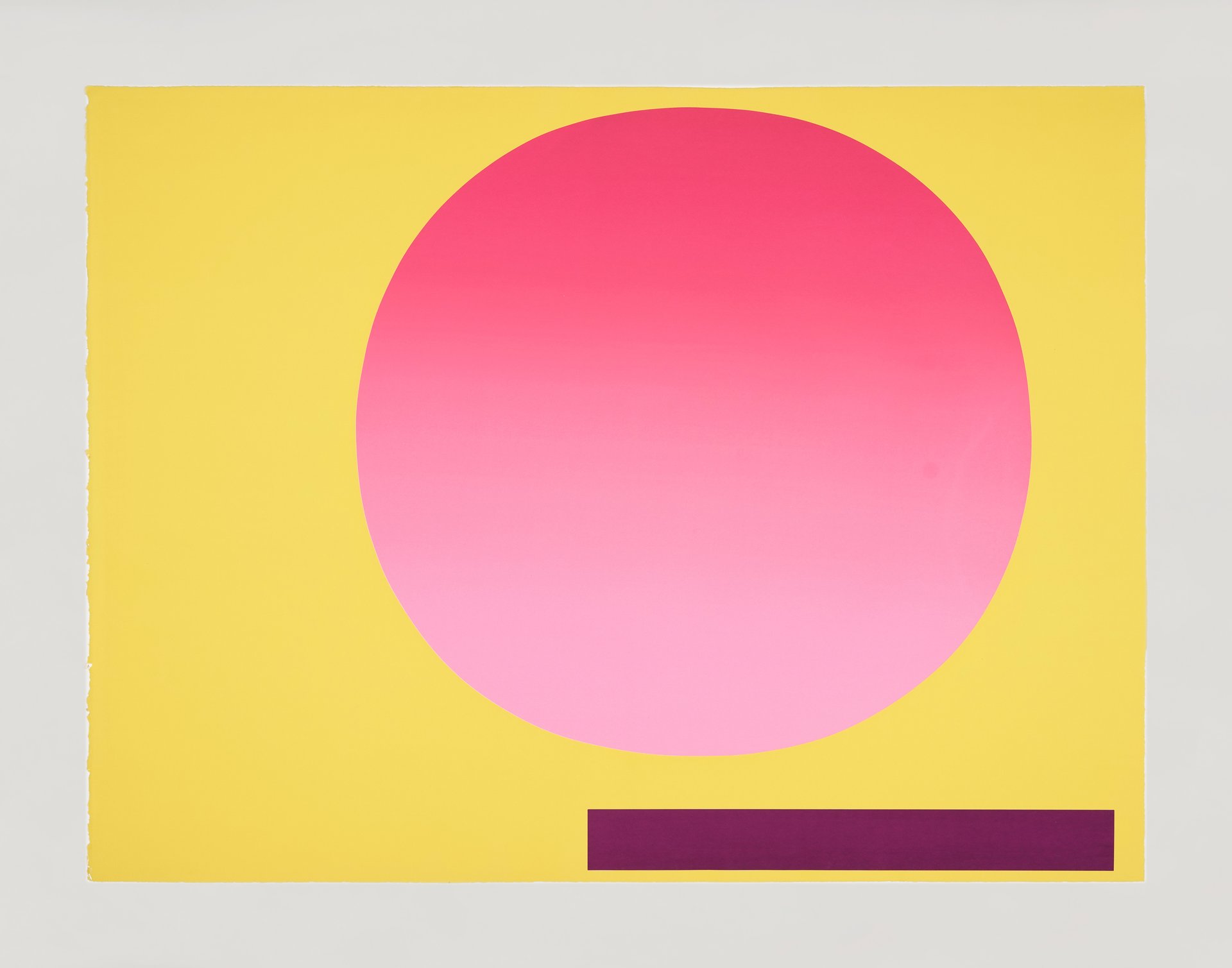
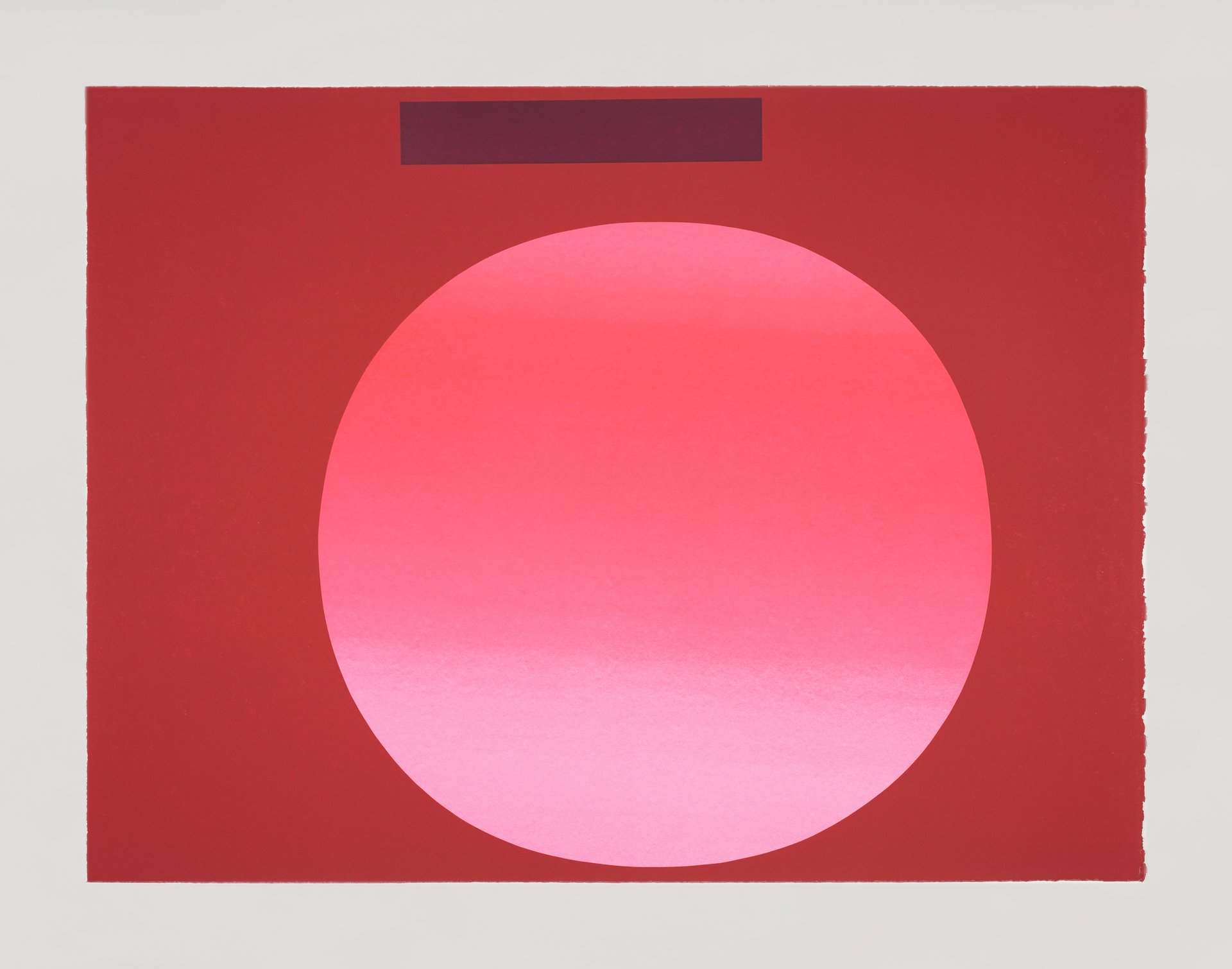
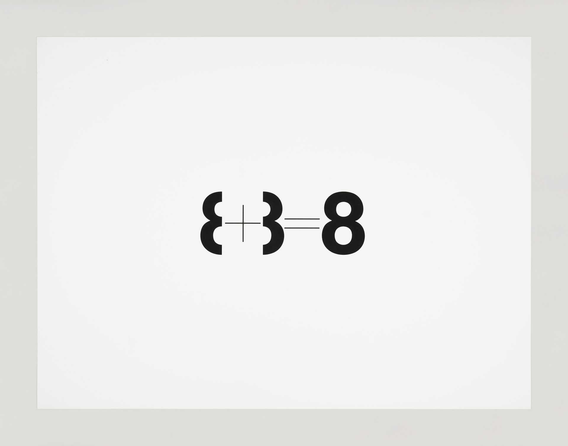
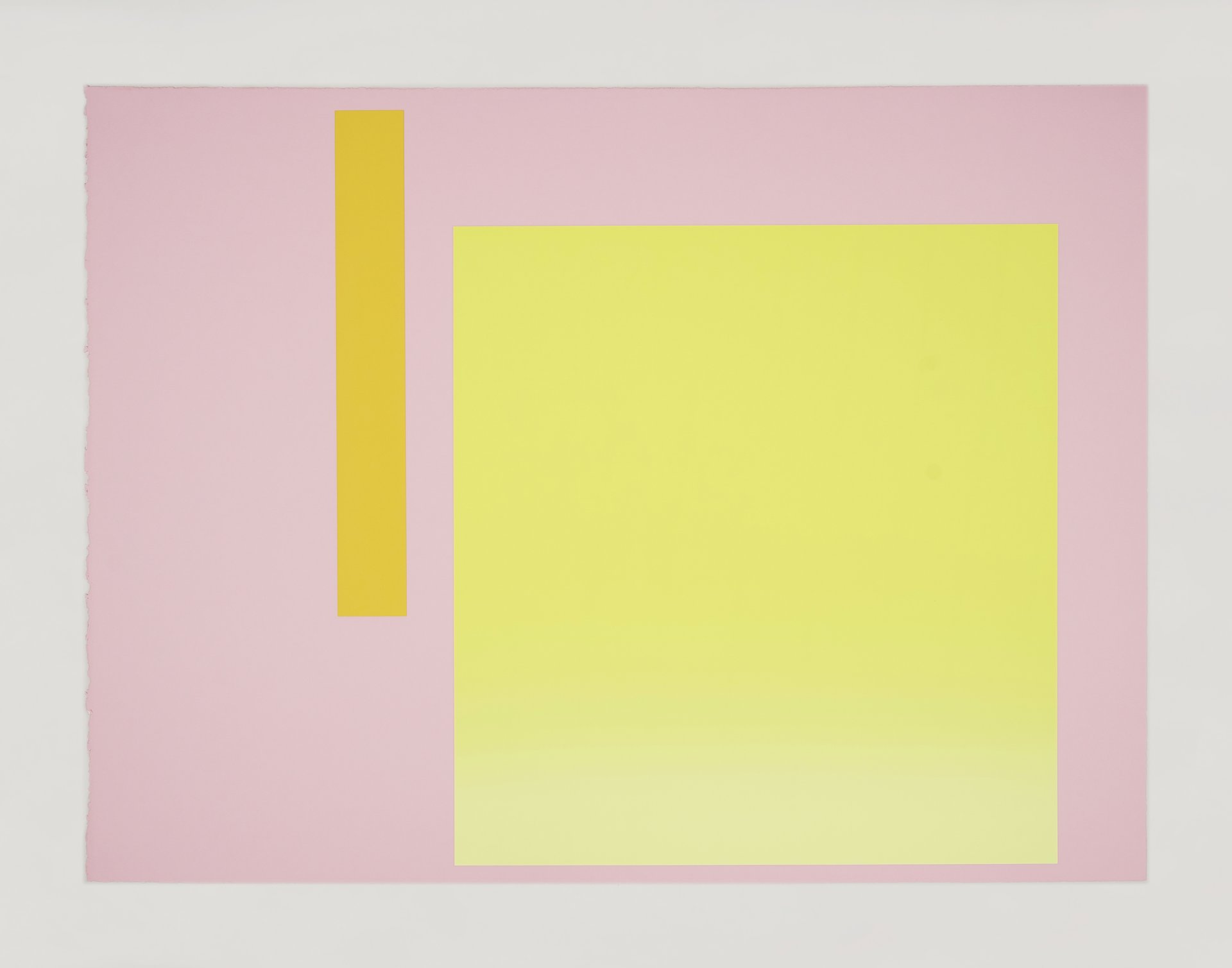
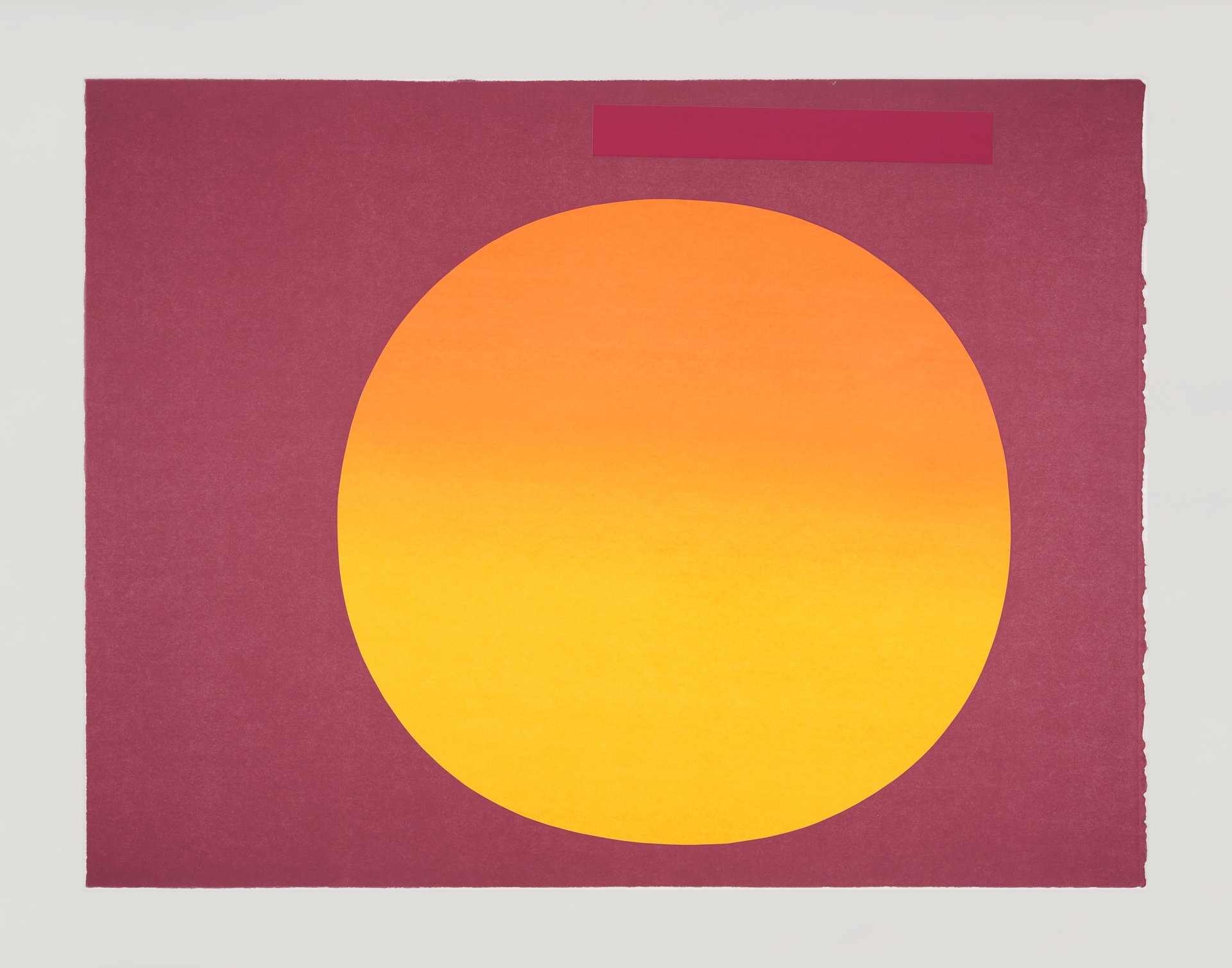
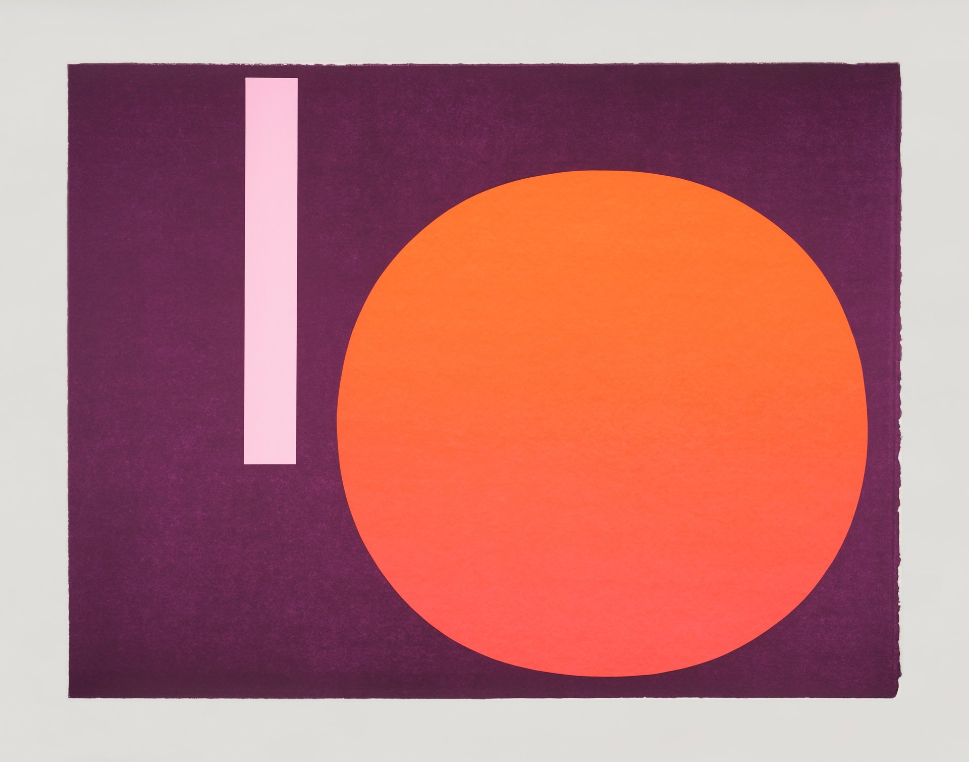
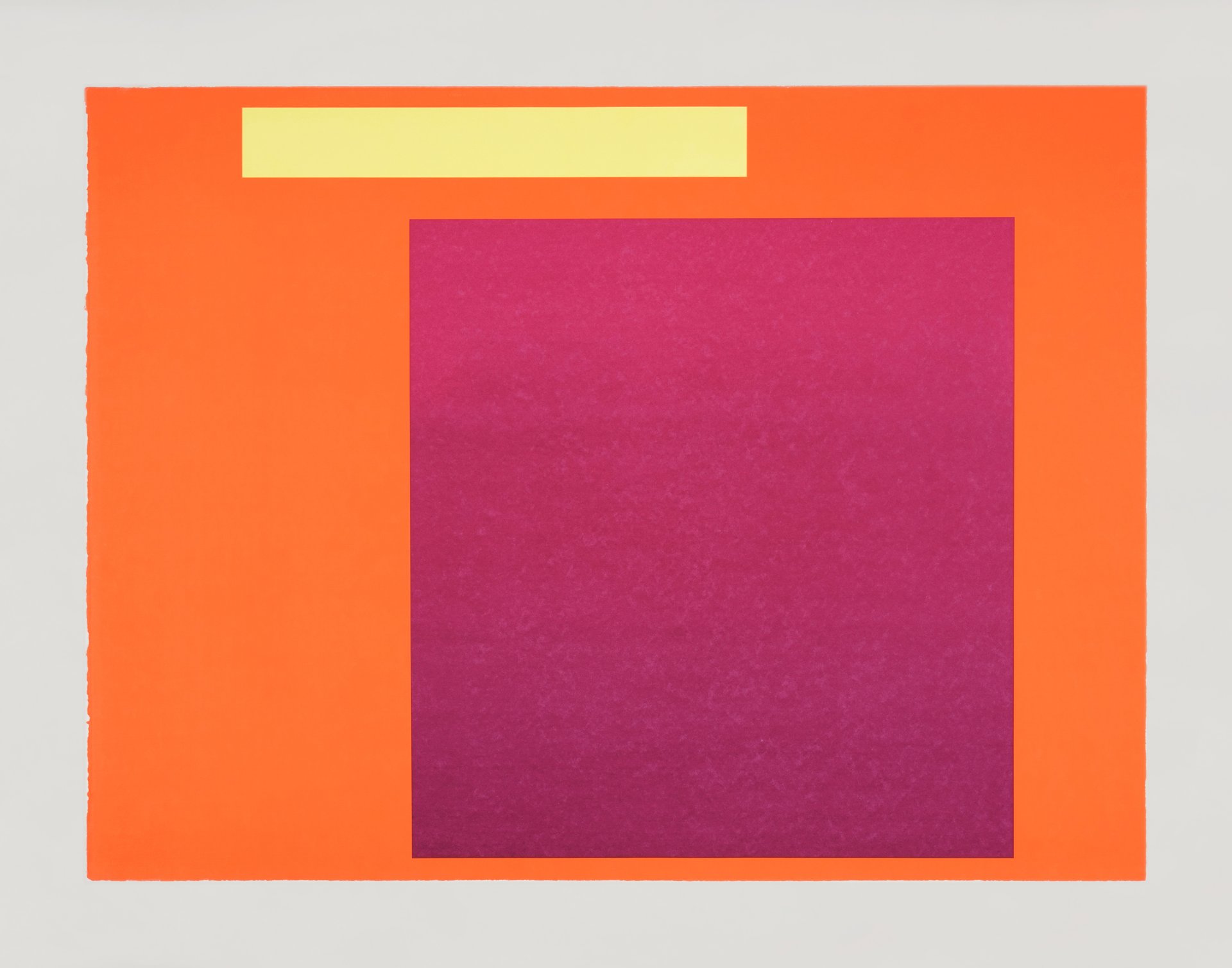
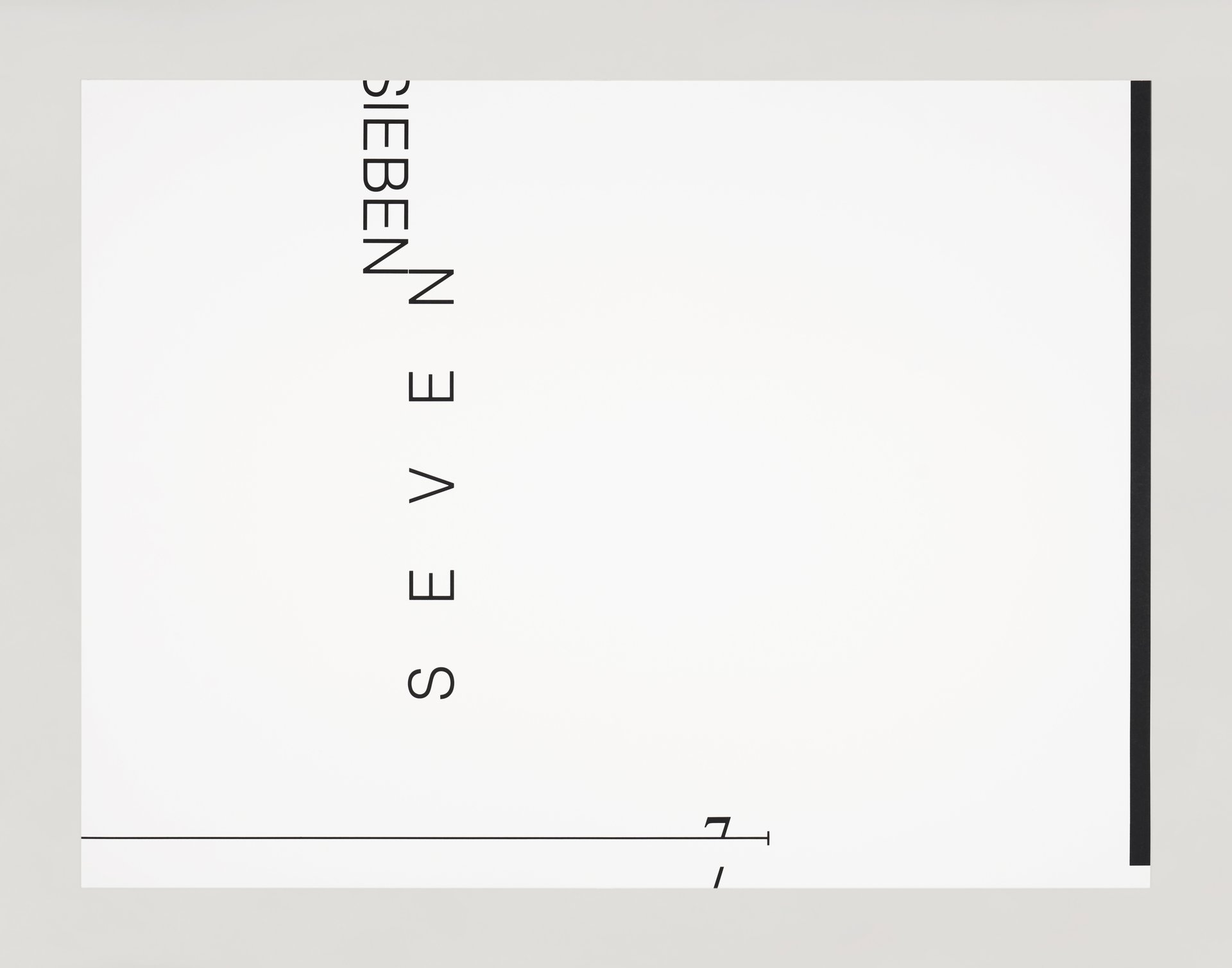
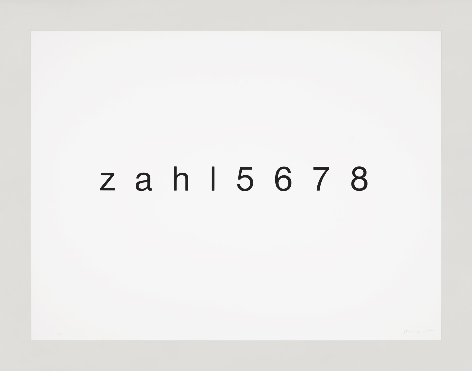
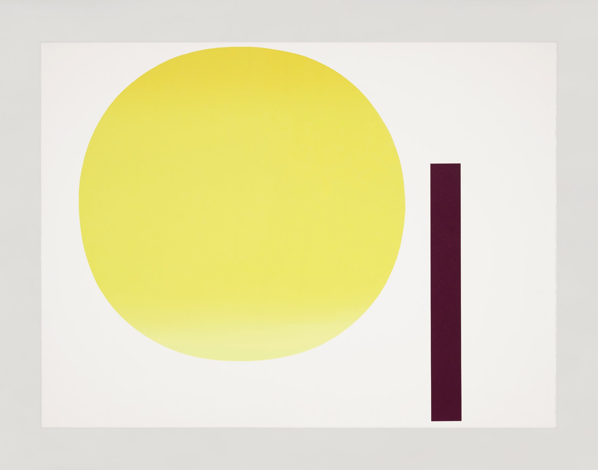
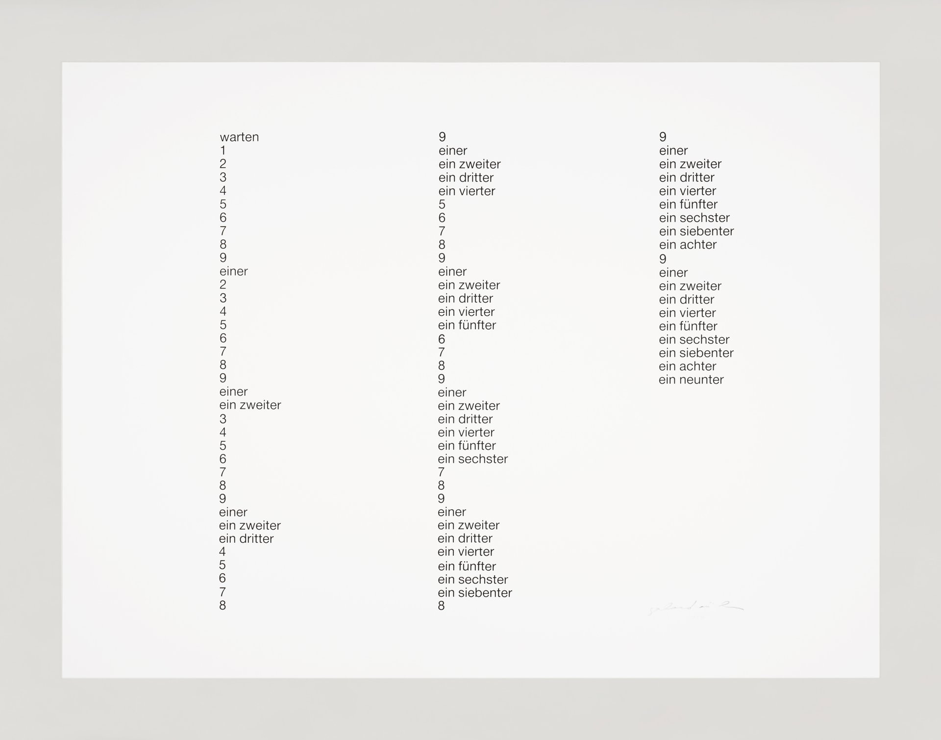
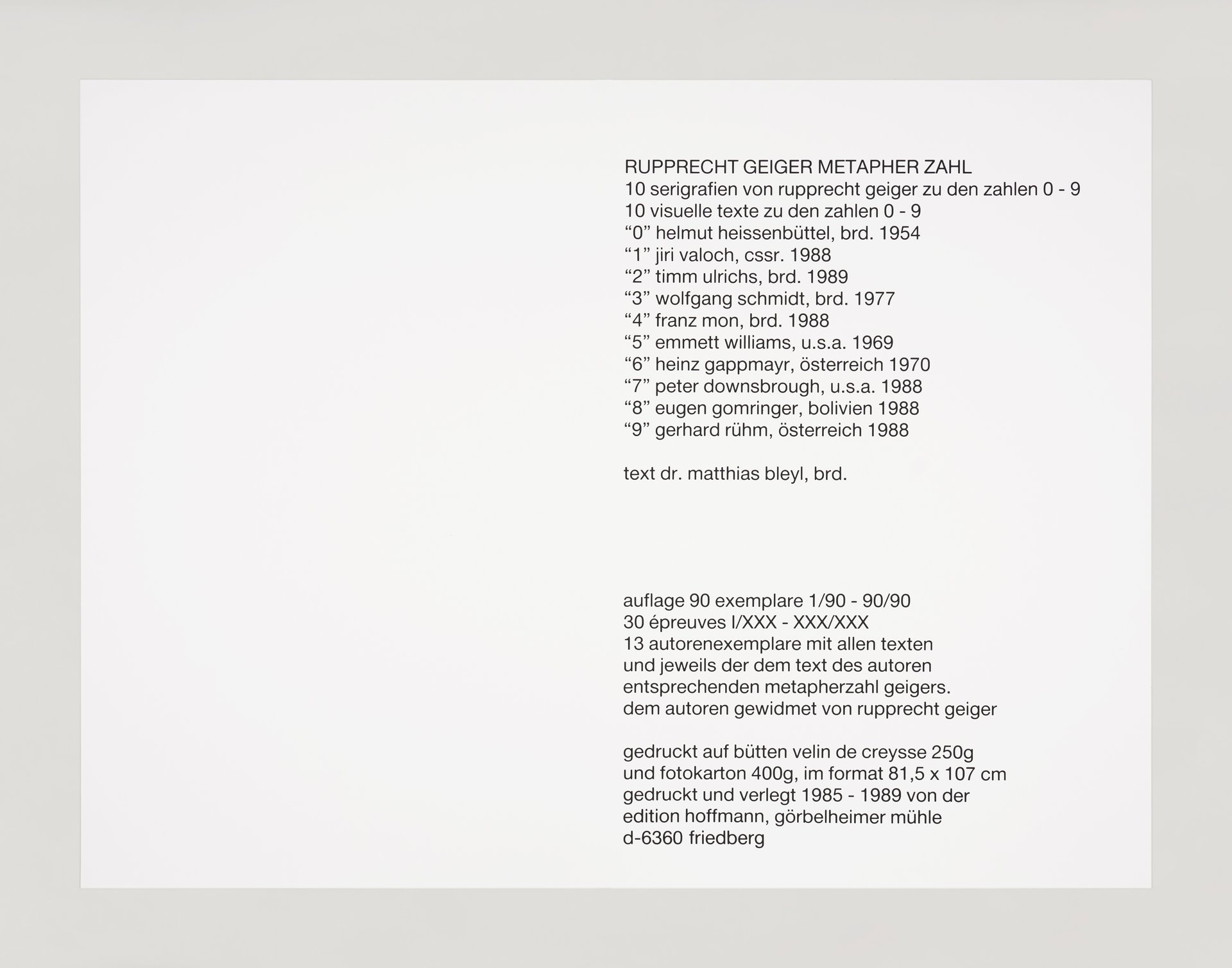
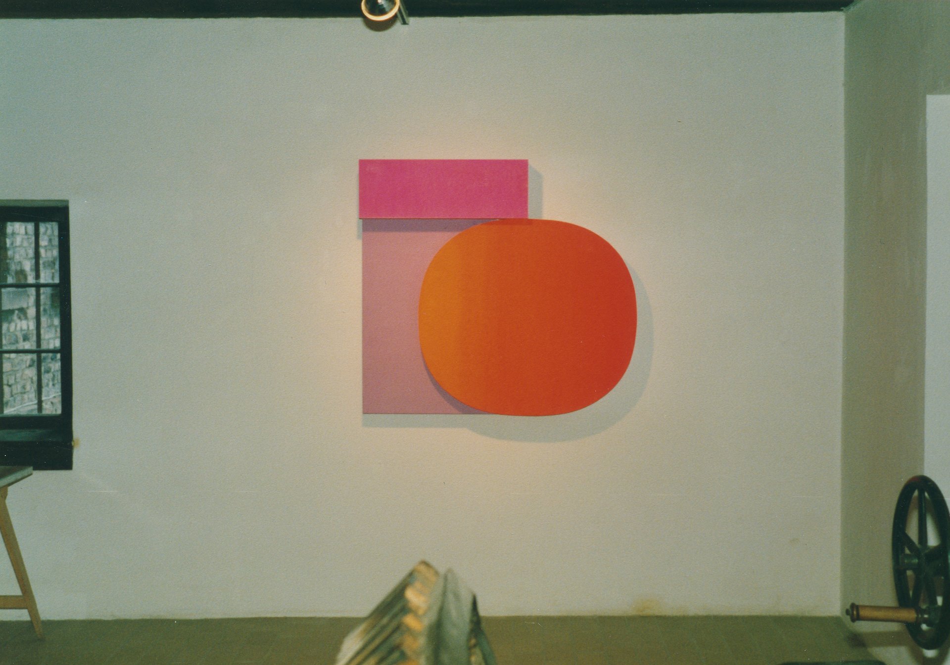
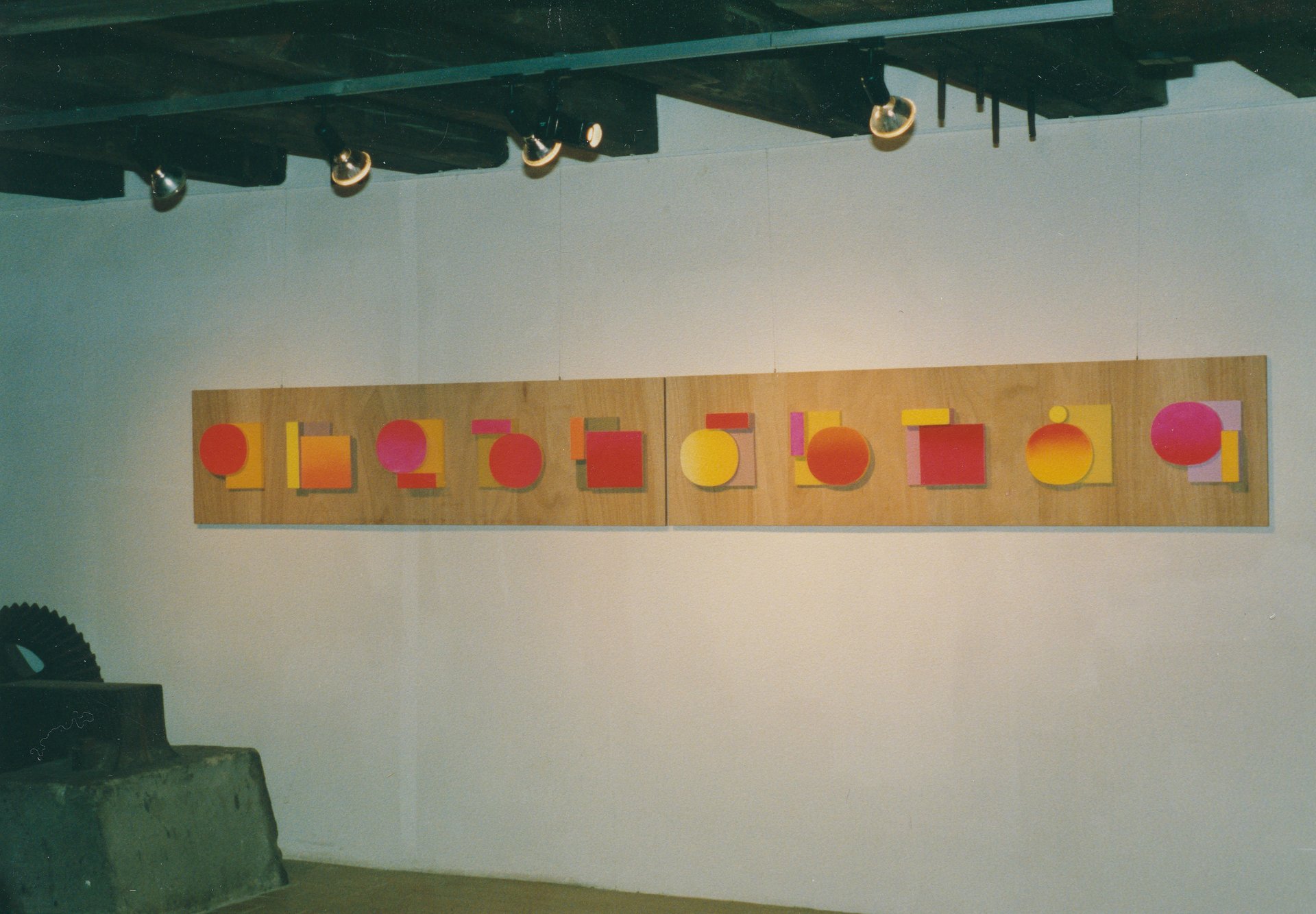
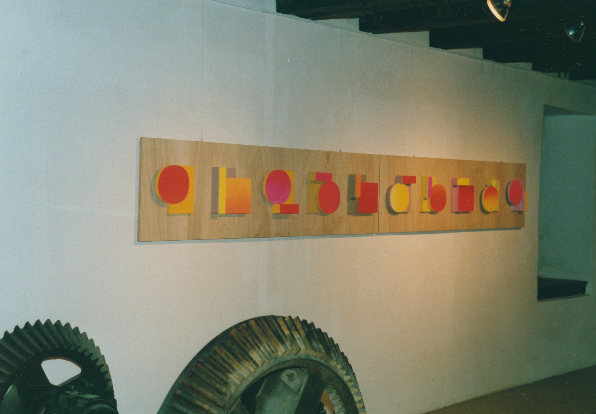
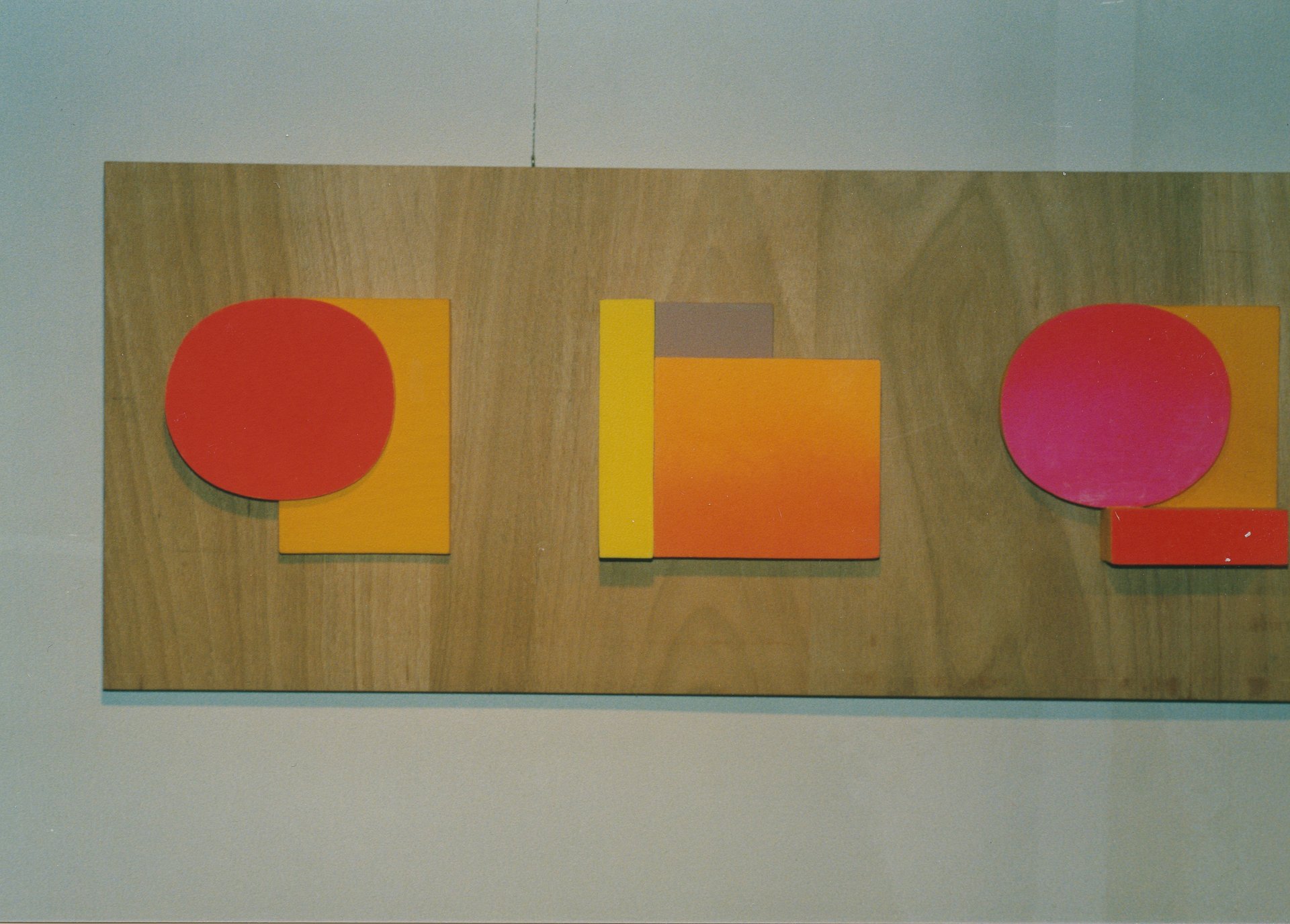
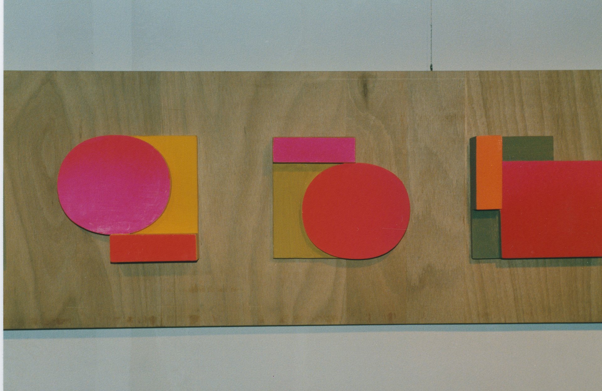
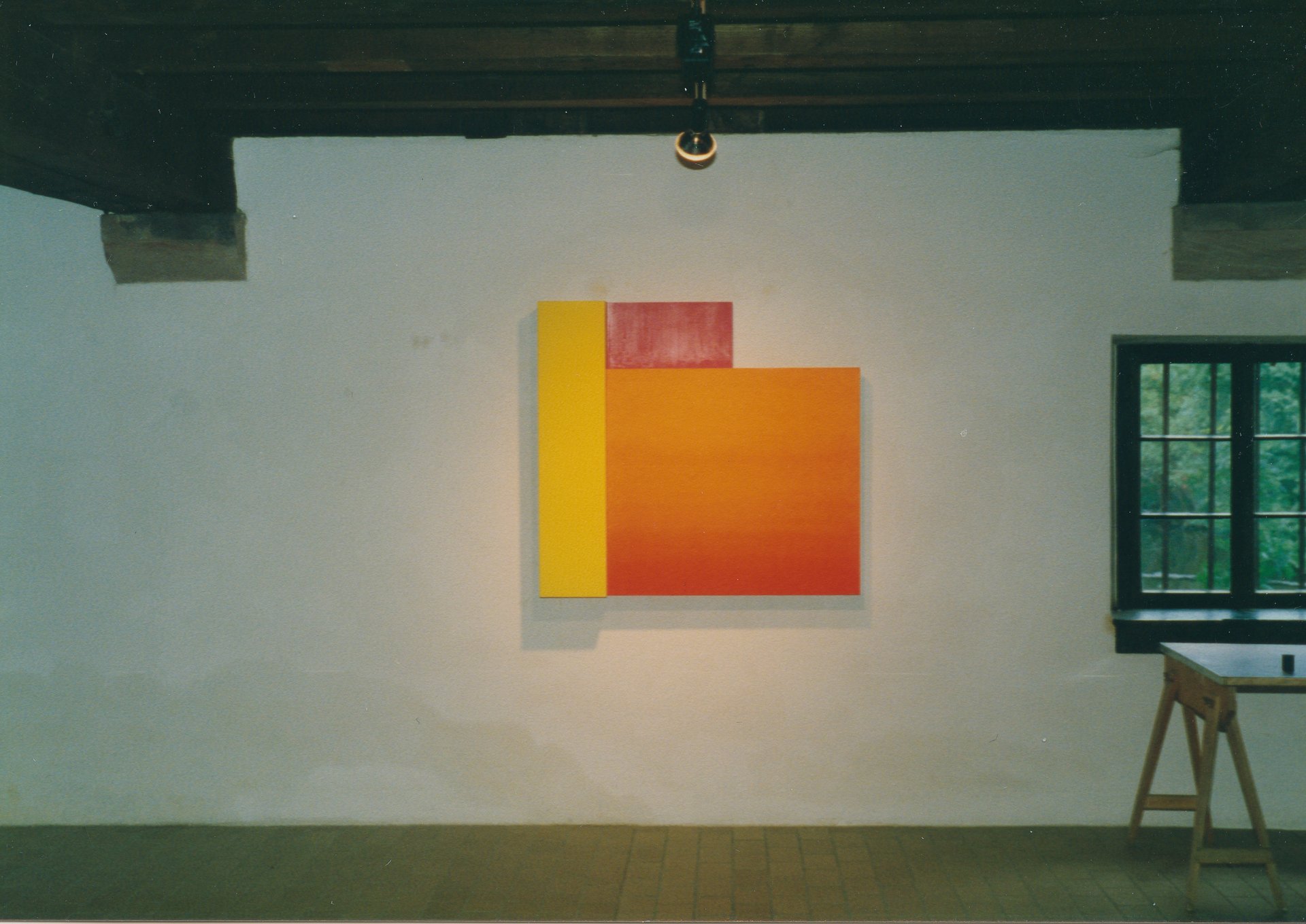
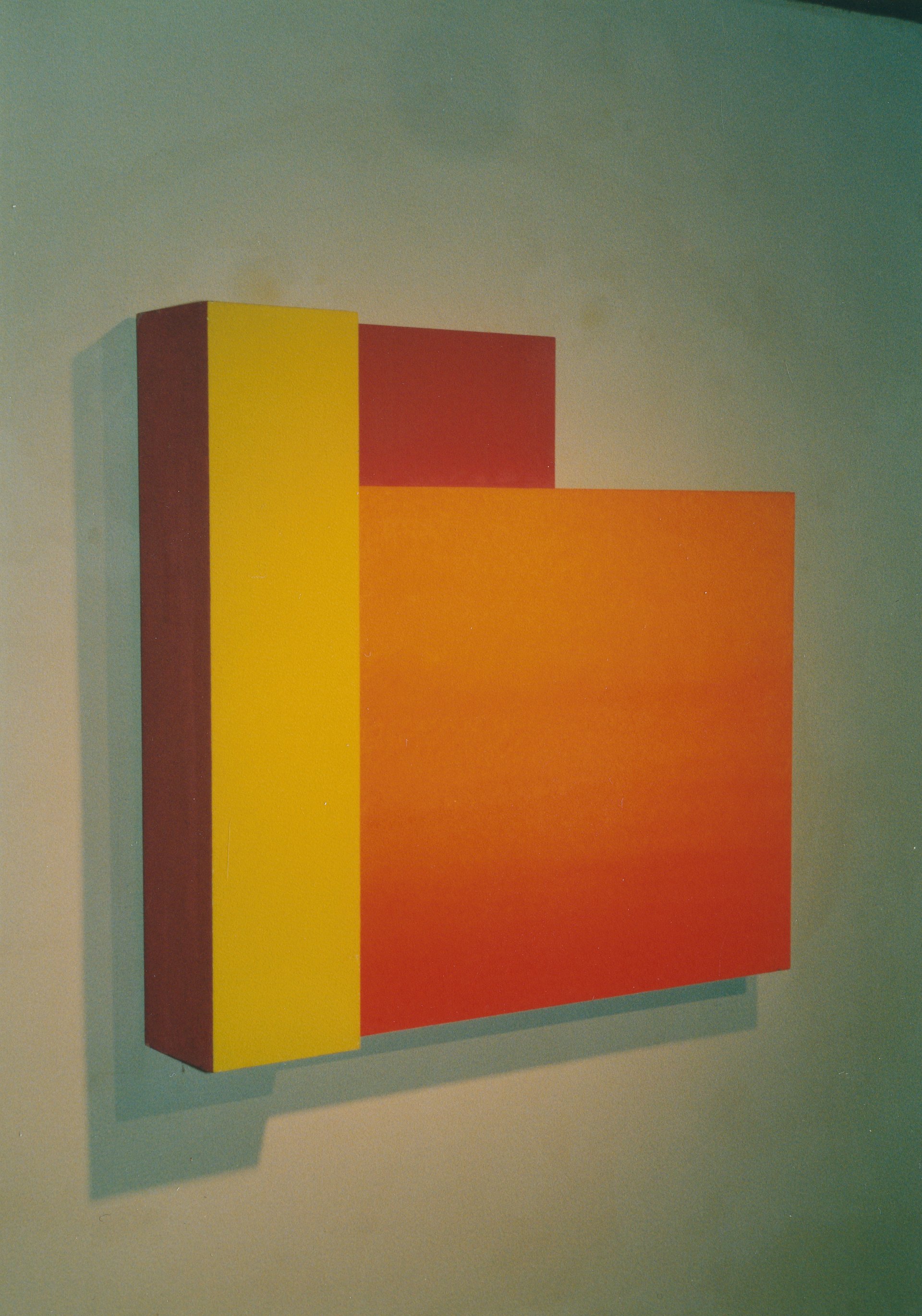
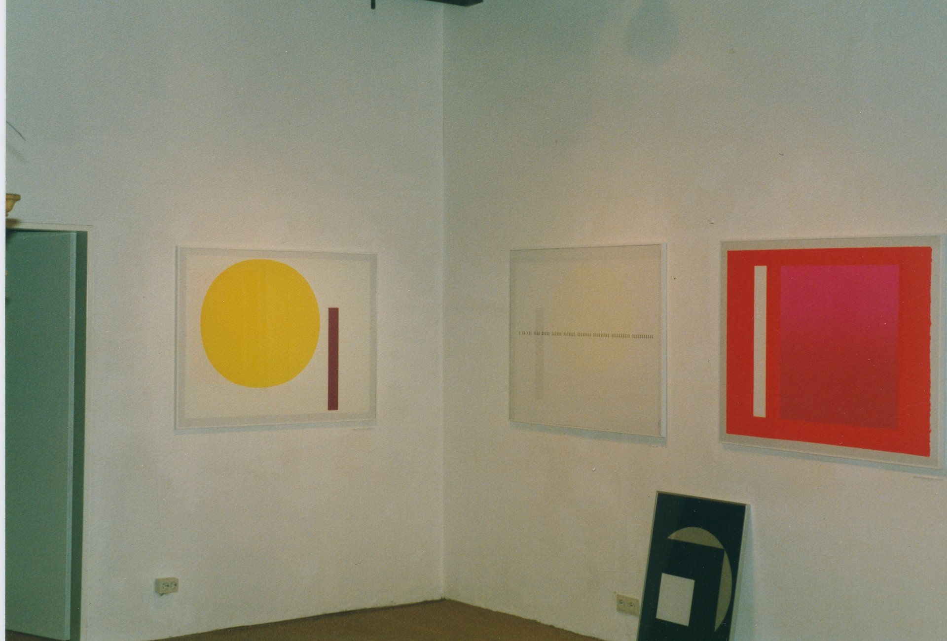
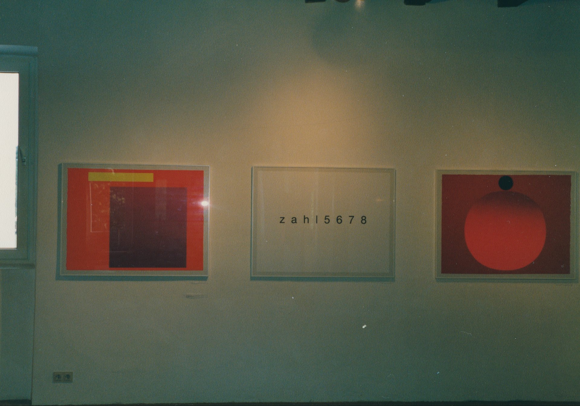
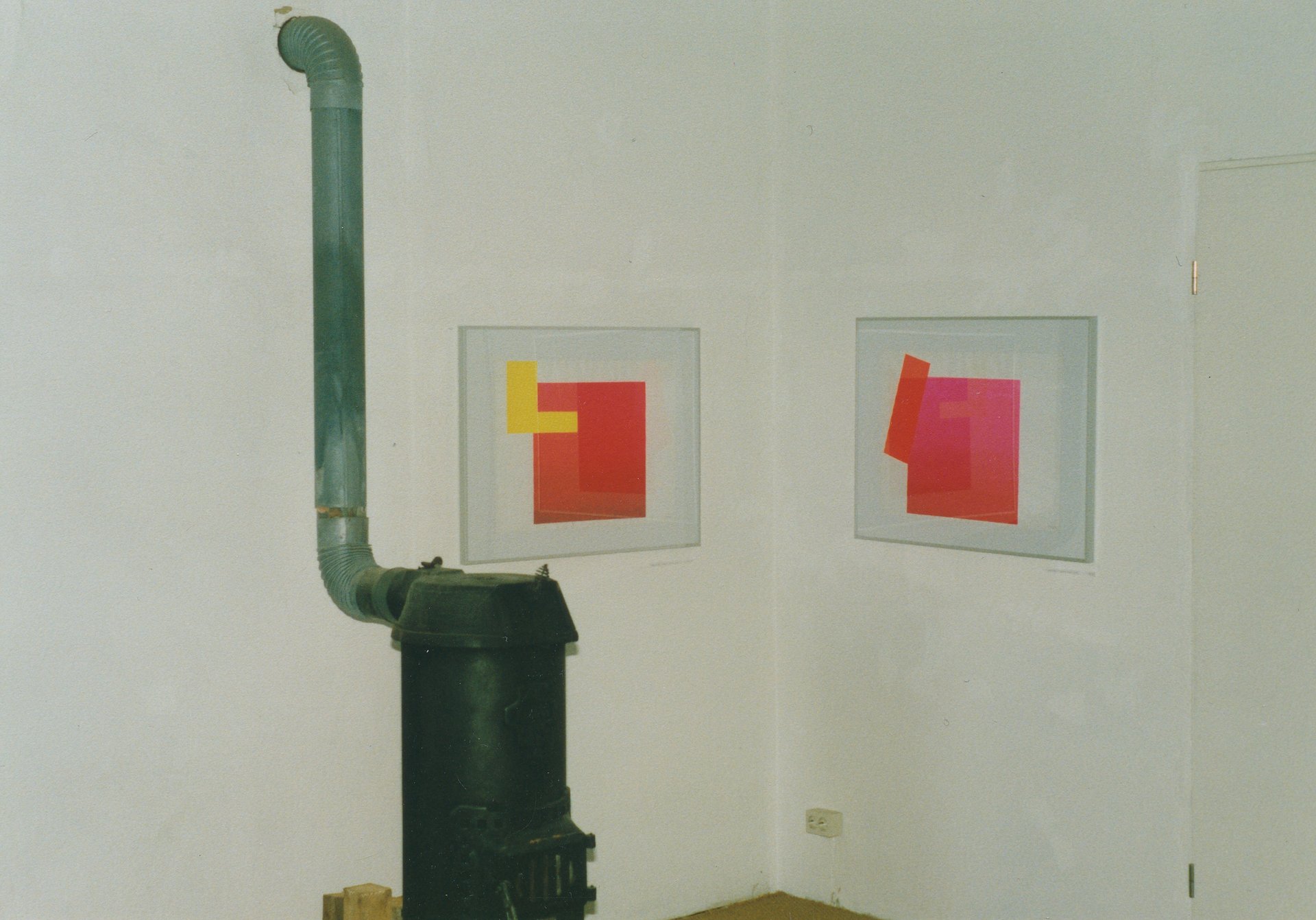
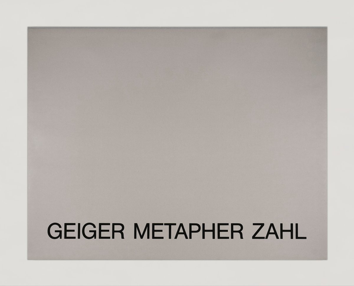
edition hoffmann’s price list of september 1985 mentioned a portfolio by rupprecht geiger––"numbers 0–9." its publication was delayed until autumn 1988. the reason for the delay was the perfection the printer and publisher called for. the complete edition was already proof printed in half the size – of the current format – when the decision was made in favor of the larger format, which increases the effect of the luminous color on the pages. the printing of the folder’s sheets turned out to be complicated. first, colors had to be mixed and test-printed. heidi hoffmann stirred for days, often up to her elbows in buckets of ink––until the right tone was found. the ink had to be used up immediately after opening the containers. luminous ink drys out quickly. pauses during the production of a single sheet were not possible. the gradual lightening and the change in color value––iris printing––demanded constant control of the change in ink quantities and their compensation.
three people were printing together: hans-jürgen and kyrill slusallek pressed the squeegee over the screen, heidi hoffmann controlled the ink’s distribution. the color value of dry luminous ink can’t be identified adequately in moist condition. differentiation is even harder under artificial light. during night shifts in the print shop an unmixed ink was used, whose manufacturer's designation differed from the actual color value. in the morning, when the ink had dried out 120 sheets of paper, which came out too dark lay in the drying racks.
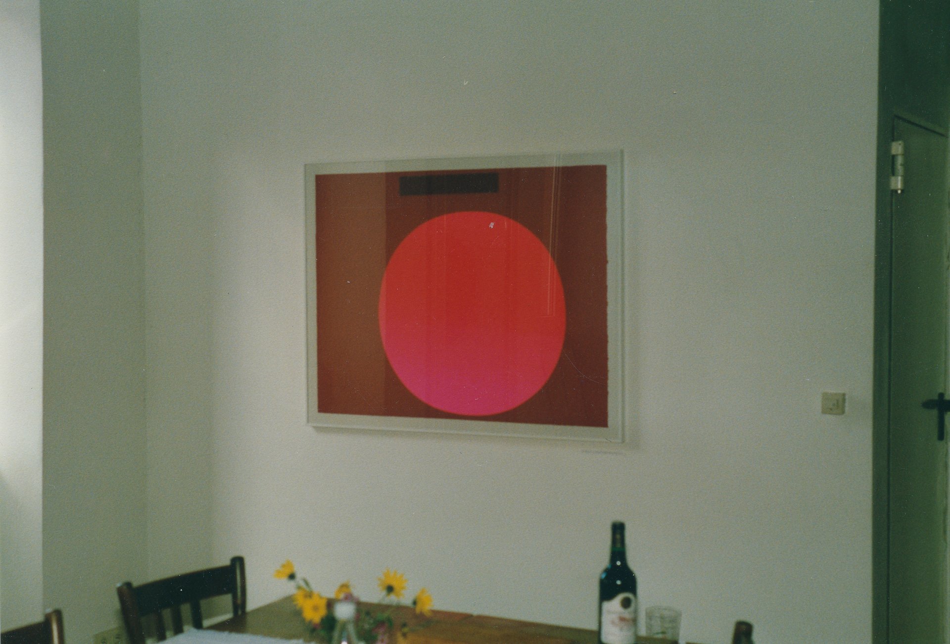
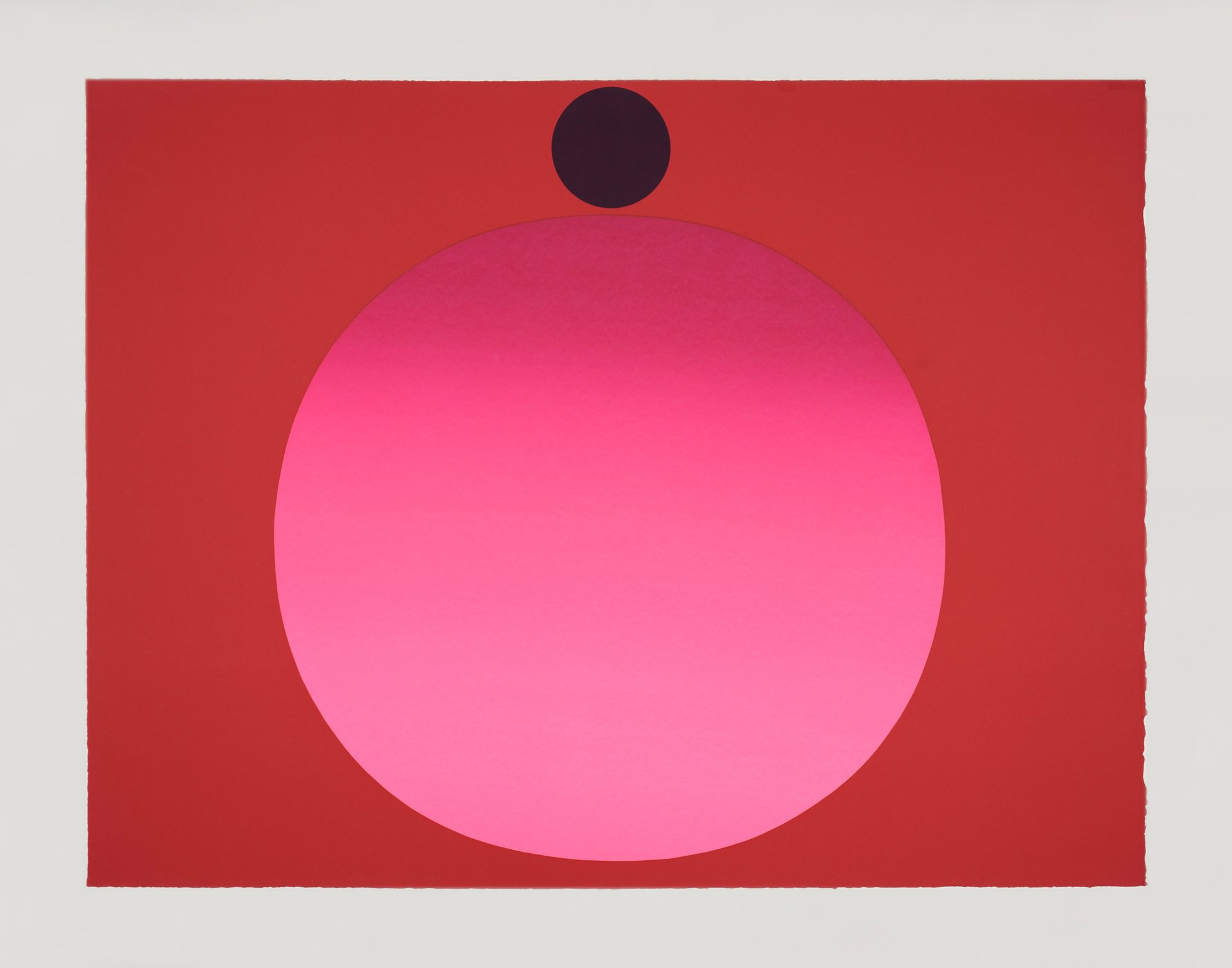
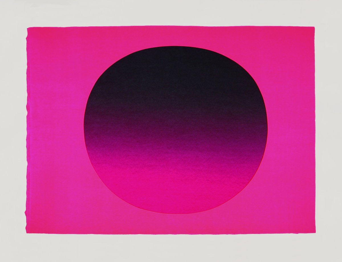
the concept for the artist portfolio's individual sheets had been developed by rupprecht geiger for this occasion. when he saw the completed sequence he was thrilled. geiger was asked if he wanted to use the sheet that had been printed too dark and could not be used for the portfolio, he immediately agreed. after a few weeks he had developed a sheet, eventually titled "schwarzes rot" (black red), from the initial misprint. it was published as an individual limited edition print by edition hoffmann. a close-up view shows the change from silkscreen to acrylic paint. the print depicts a slowly diminishing contrast between the red surface and the almost black, almost purple round shape, which becomes redder towards the top.
an artwork that initially was not intended, came into being; the paper maker’s, the ink manufacturer’s and the labor of the people at edition hoffmann would have been lost without rupprecht geiger’s willingness to improvise. the careful handling of materials and human labor has taken shape in "schwarzes rot."
jörg stürzebecher, 1989 (translation from the original german by robert b. roger, 2022)
