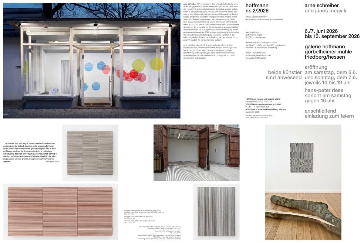
no. 2/2026
jános megyik and arne schreiber
june 6 – september 13, 2026
exhibition opening on saturday june 6 and sunday june 7, 2pm to 7pm
galerie görbelheimer mühlegörbelheimer mühle 1, 61169 friedberg
jános megyik and arne schreiber
june 6 – september 13, 2026
exhibition opening on saturday june 6 and sunday june 7, 2pm to 7pm
galerie görbelheimer mühlegörbelheimer mühle 1, 61169 friedberg

jános megyik, space and horizon
jános megyik is a hungarian postwar avant-garde artist who spent much of his career abroad. megyik emigrated to austria in 1956 due to political circumstances. he took advantage of his newfound freedom of travel to make extensive trips to paris, where he became familiar with contemporary art trends. in his own work, he engaged with art informel, french tachisme and american abstract expressionism. during his studies in vienna, megyik was interested in renaissance painting, producing copies of works from the kunsthistorisches museum.
his analytical approach focused not on the visible elements of a picture, but on the abstract relationships between the figures, which proved formative for his later development. this resulted in a kind of abstract diagram that made these optical relationships visible. megyik himself says that he began to “think in geometry” during this phase. however, he approaches this geometric thinking in a very concrete way because it exists only in the mind and can only be realised visually in a model-like sense. the drawings from this period have a distinctively constructed appearance, though the underlying system remains elusive due to its enigmatic nature.
during this period, megyik also saw himself as a designer. he founded his own design firm together with his first wife, edith kasza, and designed various everyday items, including cutlery and candles. alongside his painting, which remained his primary profession, he also engaged in sculptural work. echoes of contemporary trends are unmistakable. yet what is more important is his interest in elements that transcend genre trends. megyik was particularly interested in what individual, self-contained areas shared across boundaries. here, the abstract construction principle of a work of art is of essential importance.
for the artist, however, this is neither measurable nor visible, as it is in concrete art, with which he was associated for a time. rather, it constitutes a philosophical foundation. by further developing this foundation, megyik moved away from euclidean geometry and discovered projective geometry for himself. this meant that he turned his back on classical painting and began to apply his insights from renaissance art.
reliefs and three-dimensional, model-like objects are made from wooden slats. these come together to form a space that cannot be 'measured.' the drawings that accompany the reliefs illustrate what this entails. these drawings convey a sense of space that is invisible yet evokes a philosophical and poetic dimension, making the object comprehensible on an abstract and conceptual level. the large photograms are important, as they give geometry a projective nature with its own dimension.
in the 1990s, megyik returned from real-world spatial constructs to the two-dimensional plane, employing a new technique in which cut-outs are created in steel discs. in this technique, the frame of the 'image'—that is, the boundary of the pictorial space—is the decisive optical category. some of the objects resemble paper cut-outs at first glance. the visible forms appear as if suspended from the upper frame. this relates to megyik’s engagement with the frame in art.
while classical art has traditionally been seen as a window to the world, megyik reflects on the significance of the concepts of 'inside' and 'outside.' does the philosophical and poetic essence of a work of art extend beyond its frame, or is it confined to what is visible within the pictorial space? the artist experiments with the transparency of these metal works. for example, they are placed against a white wall. when illuminated, this creates a silhouette that produces a sort of double image. however, this is not an exact copy or mirror image; it is merely a spatial illusion that cannot be discerned in the flat form of the steel panel.
in megyik’s work, these aesthetic experiments are always based on his philosophical thoughts, through which he explores the optical foundations of the visual arts, paying little attention to optical feasibility. this develops, particularly in his most recent metal works, into a duality of the visible and invisible—two antagonists united within a single artwork. in this respect, megyik is an intellectual artist, a theorist and a poet who experiments with the concept of the invisible in visible art.
this dialectic can be seen—or rather, read—above all in his drawings. megyik is one of the finest graphic artists of his generation. here, his interest in translating two-dimensional (i.e., drawn) structures into a spatial dimension is once again evident. it is therefore unsurprising that the artist is deeply interested in architectural drawings, which often form the basis of spatial constructs by definition. in all these spheres of visual creativity, megyik seeks the common ground between aesthetic genres. in this respect, he aligns closely with the integrated aesthetics of the german bauhaus, a concept that has abolished the arbitrary boundaries of artistic disciplines.
hans-peter riese
arne schreiber, redundancy as an artistic program
the concept of redundancy is typically applied in art criticism when structures are generated through the repetition of a visual element. such structures are often very one-dimensional. furthermore, the significance of the individual element forming them is ignored. arne schreiber, however, does not view the concept as a devaluation of his artistic method. schreiber is renowned for his murals. although, these works should not be classified as paintings, but rather as wall drawings. they have a very dense structure, consisting of narrow lines painted by hand onto the wall without the use of a ruler. viewers generally do not pay particular attention to these lines.
schreiber, nonetheless, gives these lines a very individual description. according to schreiber, each line—which, in the overall view of the image or drawing, evokes a strong uniformity of structure—is clearly distinct in its own right. aesthetically, each line has its own value. in this respect, structures consisting of lines are not redundant; it is only the homogeneous impression of the structure that reflects redundancy. what the viewer does not perceive, however, is that schreiber draws on an impression from nature here.
for a while, he referred to his canvas paintings as 'branch paintings.' in nature, we perceive branches as uniform. in reality, no two branches are exactly alike. each branch has its own unique form, despite our perception that one branch is similar to another. schreiber has transferred this impression to his structures and thus also adapted the concept of redundancy for his art. the lines, which are almost indistinguishable visually, form a coherent structure through their supposed uniformity. consequently, the visual individuality of the lines is downplayed in the composition. in this way, schreiber establishes an aesthetic dialectic that operates at the lower limit of what is visually perceptible. the relationship between distinct elements and their integration into the structure implies the possibility of deliberate harmony in the overall impression.
on the other hand, the overall impression that gives rise to the redundancy has more of a theoretical than a visual aesthetic value. schreiber has adhered to this structural approach for years. he has viewed the basis of the structure as being more in the division of space than in the emphasis on the individuality of the line. however, by doing so, he has lent some credence to the criticism that his paintings are examples of unresolved redundancy. this is especially apparent in the canvas paintings and drawings executed on graph paper, where the visual individuality of the lines is subdued. for a time, schreiber used a ruler to make the lines less distinctive. the artist also began experimenting with different surfaces. as well as paper and canvas, he started using mirrors, which intensified the structural effect and opened up a further dimension, albeit one that was difficult for the viewer to decipher.
in the 2010s, though, schreiber returned to the original concept of the individuality of the single line. instead of using any old branch from nature, he now uses a natural bamboo cane to create these lines. this natural, branch-like element is placed on the canvas via a laborious process and fixed to the surface with a brush or pen at the end of it. although the lines created in this way are now very homogeneous—at least, the human eye can hardly discern any individuality in the individual lines—for schreiber, the use of an untreated natural product as an element in the creation of a work of art signifies an inner connection between the observation of nature and the theoretical foundation of a work of art.
of course, observing nature and transposing it into art does not make arne schreiber a nature artist. clearly, the artist’s theoretical and visual observations and reflections have been fused into an aesthetic concept that lends a deeper dimension to works that appear abstract. that said, this concept, which focuses on a single element—the line—has limited potential for development.even dividing a painting’s total surface area into different sections does not significantly alter the basic concept. for this reason, in his most recent paintings, which are being shown for the first time in this exhibition, schreiber expands the concept to include a new element: colour.
the paintings take on a new appearance, yet remain connected to the formal concept of the previously used line. schreiber continues to use lines and create structures with them. these lines are rendered in colour, initially exclusively in red. schreiber is now expanding the concept of sequences by creating a series of paintings. once again, viewers might find it difficult to discern differences between individual paintings within the series. from a distance, the individual paintings appear monotonous. upon closer inspection, it becomes clear that this is not really the case. the use of colour now allows a certain painterly style to emerge, which is entirely absent in the black-and-white works. these images not only expand the spectrum of the artist’s oeuvre, but also open up a completely new dimension. this is not only exciting, but also justifies a well-founded hope for the further development of the work.
hans-peter riese


supported by the federal minister for culture and media, neustart kultur and stiftung kunstfonds


