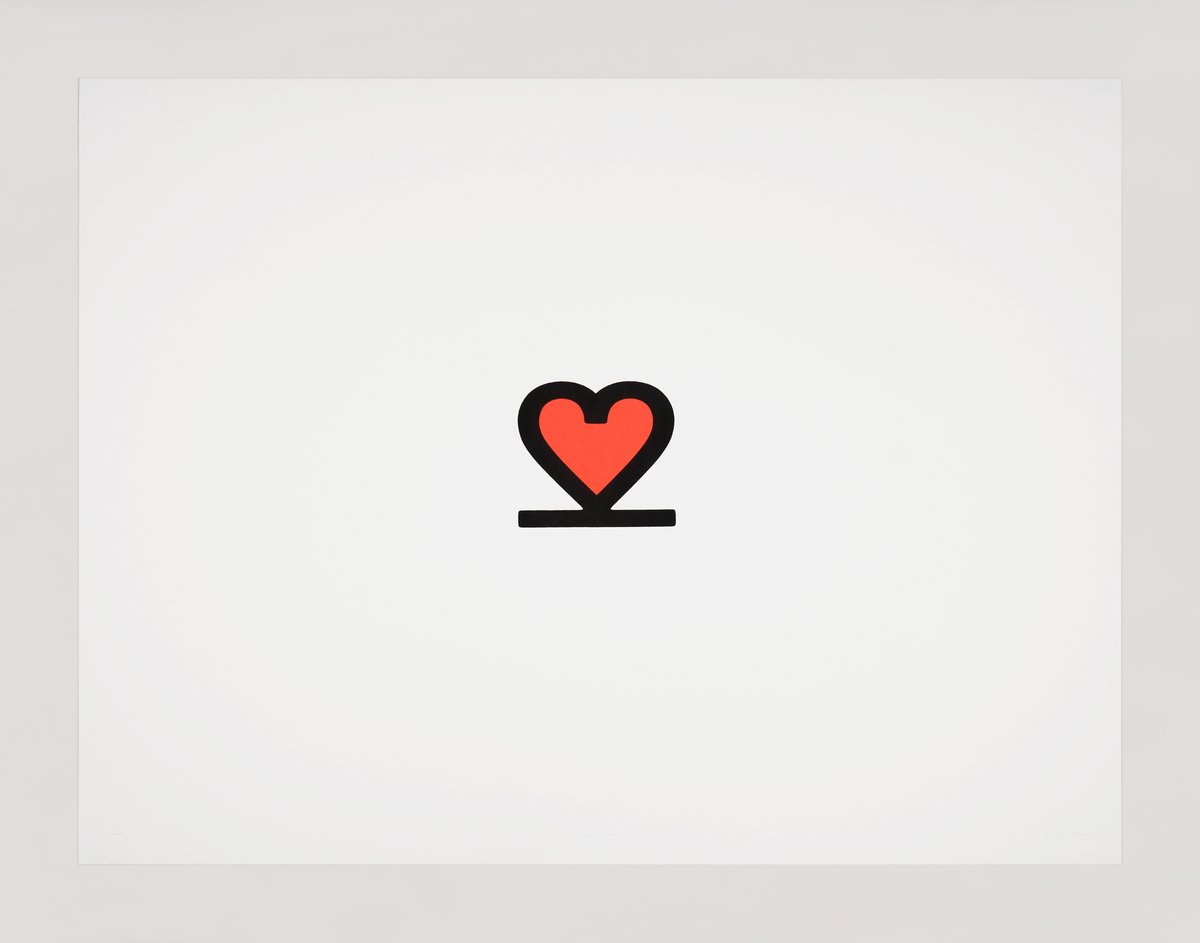
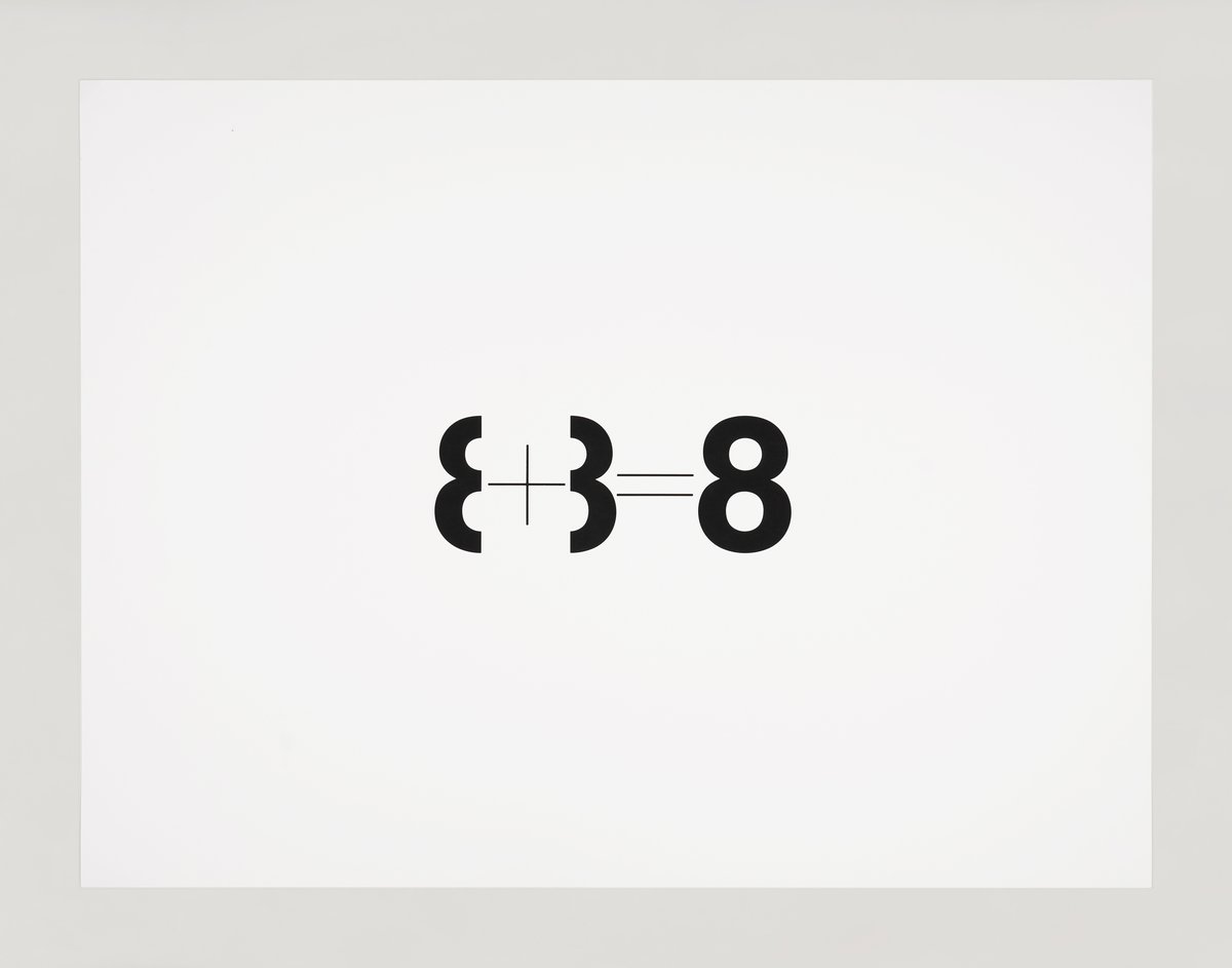
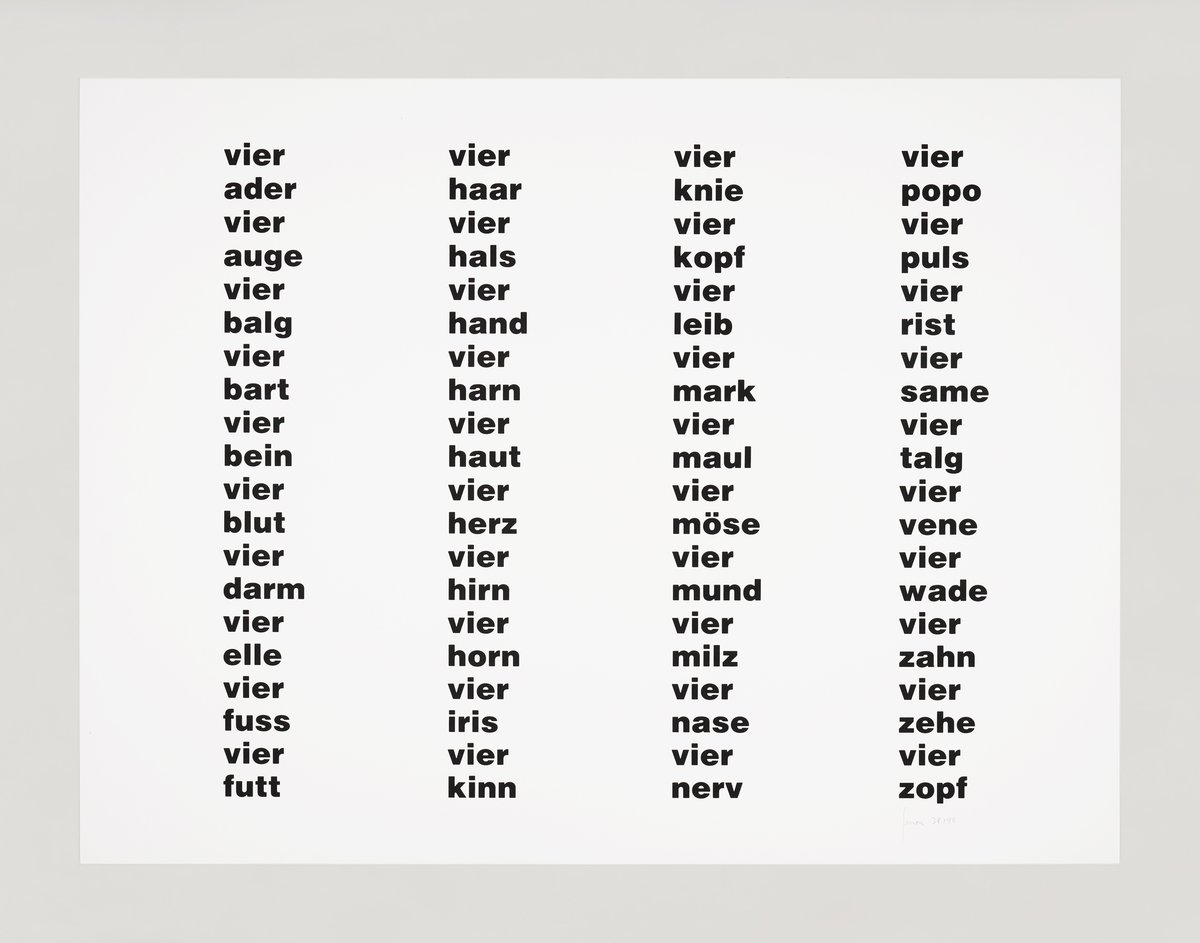
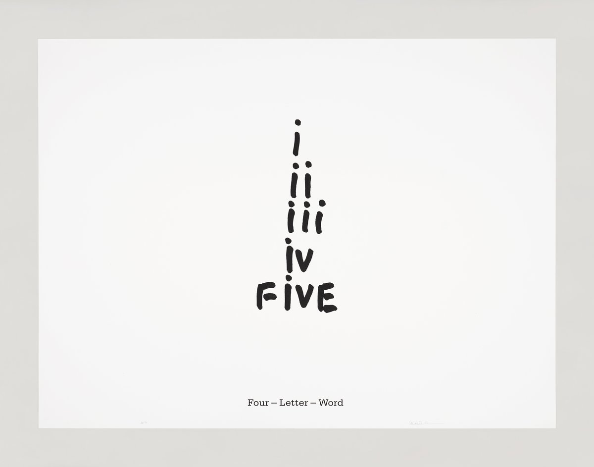
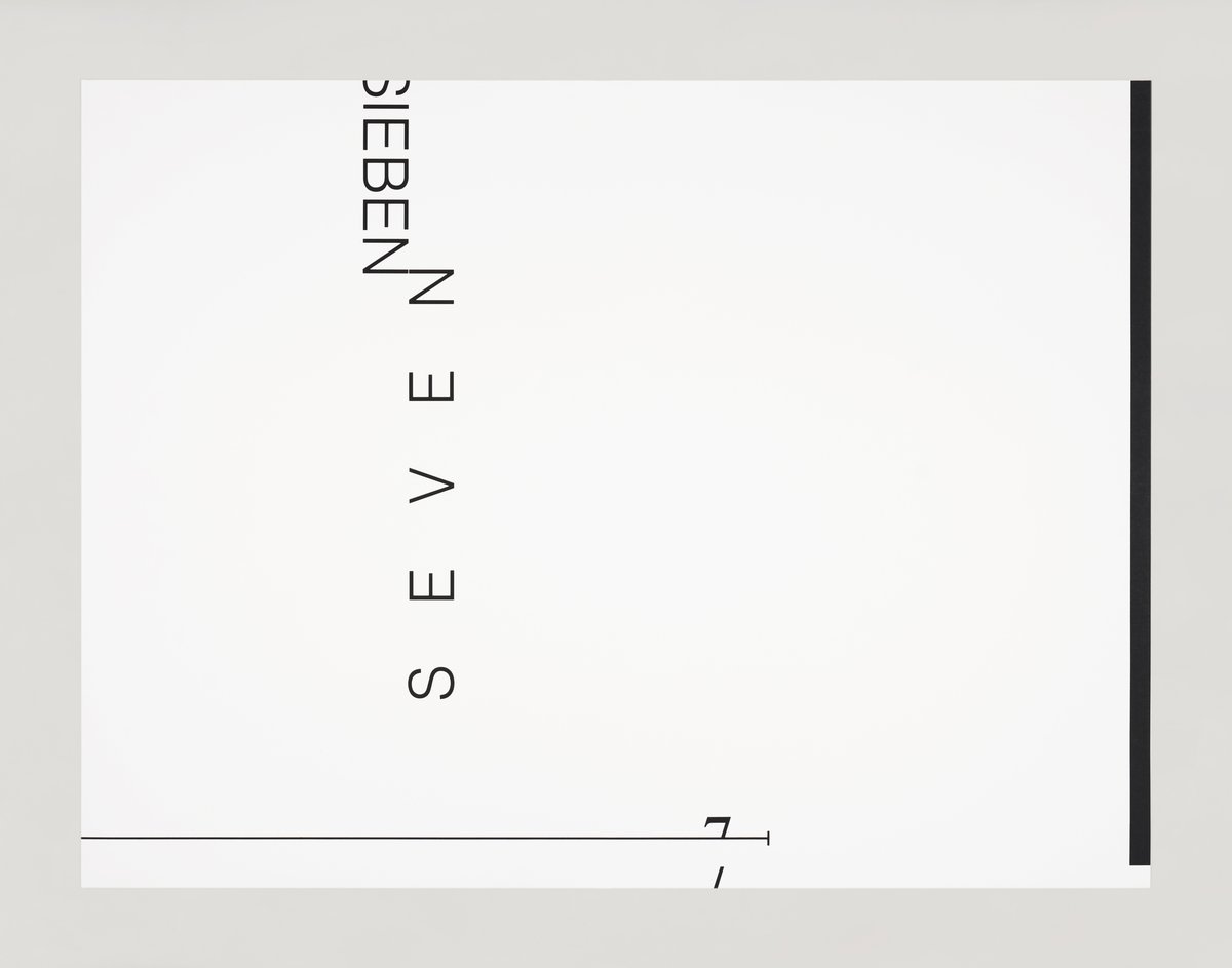
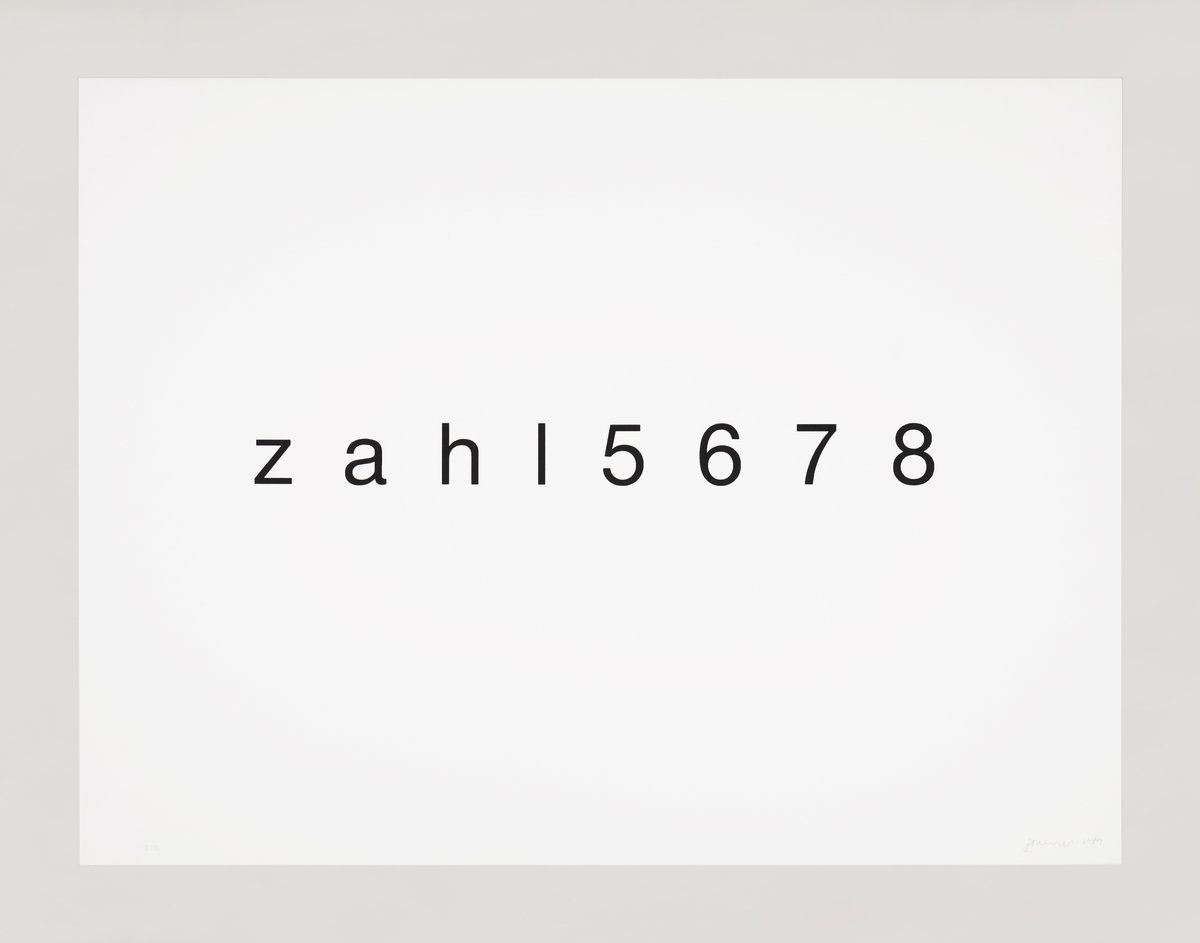
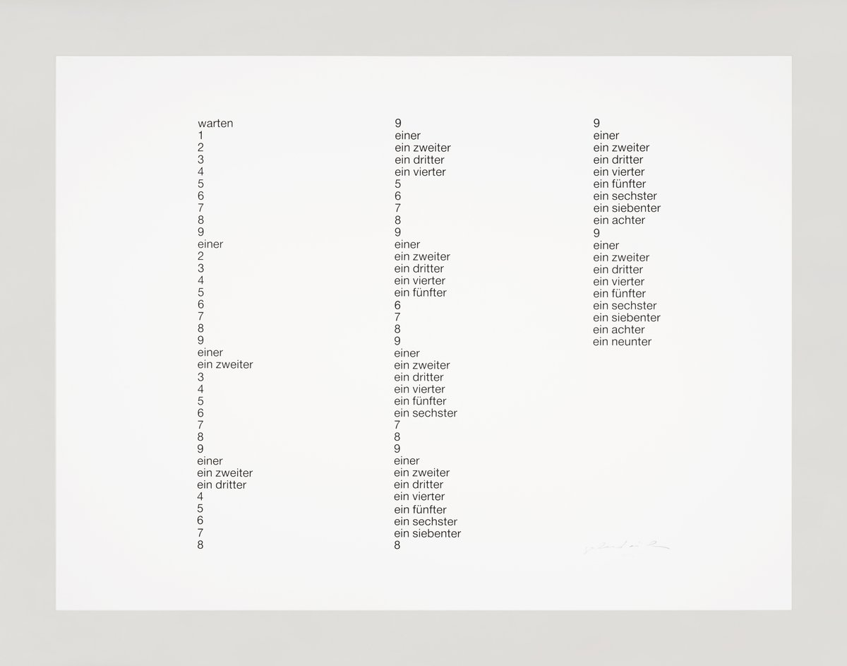
metapher zahl
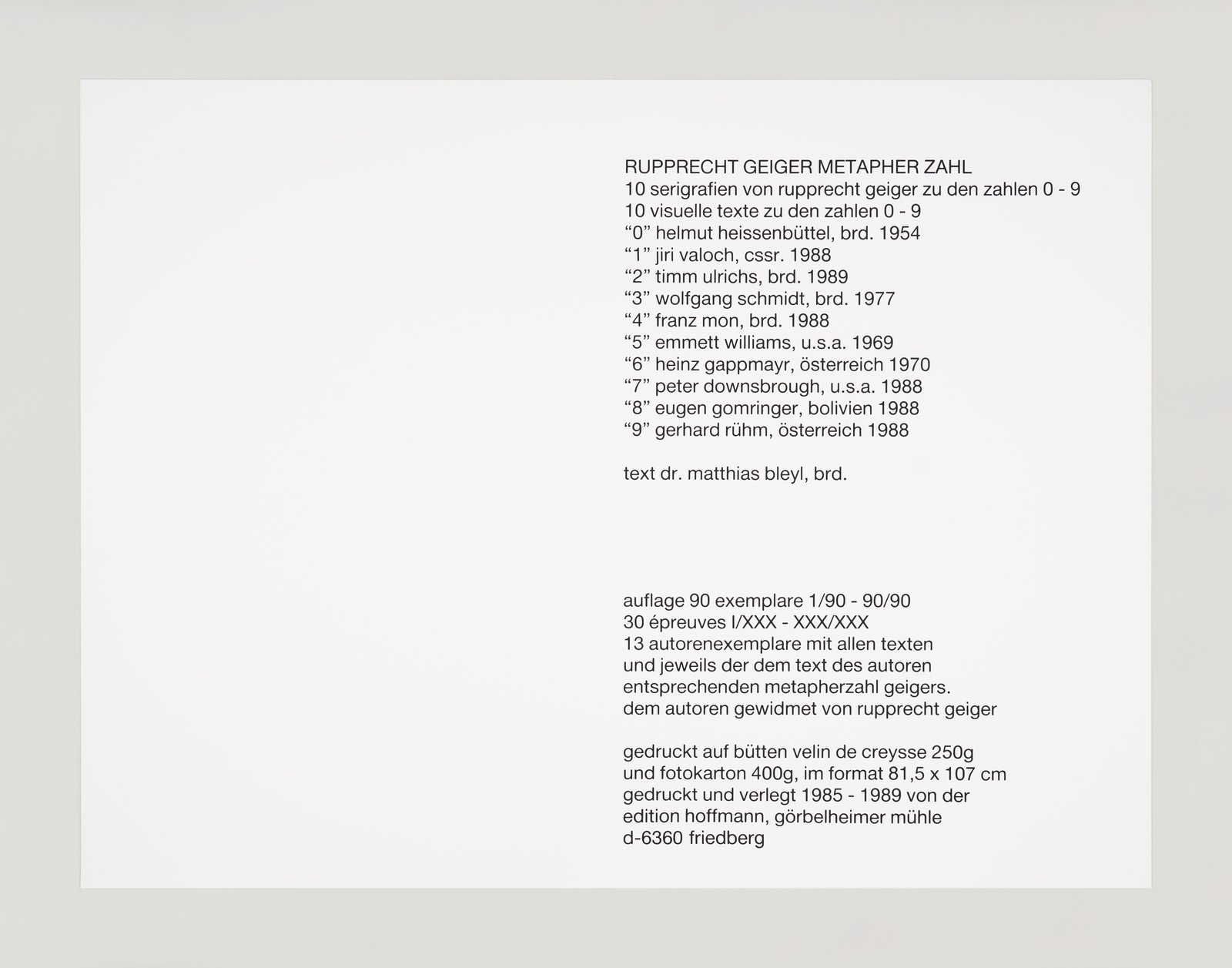
peter downsbrough, heinz gappmayr, rupprecht geiger, eugen gomringer, helmut heissenbüttel, franz mon, gerhard rühm, wolfgang schmidt, timm ulrichs, jiří valoch, emmett williams
1985-89
original-silkscreen on laid paper
80.5 × 107 cm
3′ 6 1⁄8″ × 2′ 7 11⁄16″
edition hoffmann
edition of 90 + 30 e.d’a.
signed, dated and numbered
20-part portfolio
publisher: edition hoffmann
printer: edition hoffmann
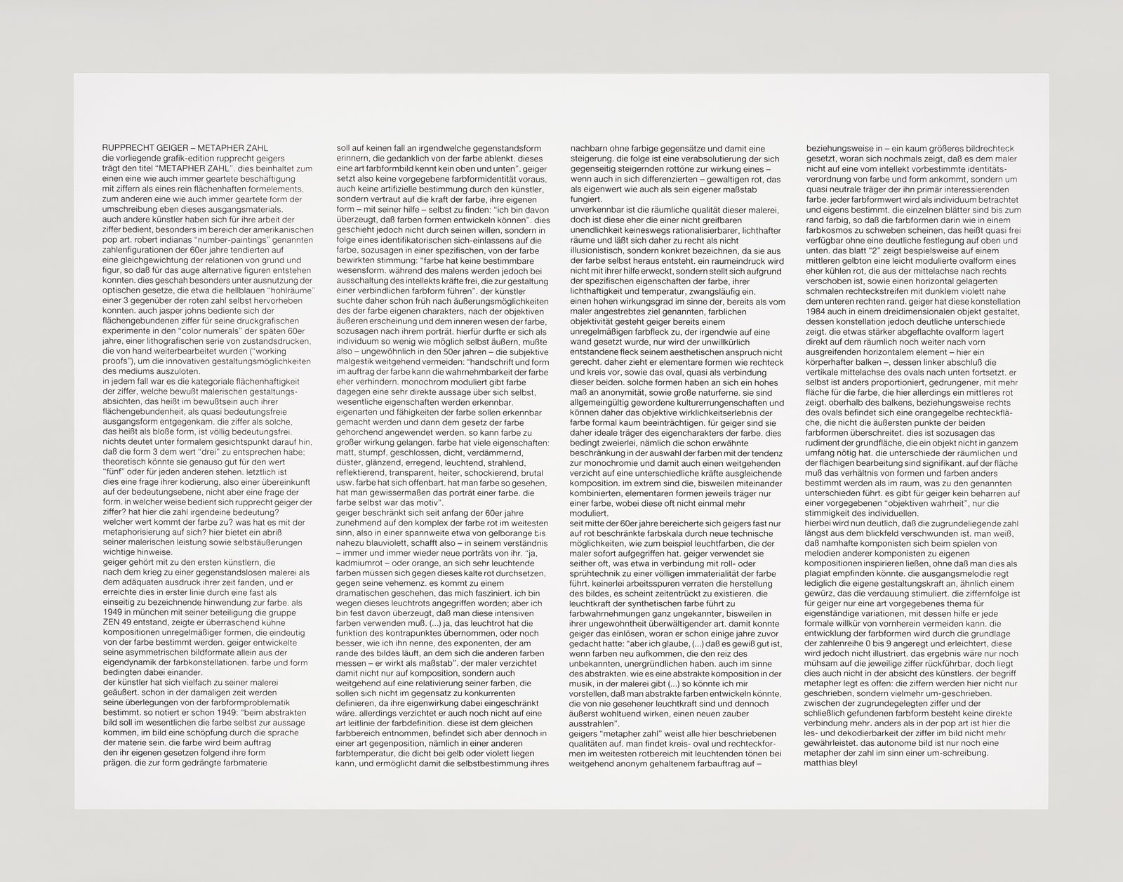
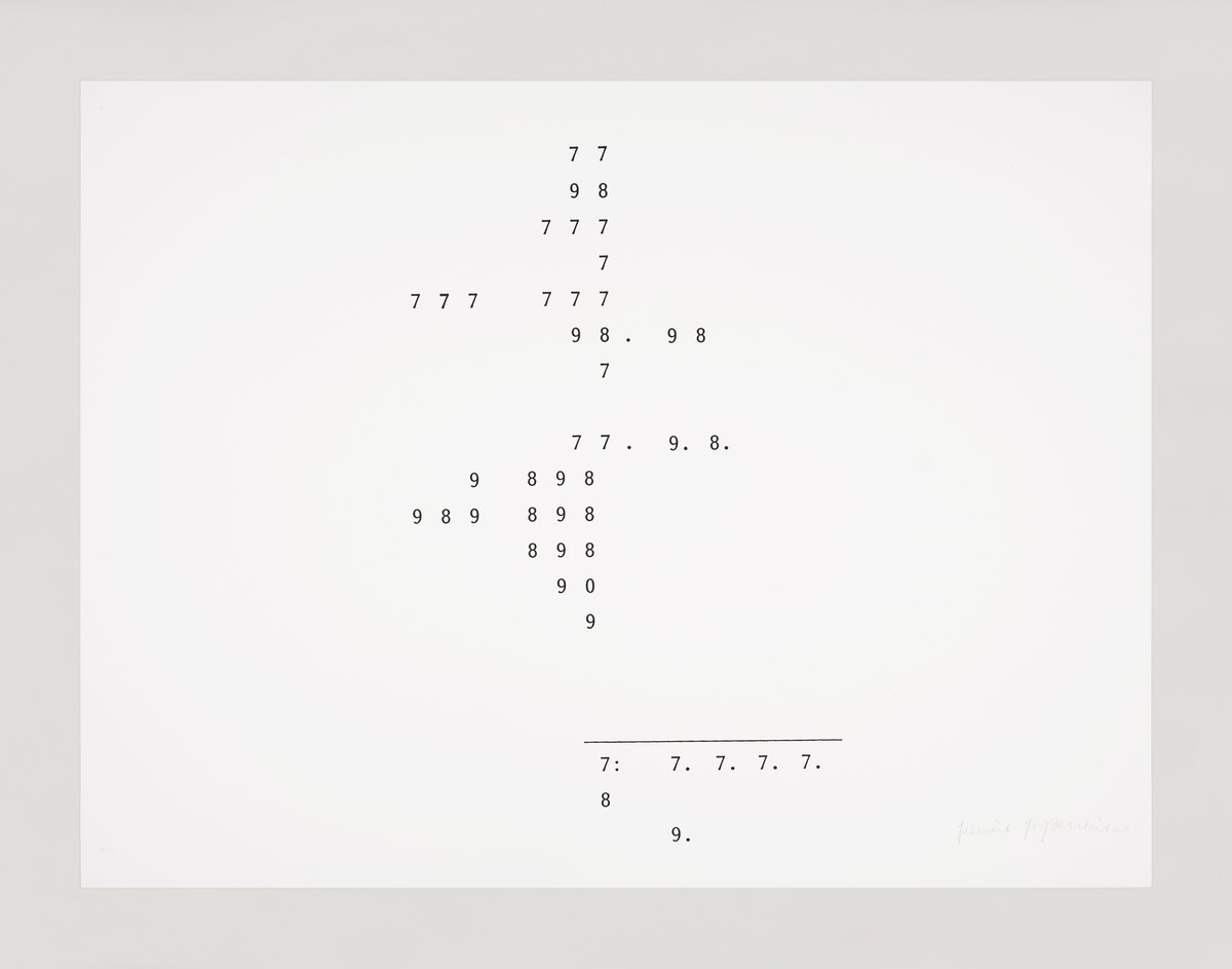
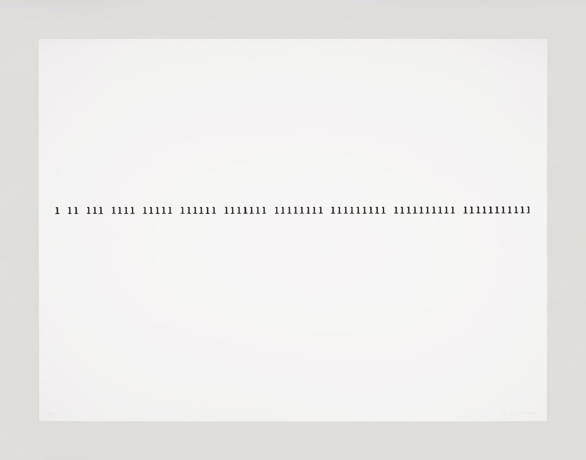
the present portfolio by rupprecht geiger is entitled "metapher zahl." on the one hand, this implies some kind of preoccupation with numbers as a purely two-dimensional formal element. on the other hand, it implies some kind of paraphrasing of this very source material. other artists have also made use of numbers in their work, especially in the field of american pop art. robert indiana's “number-paintings” of the 1960s tended to balance the relationships between ground and figure, so that alternative figures could be created for the eye. this was done in particular by exploiting the laws of optics, which could, for example, emphasize the light blue "hollow spaces" of a "3" against the red number itself. jasper johns also made use of the surface-bound numerals for his printmaking experiments in the "color numerals" of the late 1960s, a lithographic series of prints that were further processed by hand ("working proofs") in order to explore the innovative design possibilities of the medium.
in any case, it was the categorical flatness of the number that consciously accommodated painterly design intentions, i.e. in the awareness of its surface-bound nature, as a quasi meaning-free initial form. the number as such, i.e. as a mere form, is completely free of meaning. from a formal point of view, nothing indicates that the form 3 has to correspond to the value "three"; theoretically, it could just as well stand for the value "five" or for any other; ultimately, this is a question of its coding, i.e. an agreement on the level of meaning, but not a question of form. in what way does rupprecht geiger make use of the number? does the number have any meaning here? what value is attached to the color? what is the metaphorization all about? an outline of his painterly achievement and his self-expressions offer important clues here.
geiger was one of the first artists after the war to find non-objective painting as the adequate expression of his time, and he achieved this primarily through a turn to color that could almost be described as one-sided. when the group zen 49 was founded in munich in 1949 with his participation, he showed surprisingly bold compositions of irregular forms that were clearly determined by color. geiger developed his asymmetrical pictorial formats solely from the inherent dynamics of the color constellations. color and form were mutually dependent.
the artist often commented on his painting, and even at that time his considerations were determined by the problem of color form, as he noted as early as 1949: “in the abstract picture, the color itself should essentially come to express itself, be a creation in the picture through the language of the material. the color will shape its form by following its own laws when applied. color(-matter) pushed towards form should in no way be reminiscent of any kind of object form that distracts from the color, this kind of color-form-picture knows not top nor bottom", geiger therefore does not presuppose a given color-form-identity, nor any artificial determination by the artist, but trusts in the power of the color to find its own form – with his help: "i am convinced that color can develop form". however, this does not happen through his will, but as a result of an identificatory engagement with the color, so to speak in a specific mood caused by the color: “color has no determinable form of being (wesensform). during painting, however, when the intellect is switched off, forces are released that lead to the creation of a binding color-form.” the artist therefore searched early on for ways of expressing the character inherent in color, for the objective external appearance and the inner essence of color, for its portrait, so to speak. to this end, he was allowed to express himself as an individual as little as possible, and thus – not very common in the 1950s – had to largely avoid subjective painting gestures: "the artist's handwriting and form as part of the process of applying color rather prevent the perceptibility of color. applied monochromatically, on the other hand, color makes a very direct statement about itself, essential characteristics become recognizable. the characteristics and abilities of color should be made recognizable and then applied according to the law of color. this is how color can achieve great effect. color has many properties: matte, dull, closed, dense, dimming, gloomy, shiny, exciting, luminous, radiant, reflective, transparent, cheerful, shocking, brutal, etc. once you have seen color in this way, you have, so to speak, the portrait of a color. the color itself was the motif."
since the beginning of the 1960s, geiger has increasingly limited himself to the complexity of the color red in the broadest sense, i.e. in a range from yellow-orange to almost blue-violet, thus creating – in his understanding – new portraits of red over and over again. "yes, cadmium red - or orange, very bright colors in themselves have to assert themselves against this cold red; against its vehemence. a dramatic event occurs that fascinates me. i have been attacked because of this luminous red; but i am firmly convinced that one must use these intense colors. (...) yes, the bright red has taken on the function of the counterpoint, or even better, as i call it, the exponent that runs along the edge of the picture, against which the other colors are measured - it acts as a reference point". the painter thus not only renounces composition, but also largely a relativization of his colors, which should not define themselves in contrast to their competitors, as this would limit their own effect. however, he does not yet renounce a kind of guideline of color definition. this is taken from the same color range, but is nevertheless in a kind of opposite position, namely in a different color temperature, which can be close to yellow or violet, and thus enables the self-determination of its neighbor without color contrasts and thus an increase. the consequence is an absolutization of the mutually enhancing red tones to the effect of a powerful red - albeit differentiated in itself - which functions as an intrinsic value as well as its own standard.
the spatial quality of this painting is unmistakable, but it is rather that of an intangible infinity of light-filled spaces that cannot be rationalized in any way and can therefore rightly be described as concrete rather than illusionistic, as it arises from the color itself. an impression of space is not created with its help, but is inevitable due to the specific properties of the color, its luminosity and temperature. geiger already concedes a high degree of effectiveness in the sense of color objectivity, already mentioned as the painter's goal, to an irregular patch of color that has somehow been placed on a wall, but the involuntarily created patch does not do justice to his aesthetic claim. he therefore prefers elementary forms such as rectangles and circles, as well as the oval, as a kind of connection between the two. such forms have a high degree of anonymity in themselves, as well as a great distance from nature. they are cultural achievements that have become universally valid and can therefore hardly formally impair the objective experience of the reality of color. for geiger, they are therefore ideal carriers of the intrinsic character of color. this requires two things, namely the already mentioned limitation in the choice of colors with a tendency towards monochromy and thus also a far-reaching renunciation of a composition that balances different forces. in extreme cases, the elementary forms, sometimes combined with each other, are each the carriers of only one color, whereby this often no longer even modulates.
since the mid-1960s, geiger's color palette, which was almost exclusively limited to red, has been enriched by new technical possibilities, such as luminous colors, which the painter immediately took up. geiger has often used them since then, which, for example, in combination with roller or spray techniques, leads to a complete immateriality of color. no traces of work betray the production of the painting, it seems to exist in a time-remote manner. the luminosity of the synthetic color leads to color perceptions of a completely unfamiliar, sometimes overwhelming nature. geiger was thus able to realize what he had already thought of a few years earlier: "but i believe (...) that it is certainly good when colors emerge that have the charm of the unknown, the unfathomable, also in the sense of the abstract. just as there is an abstract composition in music, in painting (...) so i could imagine that one could develop abstract colors that are of a luminosity never seen before and yet have an extremely pleasant effect, radiate a new magic."
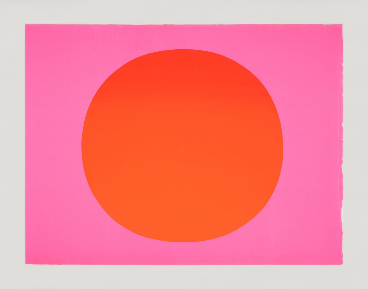
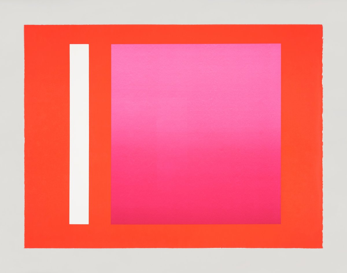
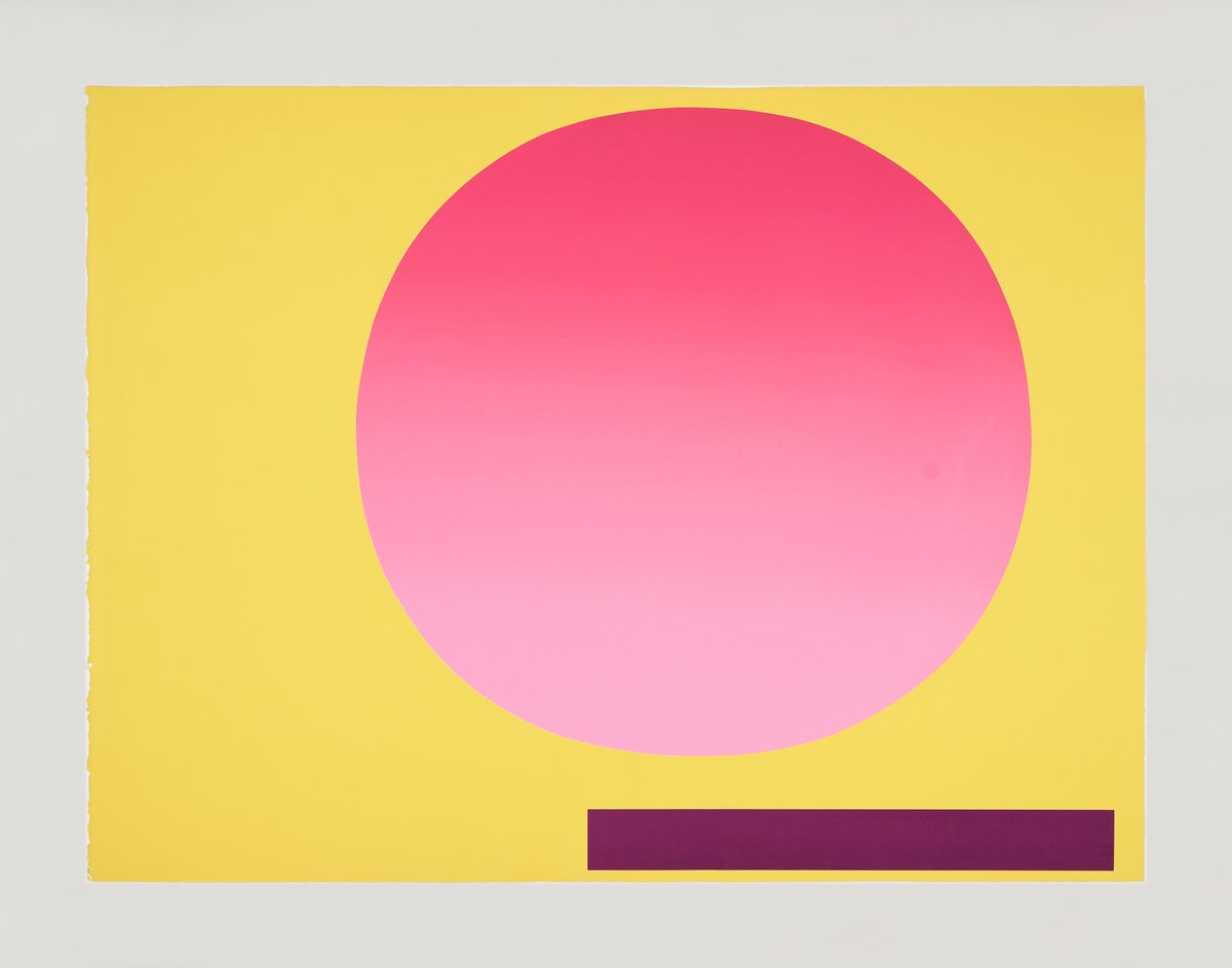
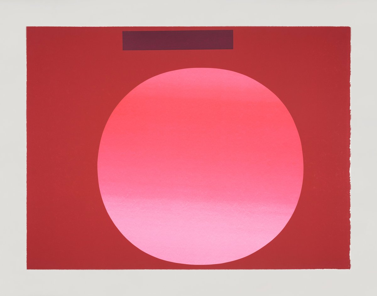
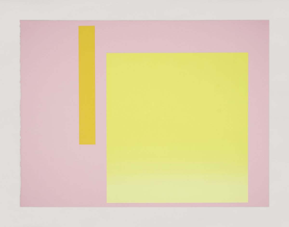
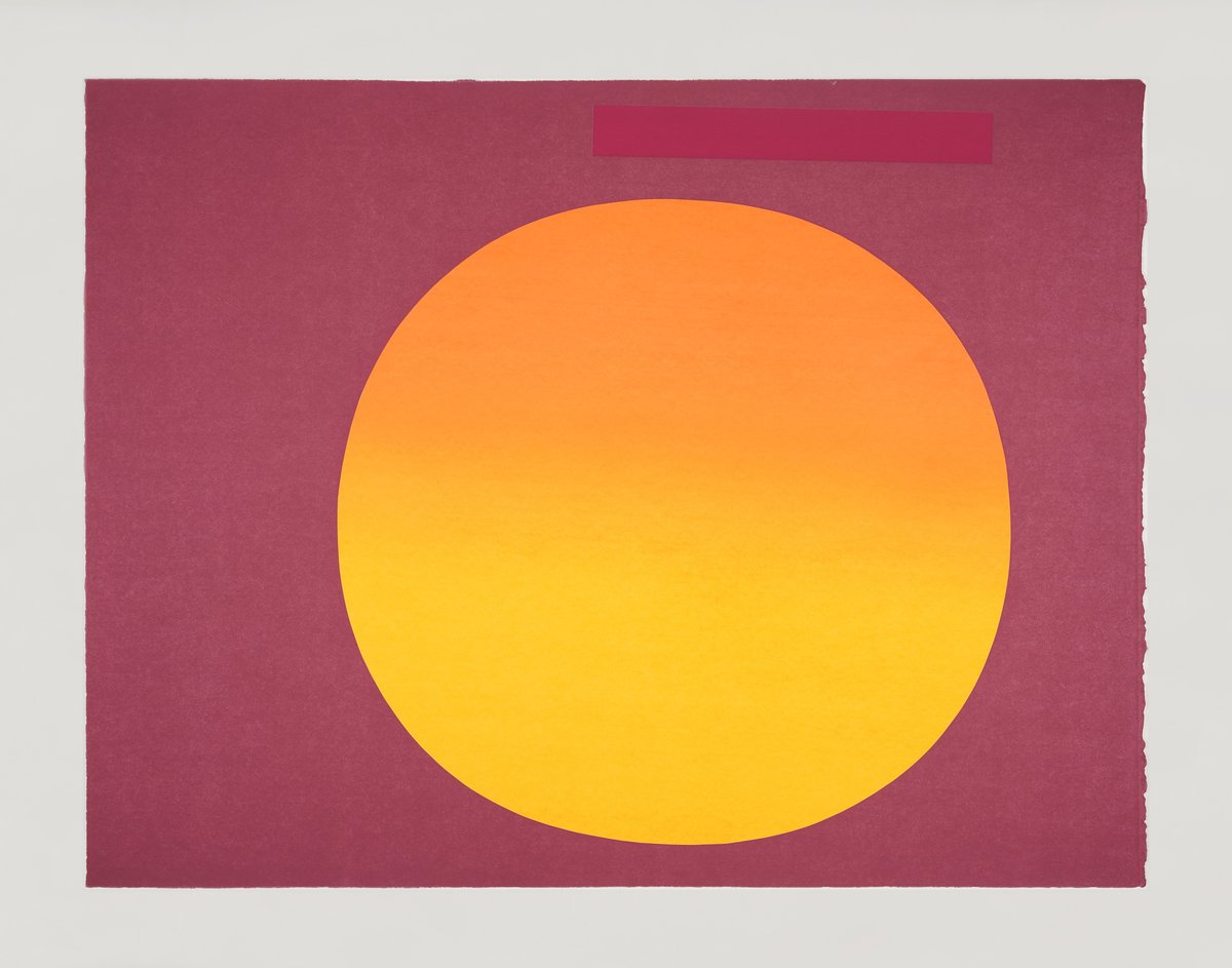
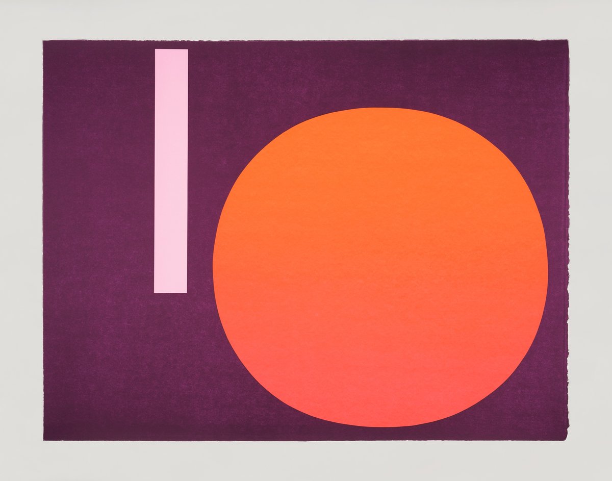
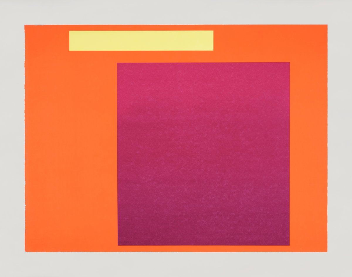
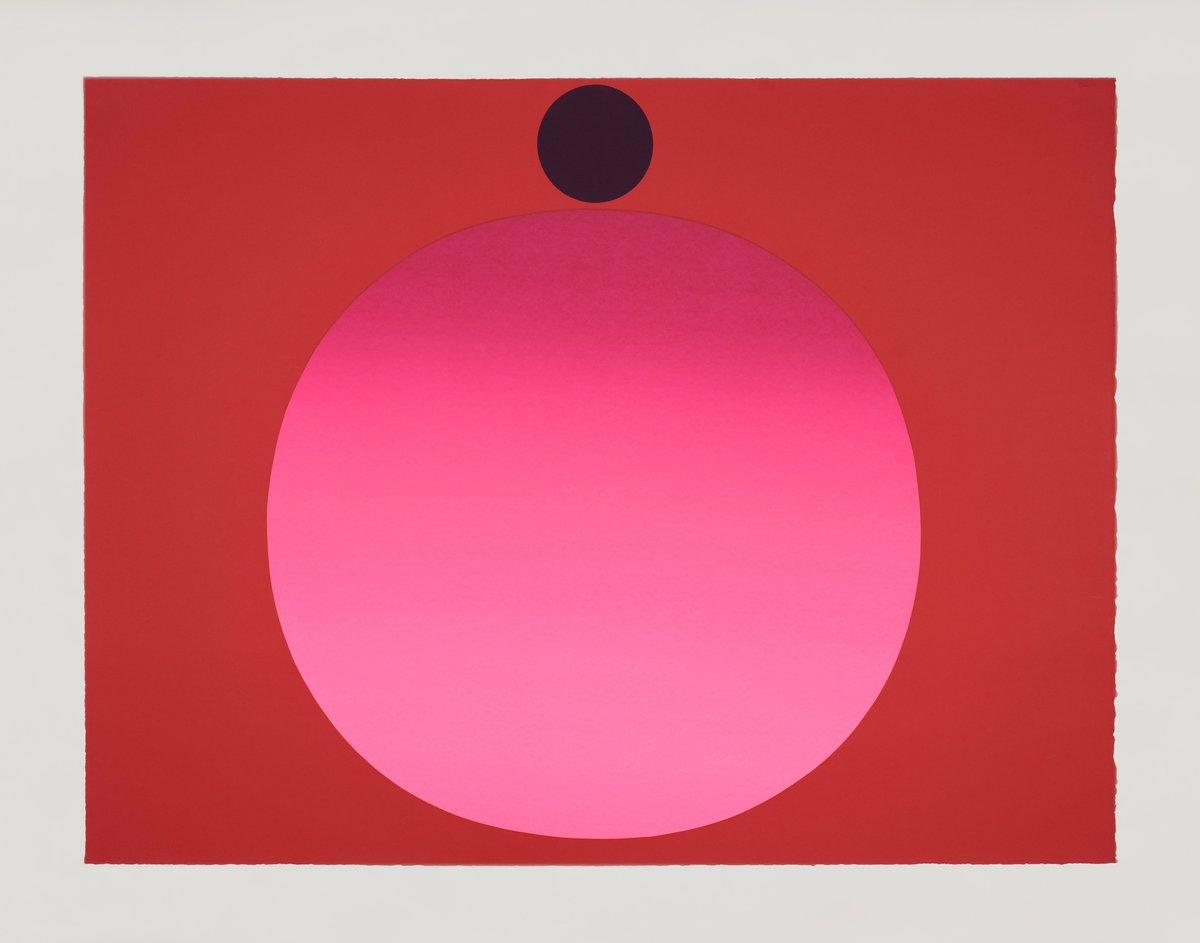
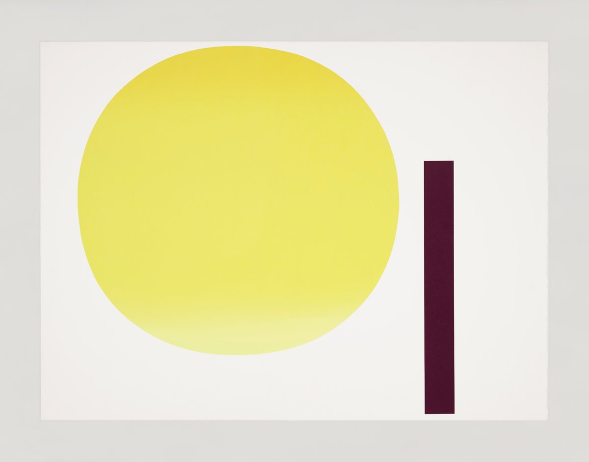
geiger's portfolio “metapher zahl” exhibits all the qualities described here, one finds circular, oval and rectangular forms in the widest red ranges with luminous tones with a largely anonymous application of color on or in – a barely larger picture-rectangle (bildrechteck), which shows once again that the painter is not interested in an intellectually predetermined identity regulation of color and form, but in quasi-neutral carriers of the color that primarily interests him. each color-form-value is regarded as an individual and determined by itself, the individual sheets are colored up to the edge, so that the color forms seem to float in them as if in a color cosmos, i.e. quasi freely available without a clear definition of top and bottom. sheet "2," for example, shows a slightly modulated oval form of a rather cool red on a centrally yellow tone, which is shifted from the central axis to the right, as well as a horizontally positioned narrow rectangular strip with dark violet near the lower right edge. in 1984, geiger also designed this constellation in a three-dimensional object whose constellation, however, shows clear differences. the somewhat more flattened oval shape rests directly on the horizontal element that extends even further forward in space – here a corporeal bar – whose left end continues the vertical central axis of the oval form downwards. it itself is differently proportioned, stockier, with more surface area for the color, which here, however, shows a medium red. above the bar, or to the right of the oval, there is an orange-yellow rectangular area that does not exceed the outermost points of the two color forms. this is, so to speak, the rudiment of the ground plane that an object does not need in its entirety. the differences between spatial and planar treatment are significant. the relationship between forms and colors must be determined differently on the surface than in space, which leads to the aforementioned differences. for geiger, there is no insistence on a predetermined "objective truth," only the coherence of the individual.
it is now clear that the underlying number has long since disappeared from view. we know that famous composers have been inspired to write their own compositions by playing melodies by other composers, without this being perceived as plagiarism; the original melody merely stimulates the composer's own creative power, like a spice that stimulates digestion. for geiger, the sequence of numbers is only a kind of predetermined theme for independent variations, with the help of which he can avoid any formal arbitrariness from the outset; the development of the color forms is stimulated and facilitated by the basis of the number series 0 to 9, but this is not illustrated. the result would be difficult to trace back to the respective number, but this is not the artist's intention either. the term metaphor makes it clear: the numbers are not only written here, but rather rewritten. there is no longer a direct connection between the underlying number and the finally derived at color-form. unlike in pop art, the legibility and decodability of the numbers in the picture is no longer guaranteed here. the autonomous picture (bild) is only a metaphor of the number in the sense of a rewriting process.
