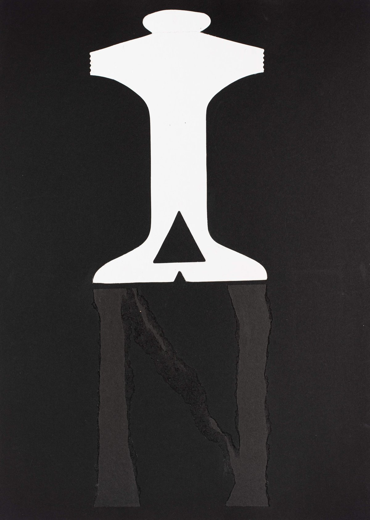
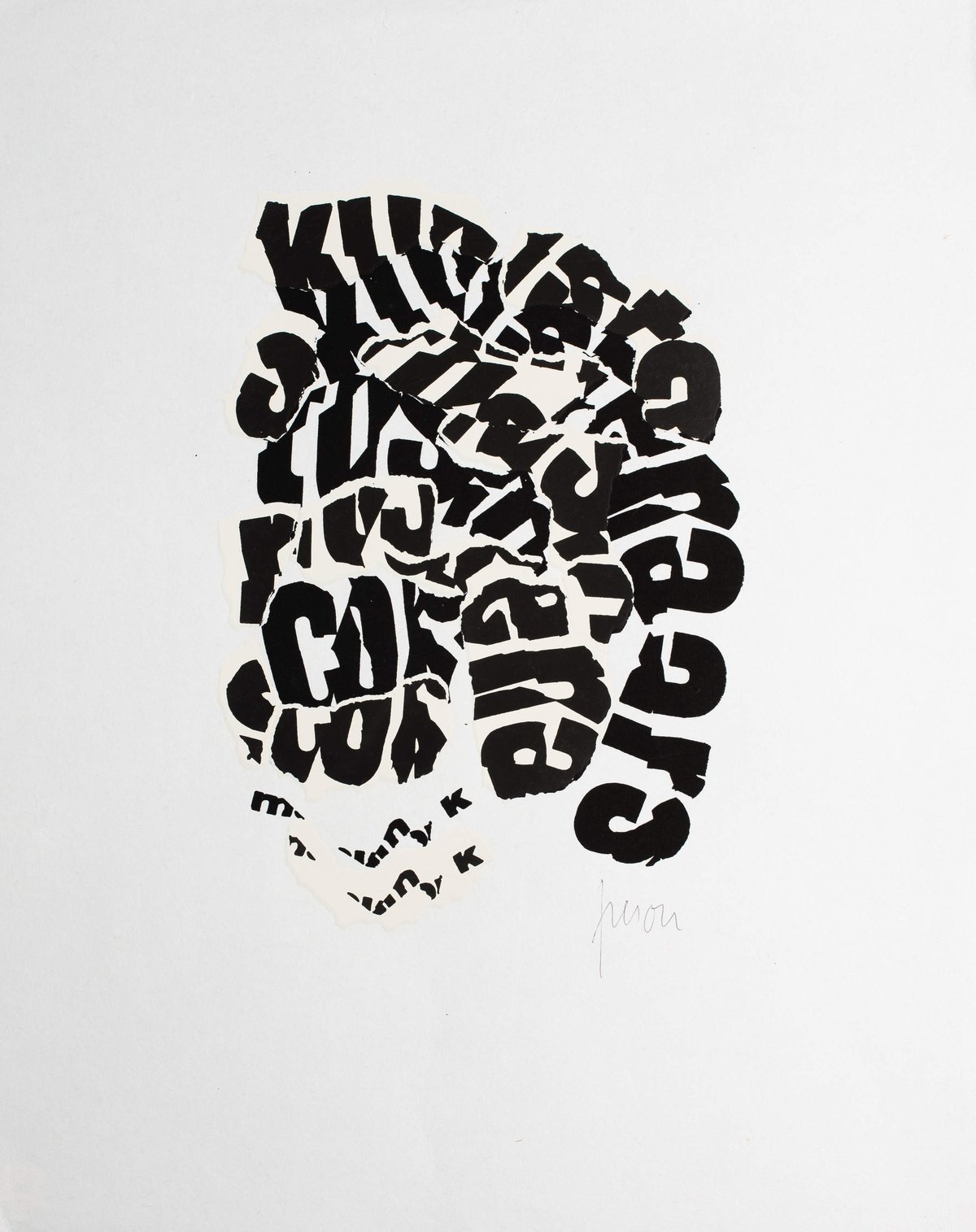
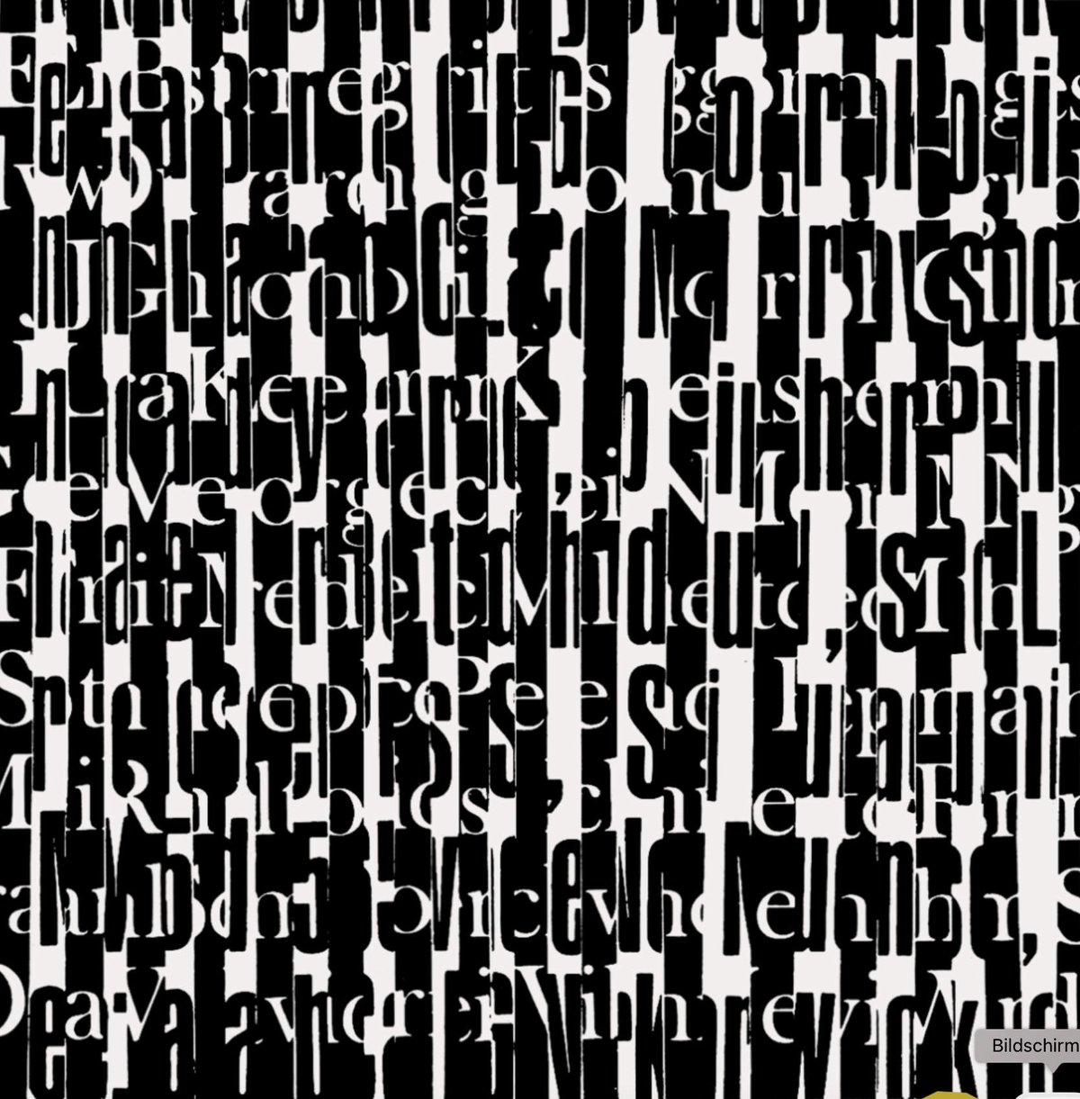
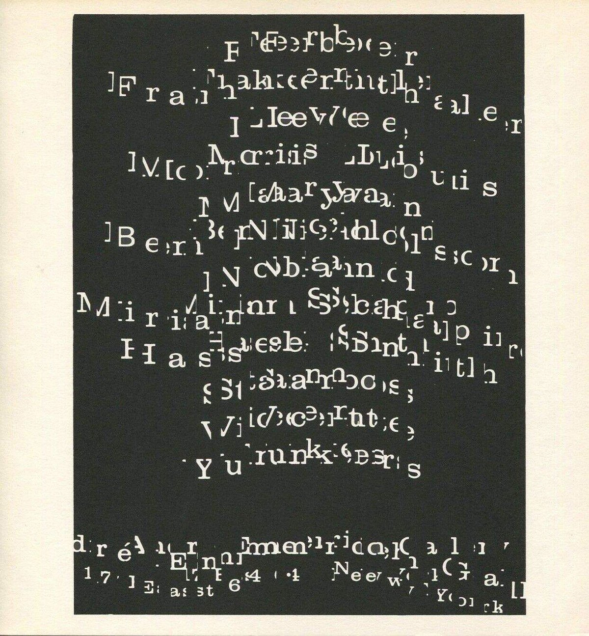
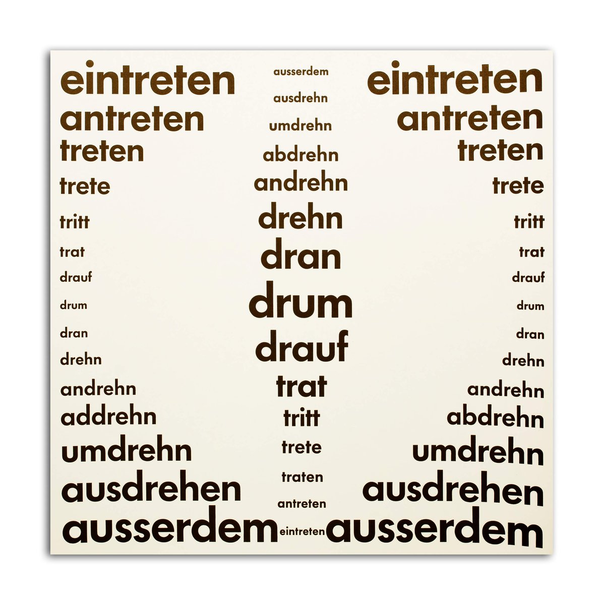
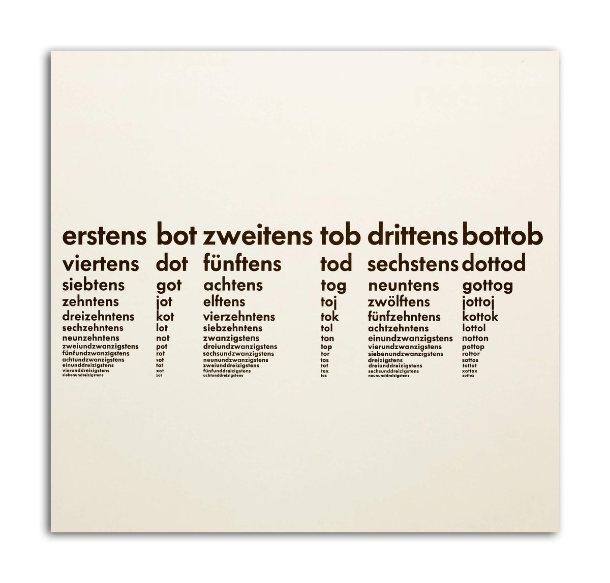
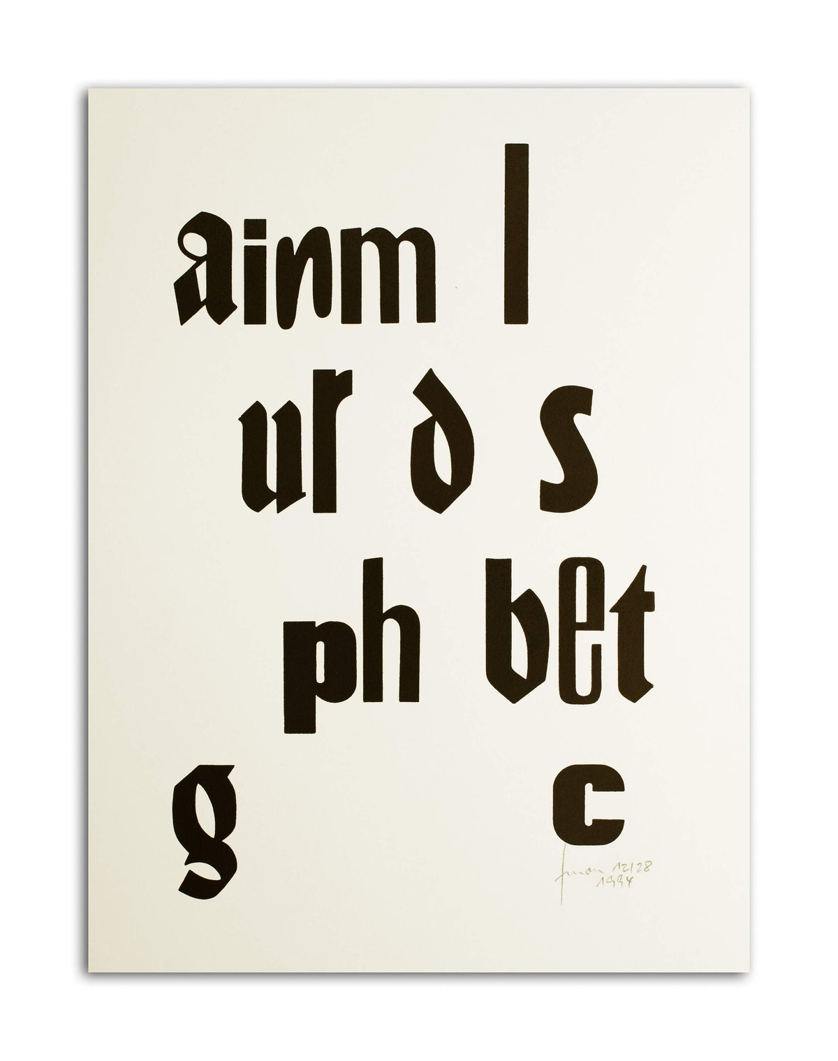
[…] working with elements of language, such as the word, the syllable or letter, franz mon engages media readily available to him: most importantly the typewriter, but also woodcut prints, then lead printing plates, and finally computers. besides his own voice that he employed for a number of audio plays, the typewriter was the tool for the creation of his letter constellations of concrete poetry—in his case often conveying messages with a surreal connotation. according to mon a single letter of a particular size at a particular location on paper of particular size can be a text. producing these works mon was not concerned with the quantity of content but rather with the relationship between letters and their compositions. in these scriptural texts, as he calls them, he drew on letters, palindromes, repetitive patterns and graphic figurative constellations. while these conventions formed concrete poetry as we know it, mon argues that "they already existed during the dark ages of the alphabet."(1)
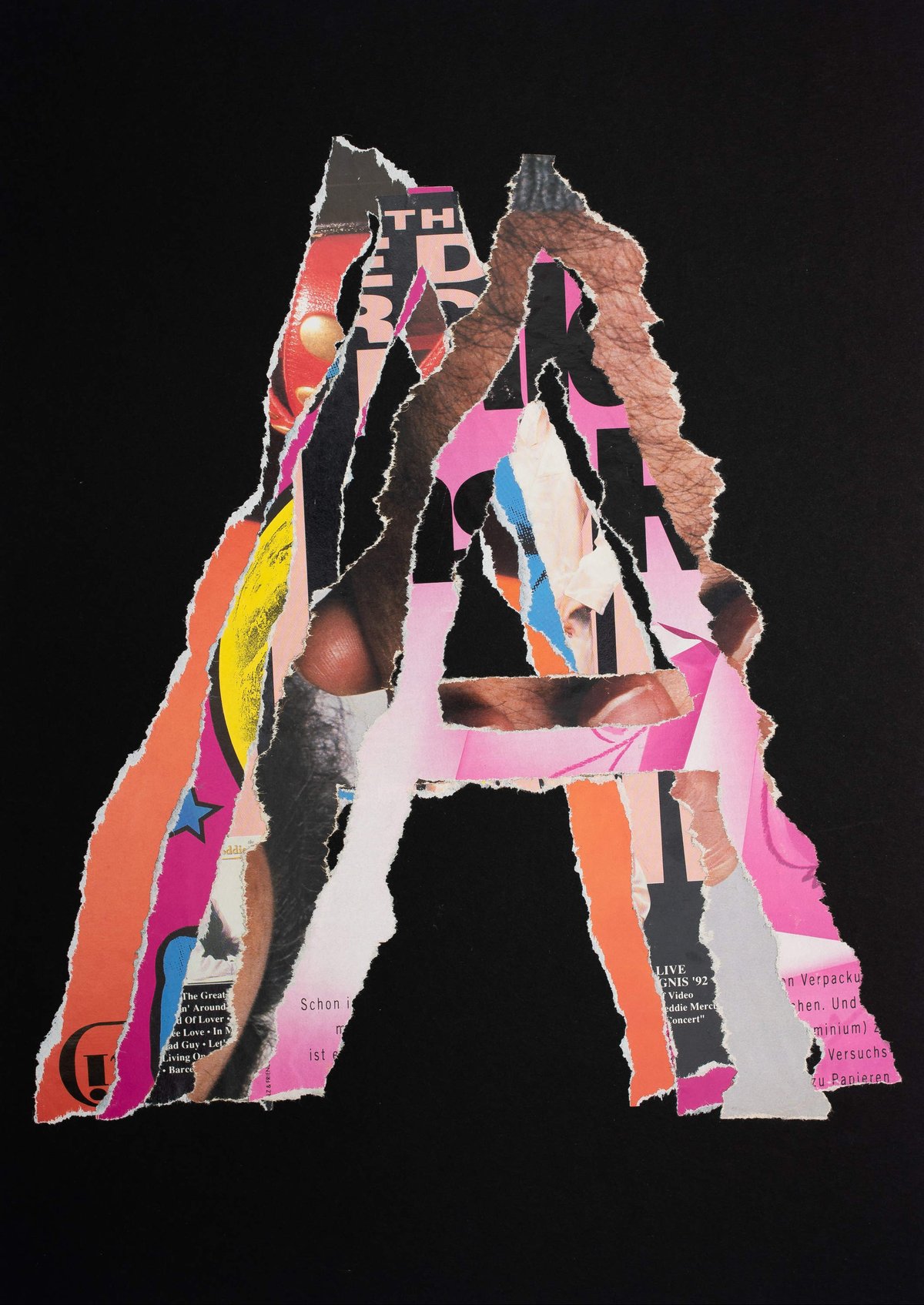
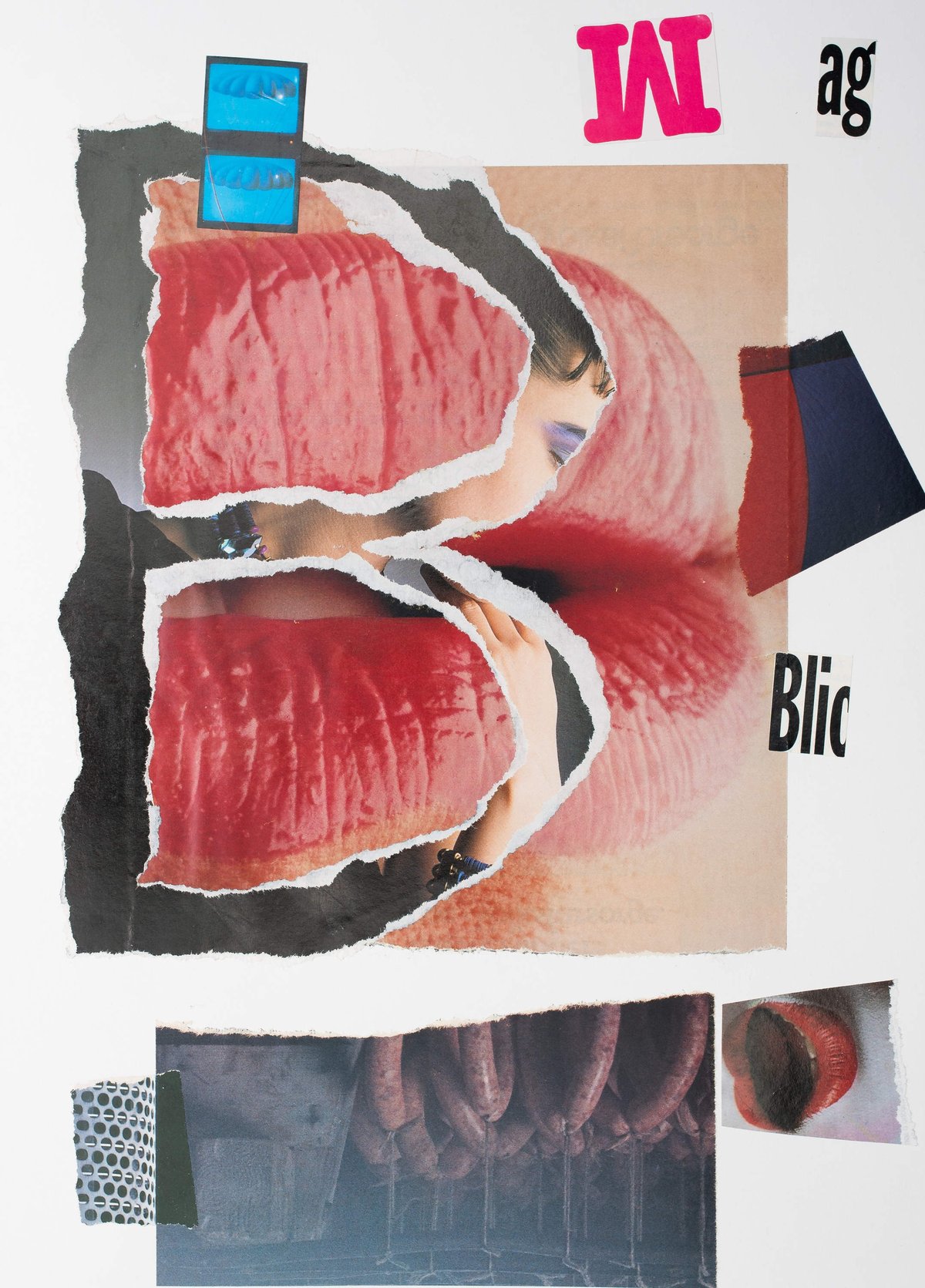
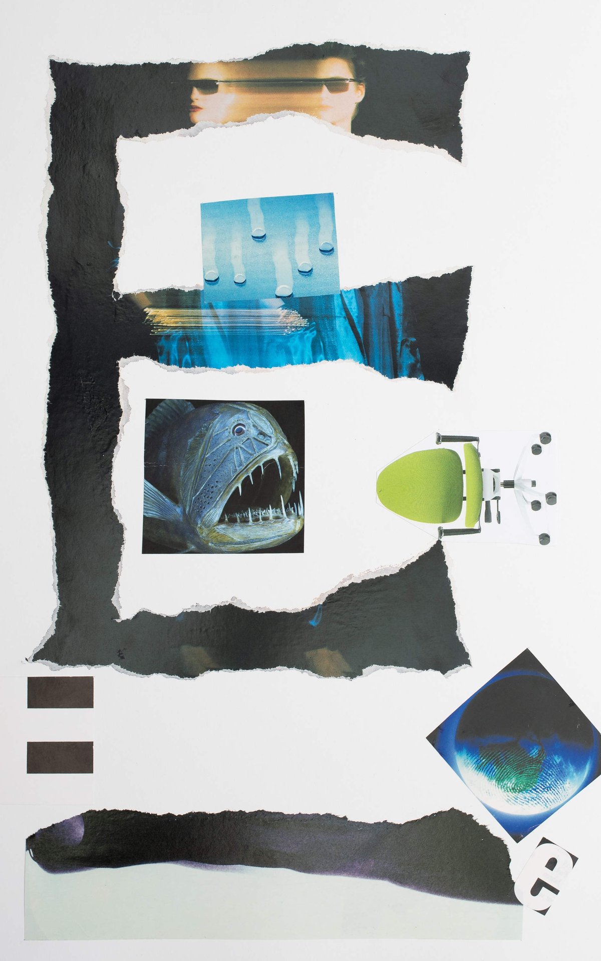
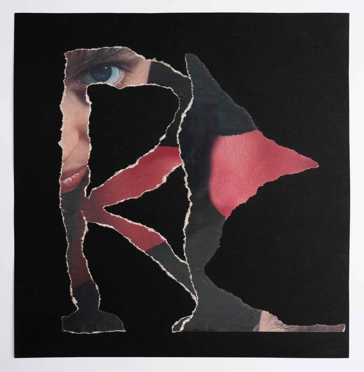
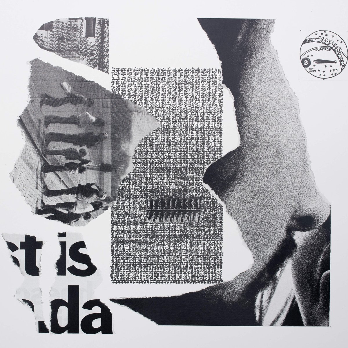
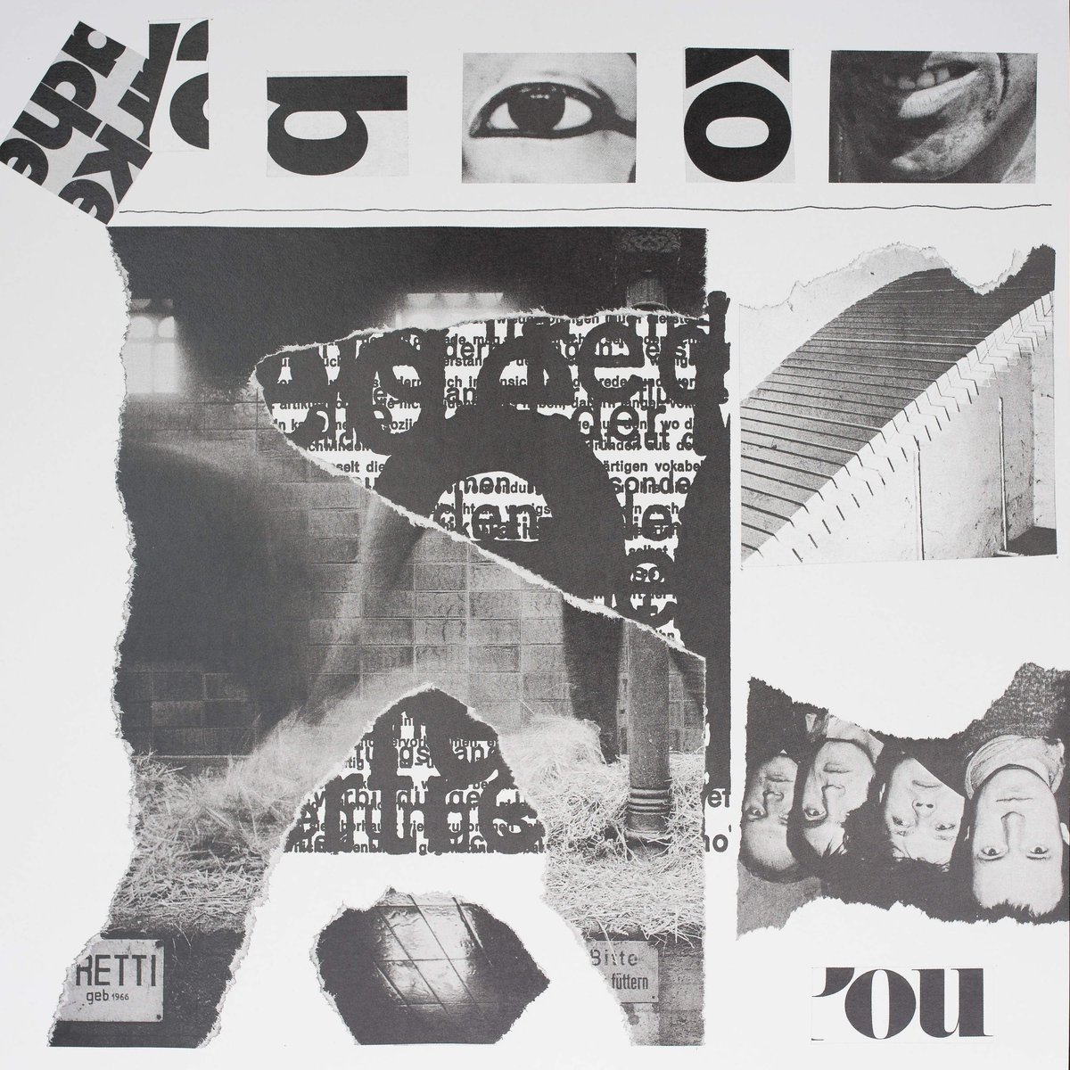
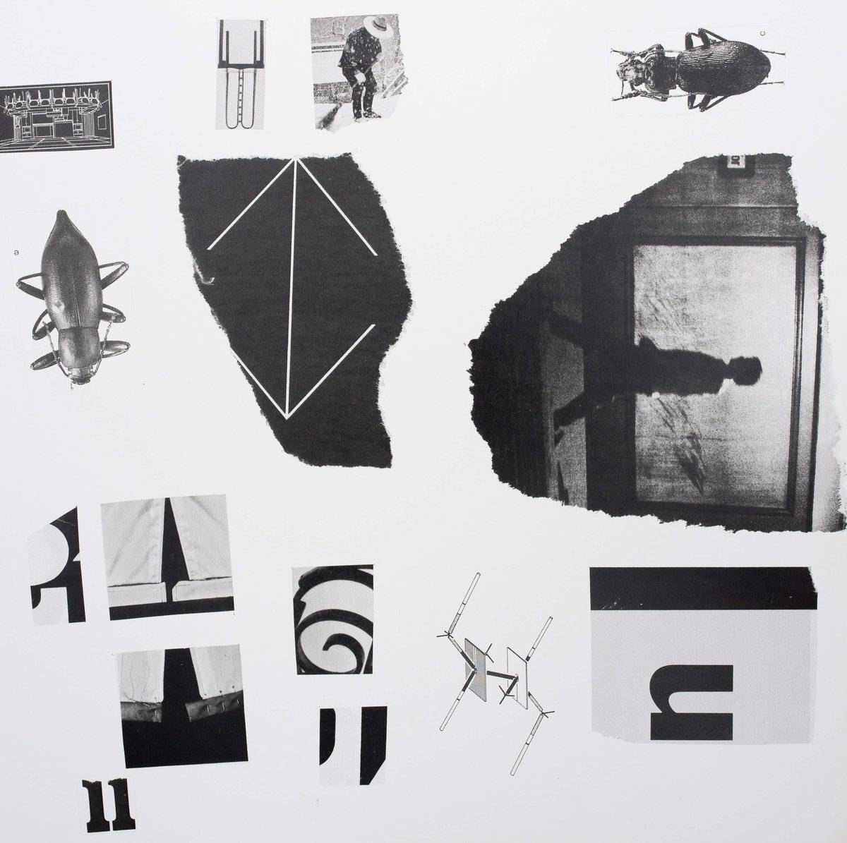
since the 1960’s and 1970’s his work has contained playful shifts when he began using images in his collages as a source element. culling material from advertising and news media, mon has not aspired to produce an oeuvre inherently critical of consumer society or german history as such. when confronted with such interpretation mon usually replies "it can be [a particular interpretation] but could also be something completely different."(2) during the same time that he produced newspaper collages and typewriter works, mon began to appropriate poster announcements into so called ‘press texts’ for which he laundered found posters in the washing machine and afterwards pressed them through a high-powered ironing board. it was also in this period that he began to produce his streifencollagen (strip collages) and reißcollagen (rip collages). in these pieces, he cut posters, magazine pages and newspapers into strips and circles, only to compose them afterwards in a different order. in contrast to the carefully executed collages and meticulously calculated typewriter pieces, mon here introduces a factor of randomness. letters exchange place with image fragments (in roman einer zeitung, 10.3.1973) or the bold head of a figure is covered with a collage with many lips and several eyes, the nose replaced by an anchor (in keine figur, 1964).
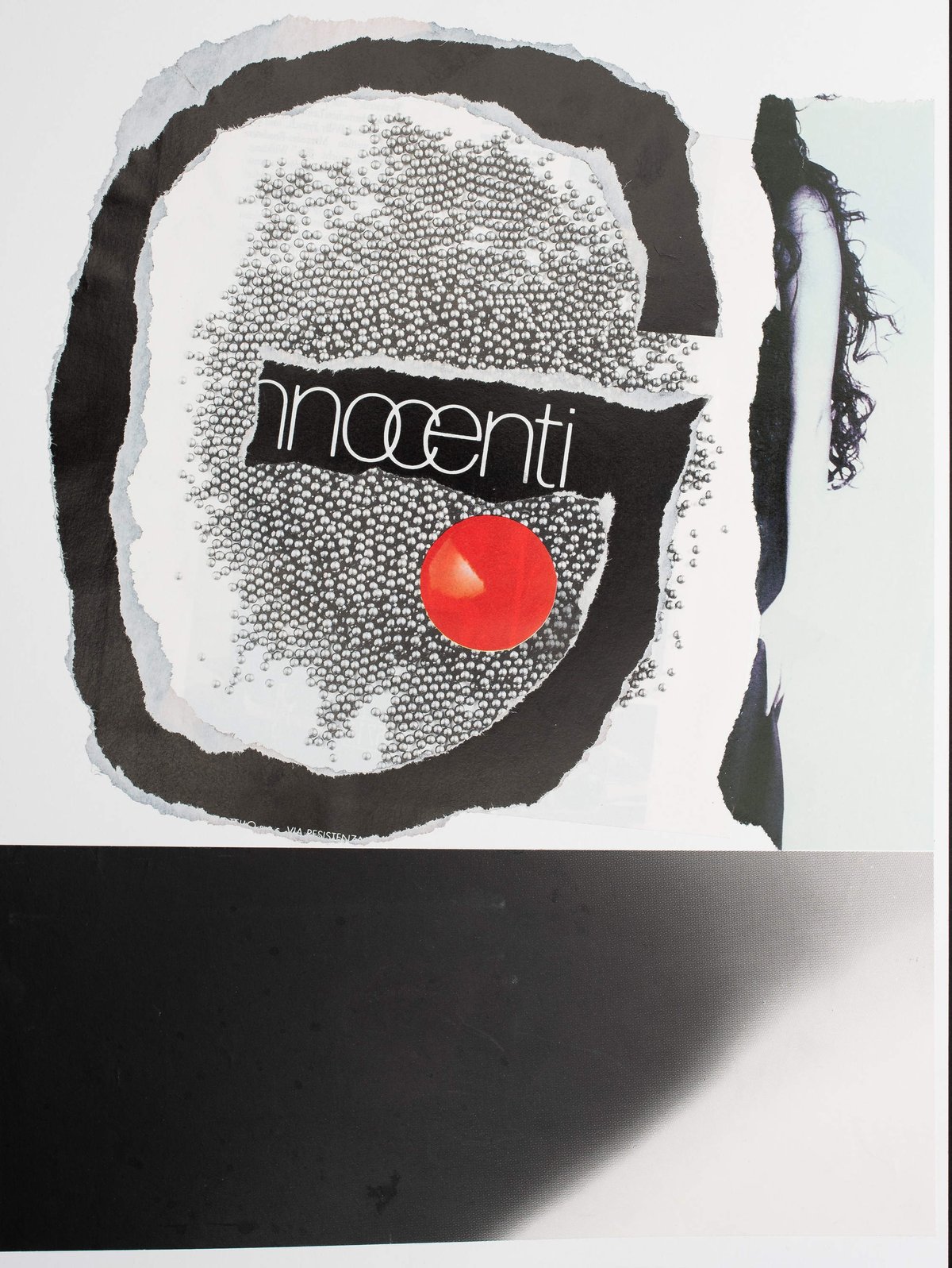
from these collages follow the visual texts, which take their elements from the context of civil society. again preference is given to images from the advertising and media landscape, prints, photo cut-outs, remains from newspapers, but also rejected products, remains, copies and covers. this time the appropriated imagery remains intact to some extend, it is through the combination of different images with text and letters that tension is established. ingresso bambini, 6.9.1984 combines entrance tickets with a fragment from fruit juice packaging by the low cost ja! brand and income receipts, a torn apart cheque, calendar sheet and advertising images. in abtrennung 27.10.1984 a model presents a video camera next to a fragment of a food coupon the artist's family received in 1944. creating analogies and juxtapositions, the images selected and their placing on the plain surface offer a myriad of readings.
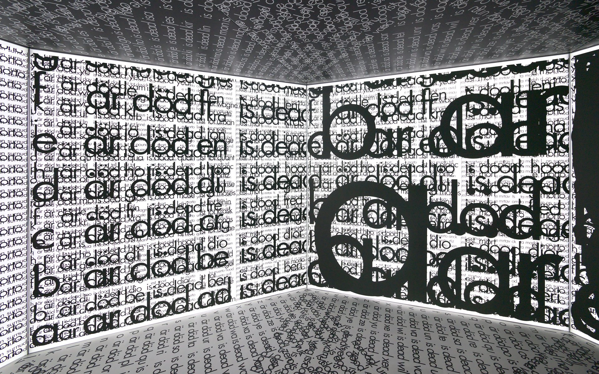
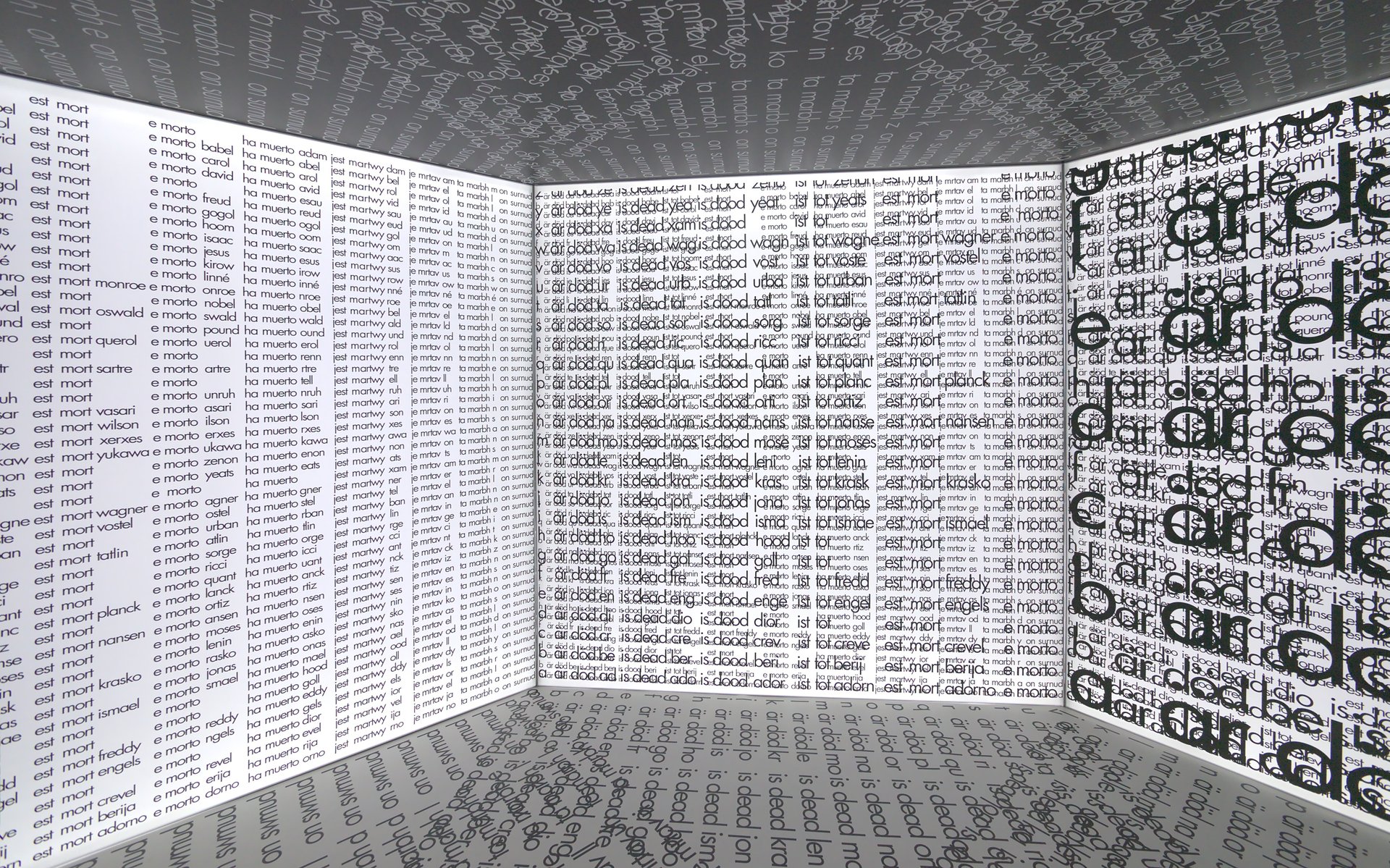
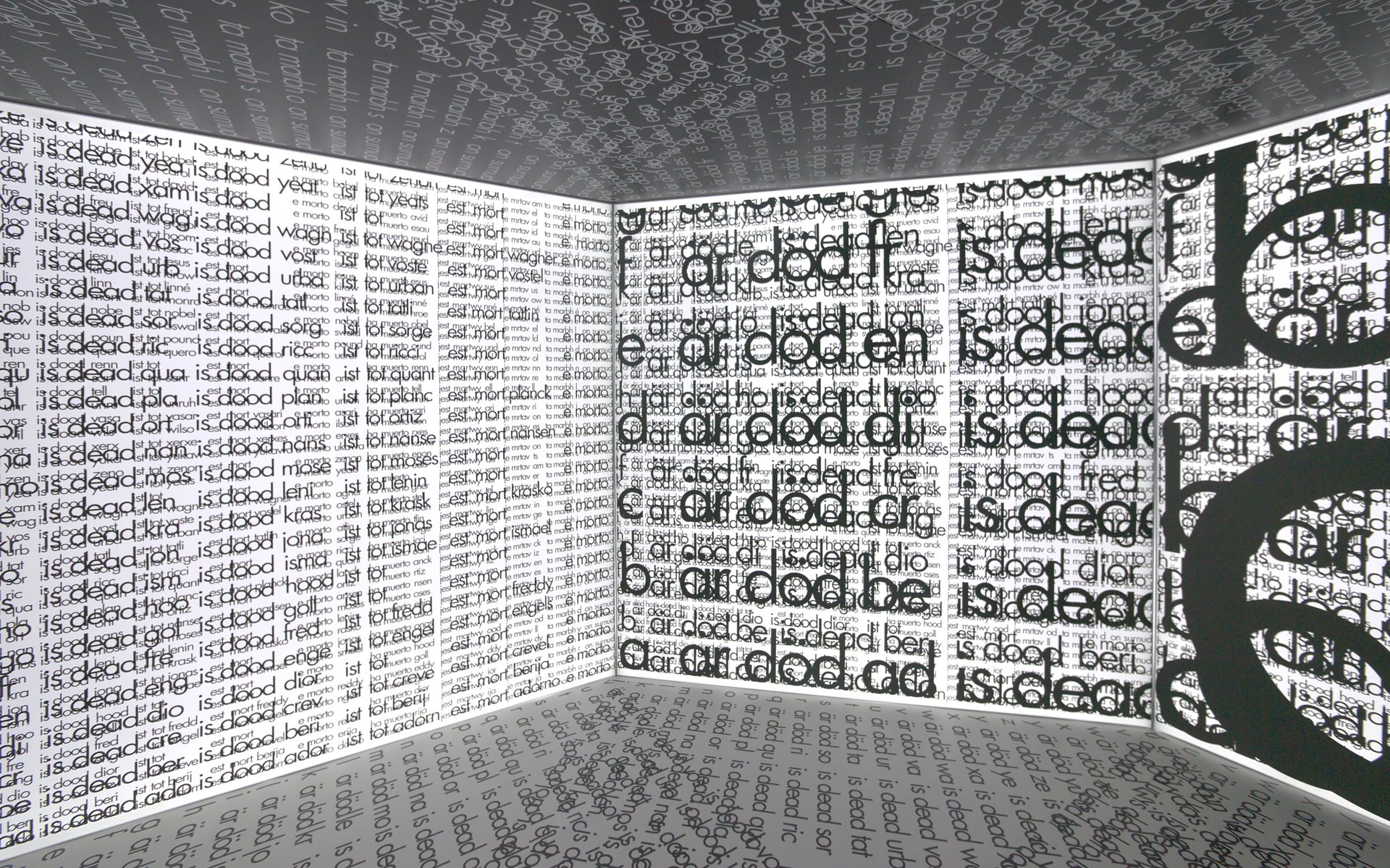
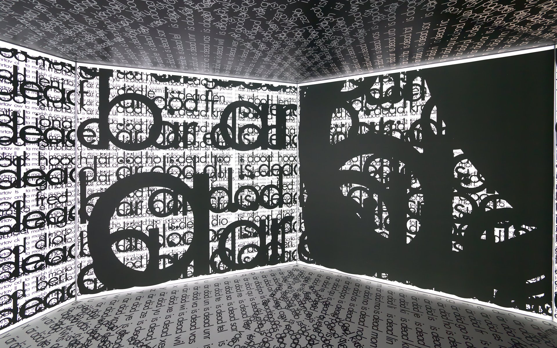
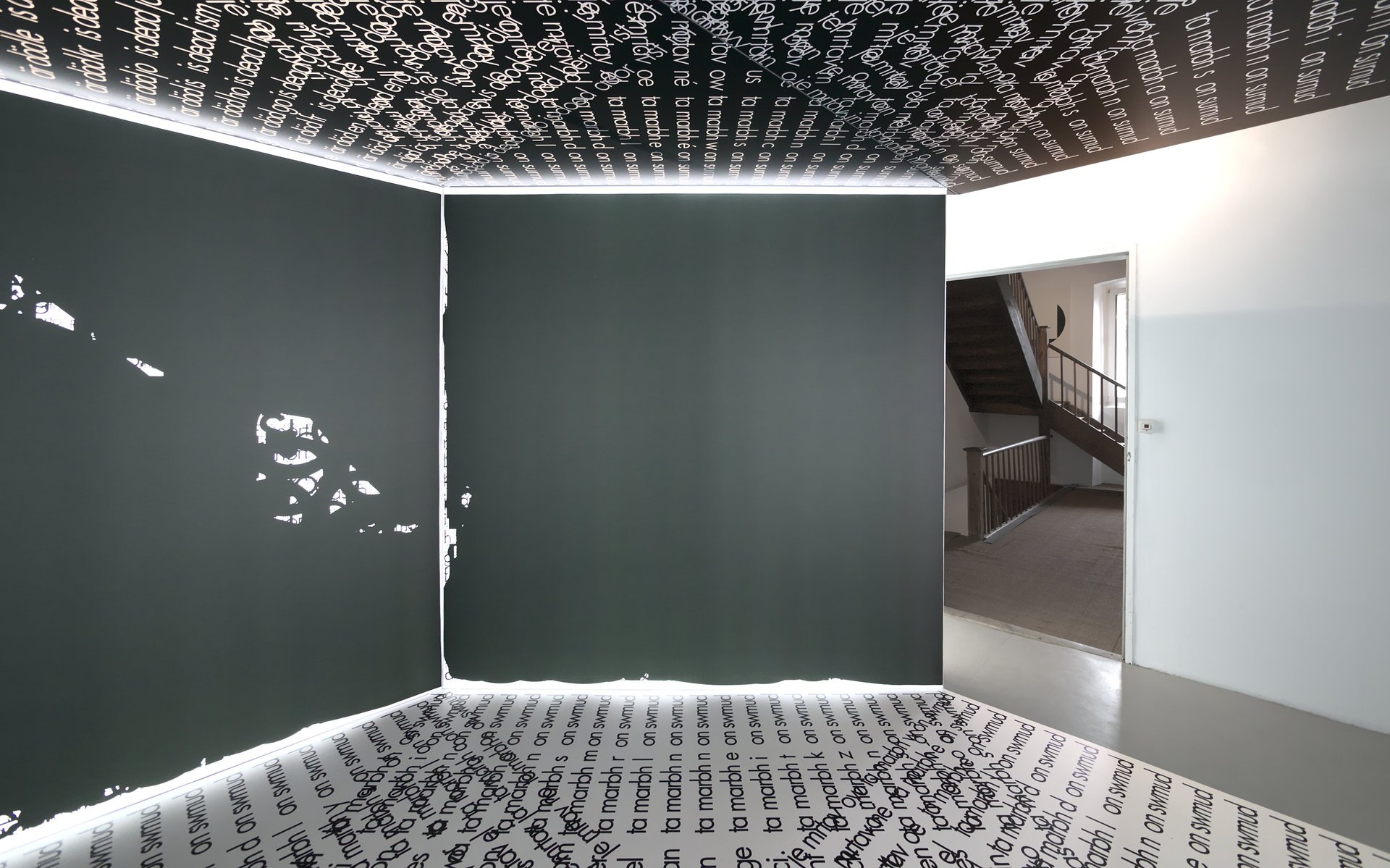
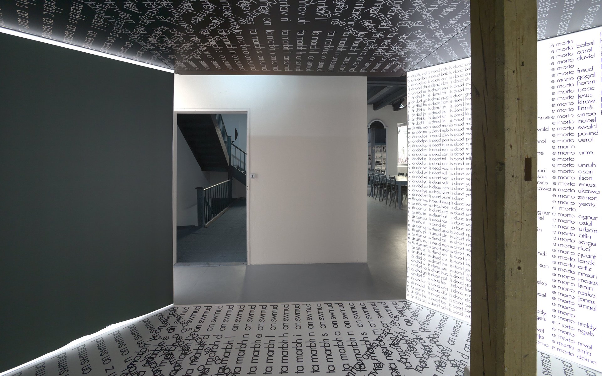
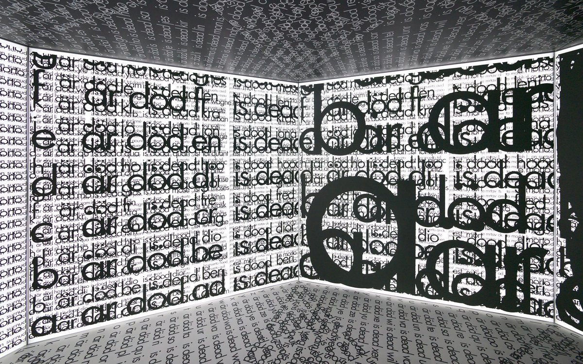
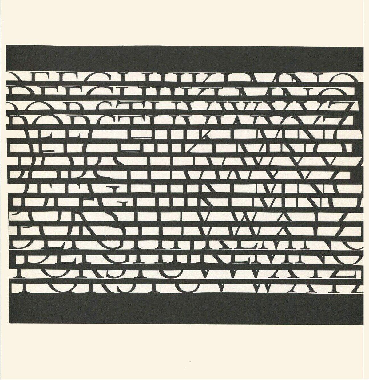
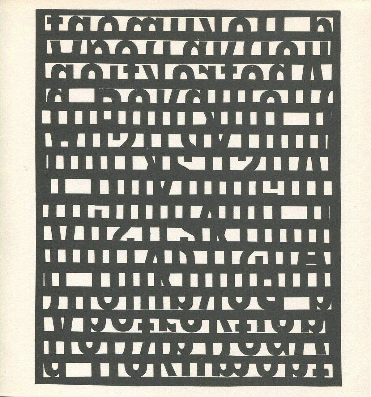
one of the larger installations mon has created during his career is mortuarium für zwei alphabete (1969) shown at the 35th venice biennial one year later. the piece was inspired by the death of philip blaiberg, the second human being to receive a heart transplantation. blaiberg lived with the donated heart for 18 months before passing away in cape town in august 1969. mortuarium für zwei alphabete is centered on a symmetric set up, which results in an octagonal form. the root text is printed to appear on wall #1 and consists of 51 names and the statement ‘is dead’ in 11 european languages. the same content is repeated on the 6 other walls of the octagon, the eighth being the entrance. yet the typefaces are superimposed and enlarged to cover the wall until no white is left and the black font covers the entire available surface on the last panel. wall 2 boasts 2 superimpositions wall 3 holds 3 and so on. the text on the floor is composed of 4 text strips from the originals appearing on wall 1. the text on the ceiling is the negative of the floor text. this immersive installation has the characteristics of a labyrinth or—as the title also indicates—a tomb. the use of language is intensified, every letter element clearly contributes to the construction of text, until the last wall is entirely black, the viewer looses orientation; mortuarium für zwei alphabete provokes thoughts on the cycle of life but also on the dramatic increase of communication and use of language over the last century.
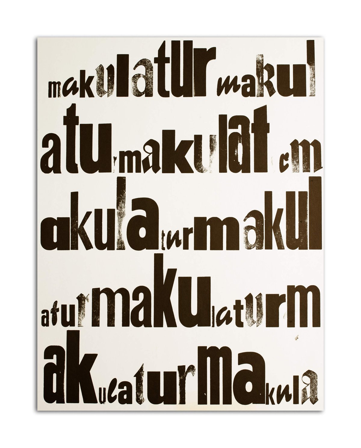
a similar technique of intensification and reduction is applied in mon’s book maus im mehl (1976). the title of the piece results from intuition not sociopolitical motivation. in the first part of the book, one letter is removed after another from the text on the right-hand page. starting with every m, then every a, u, s, i, e, h, l and so on. the letters are then copied to the left-hand page. this process is continued until all letters find themselves on the left page, and the right page is empty. the second chapter of the portfolio edition consists of a number of prints where mon has forcefully modified the printing plate with a chisel until the text is no longer recognizable. this print series is exhibited in reverse order, opening with indecipherable text and ending with a comprehensible one.
(1) franz mon, "scripturale texte" in franz mon 1951 plus (bremen: weserburg studienzentrum für künstlerpublikationen und universität bremen, 2009, kleine reihe, band 3, p.15)
(2) see, a conversation between franz mon and tobi maier published in the publication waldemar cordeiro and franz mon, ed. tobi maier.
text: tobi maier, 2011, excerpt from waldemar cordeiro and franz mon, ed. tobi maier (leipzig/new york: spector books and mini/goethe-institut curatorial residencies ludlow 38, 2011).