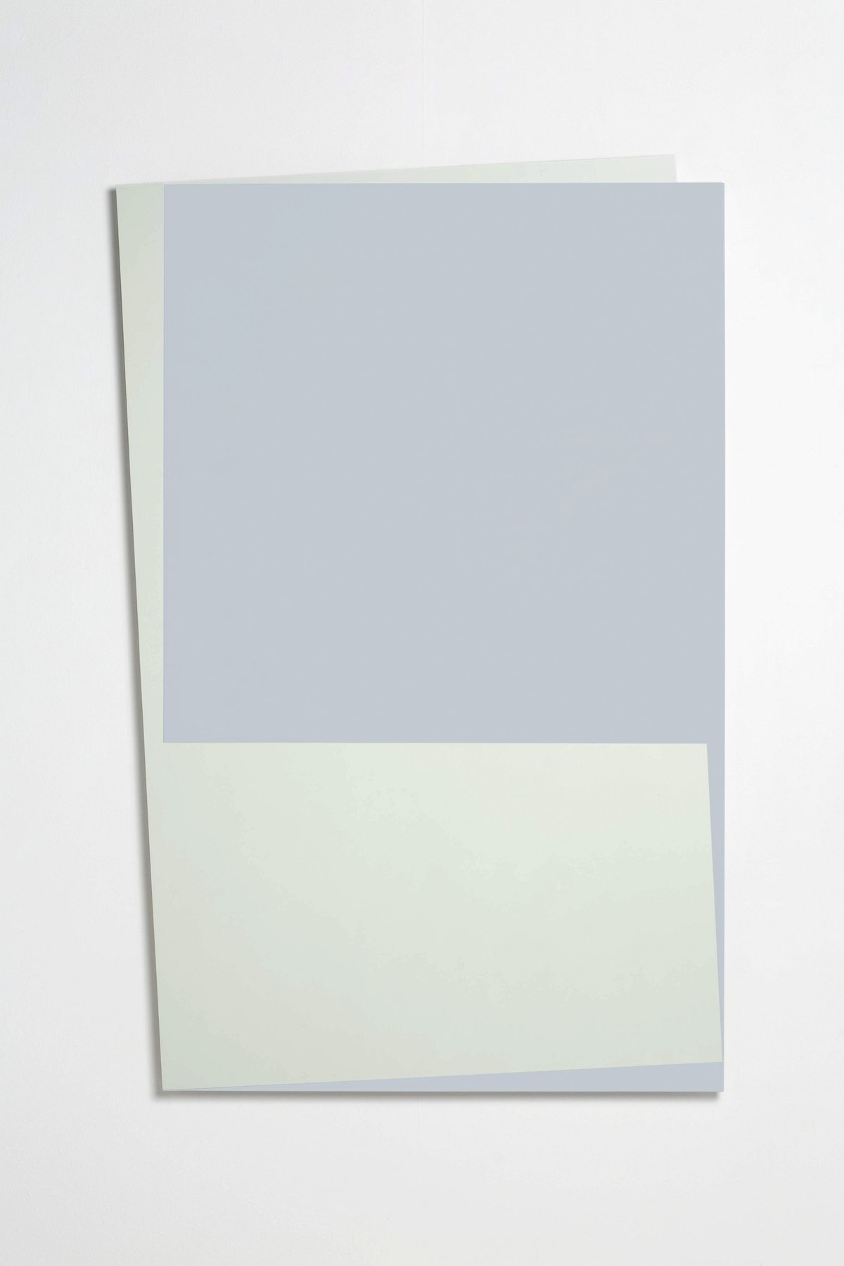
hoffmann

in focus:

john carter in conversation with klaus staudt

“for each of his objects, john carter sets up a mathematical or geometric system” writes britta buhlmann in 1994. simple rules are laid out as guiding parameters for the process of creating a new object. “what would happen, if...?” is mel gooding's interpretation of john carter's approach. this approach is what the artist and klaus staudt are discussing in the following. a conversation transcribed on the occasion of john carters first solo presentation “on the continent” at edition & galerie hoffmann in 1990.

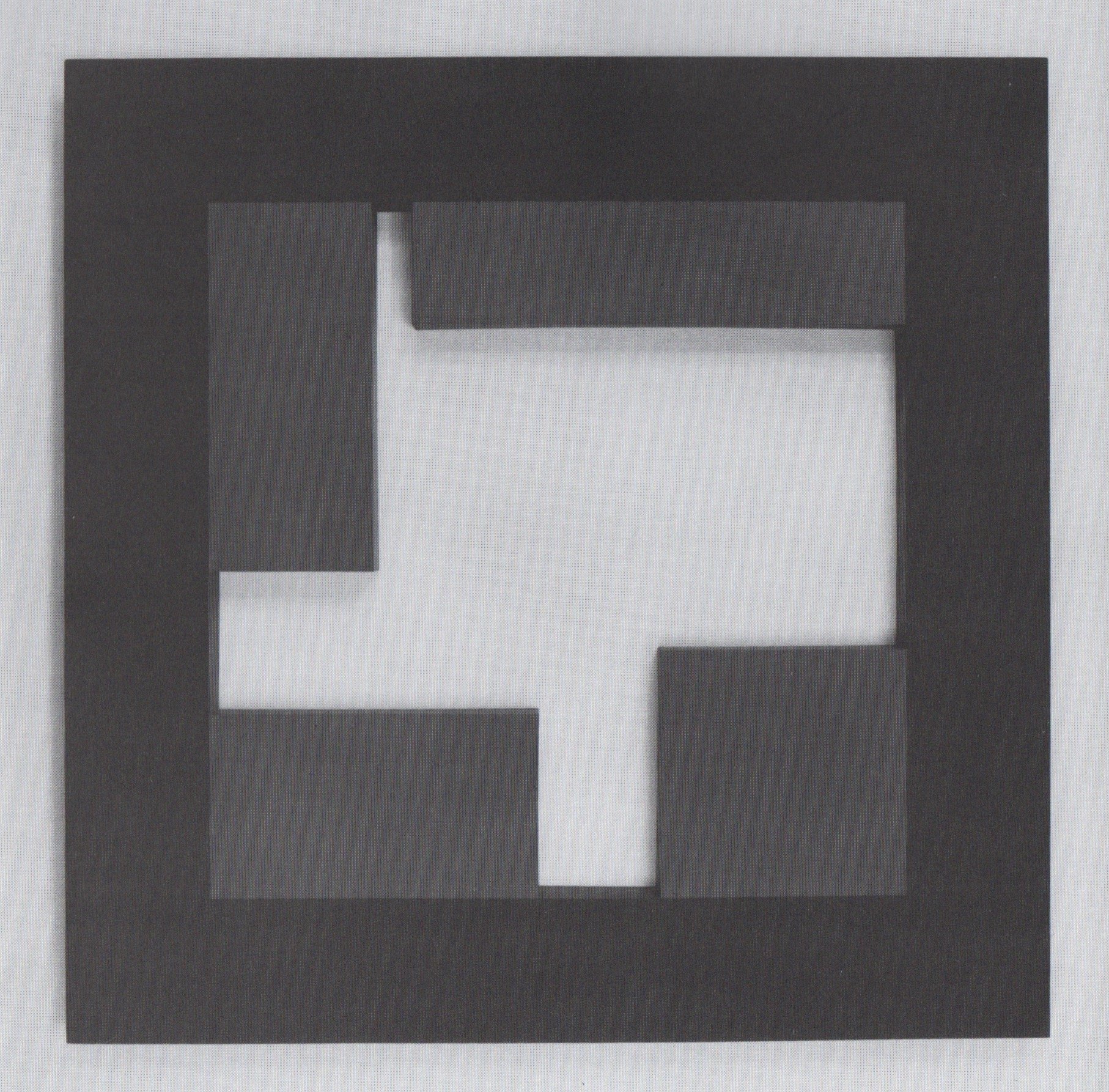
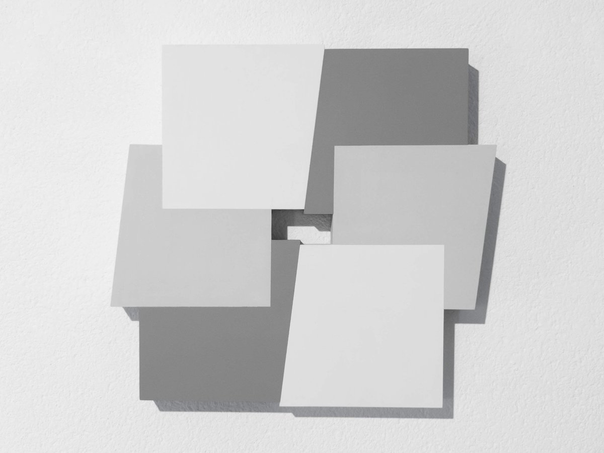
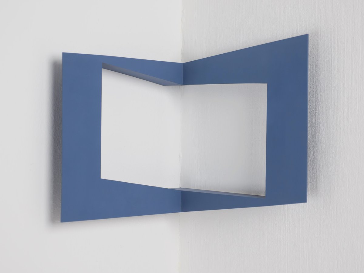
john carter: "corner – equal areas and spaces" (1985), acrylic on wood, 27 x 30 cm

john carter: "corner – equal areas and spaces" (1985), acrylic on wood, 27 × 30 cm

it was the same as the area which had been cut out from the centre of the square. there was no waste! everything which was in the negative area had become the sides. the square thus became a plane floating off the wall.

john carter, 1990

klaus staudt

john, i have been looking at your objects, your reliefs, and your drawings. they are very interesting and there are some questions i would like to ask you about them. to start with, can you say something about the concepts behind your work. how, for instance, do you find the structure and spaces, also the positive and negative forms which we see in your wall-pieces?

john carter

in some of the earlier works in this exhibition for example the small sculpture "painted structure: squares" (1983), i used a concept of negative and positive spaces calculated exactly in terms of area (see fig. 1). this produced some surprising results. it is hard to believe, that the inner square is the same area as the thin band around it, but this is in fact the case.

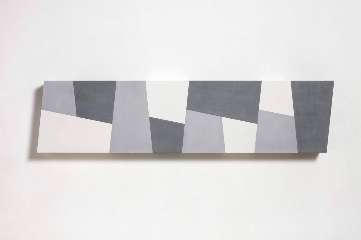
i made a work "assembly of rectangles i" (1981), which is flatter and more of a painting (see fig. 2). here you have three shapes, all of which have the same area, one is placed over the other two at exactly the halfway point. it obscures half the area from one shape and half from the other.

another work from this period "equal areas within a square" (1983), was a square which contained four inner shapes, each of these were of the same area, they may be 400 square centimetres, but each shape was a different rectangle (see fig. 3). these four shapes together added up to the area of the negative shape and was of an exact equation of spaces and forms.

the depth of this work was made by a plane, which moved back to meet the wall. this was the same as the area which had been cut out from the centre of the square. there was no waste! everything which was in the negative area had become the sides. the square thus became a plane floating off the wall. the same procedure was used in "corner – equal areas and spaces 1985" (see fig. 4).

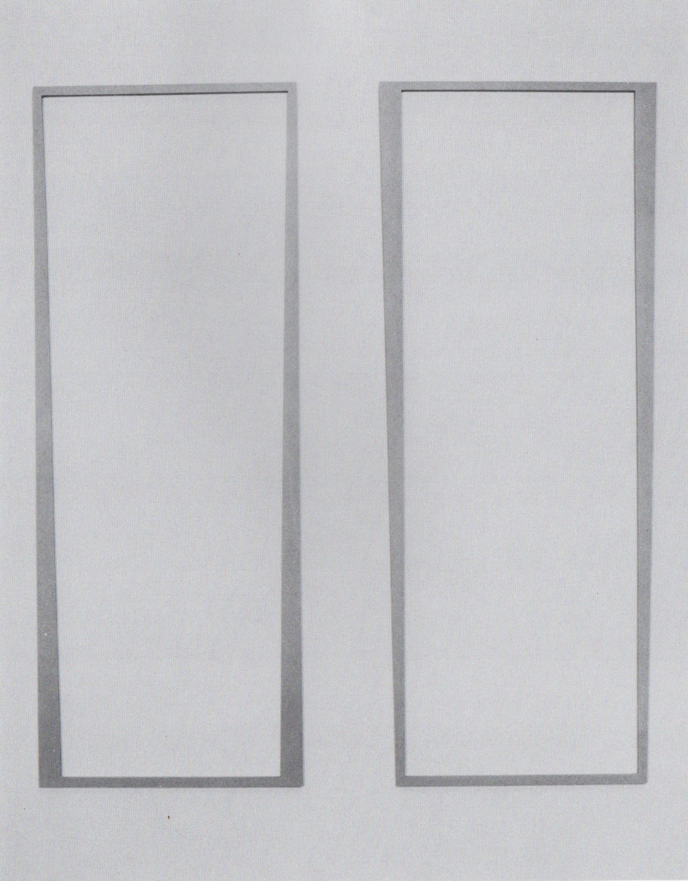
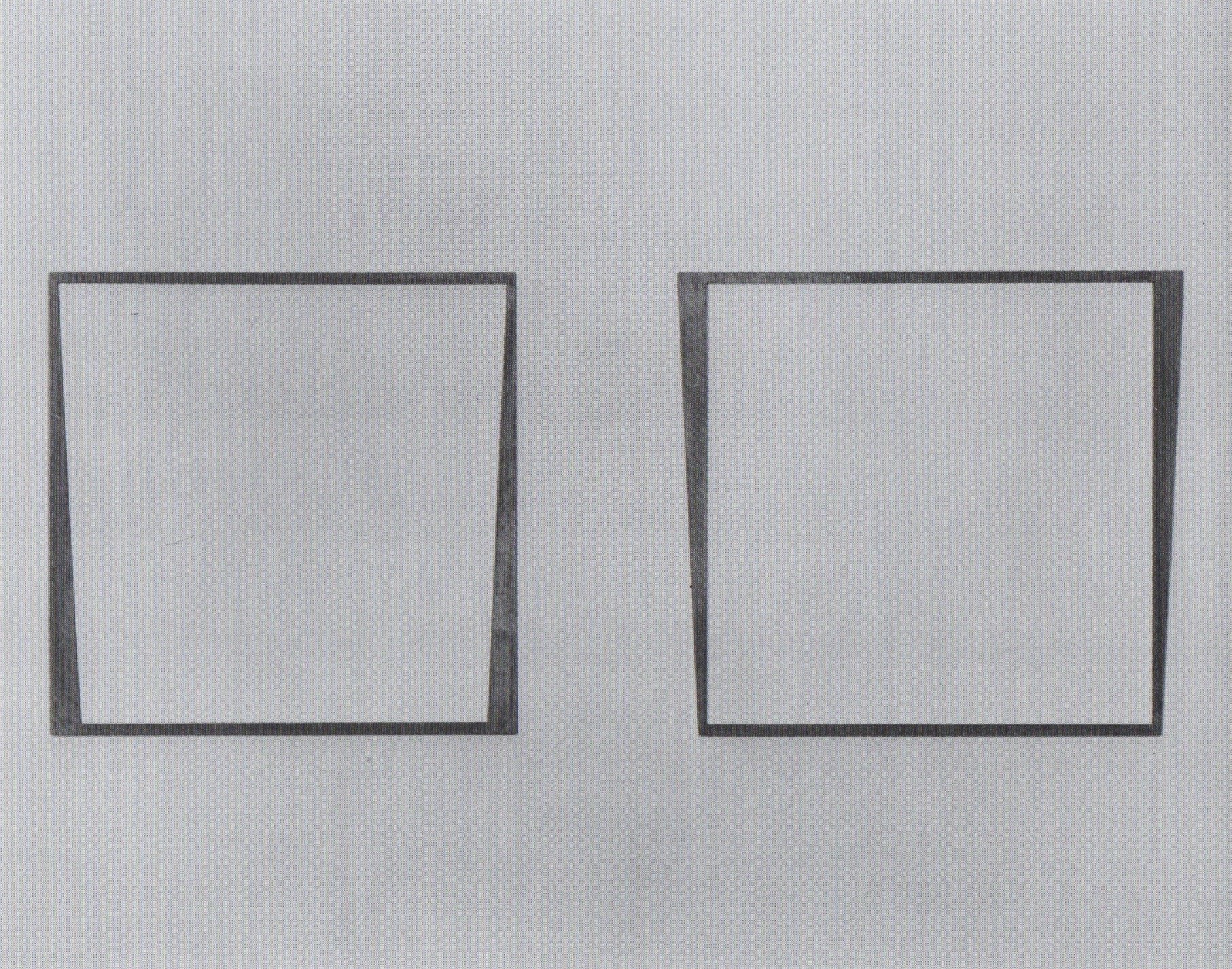
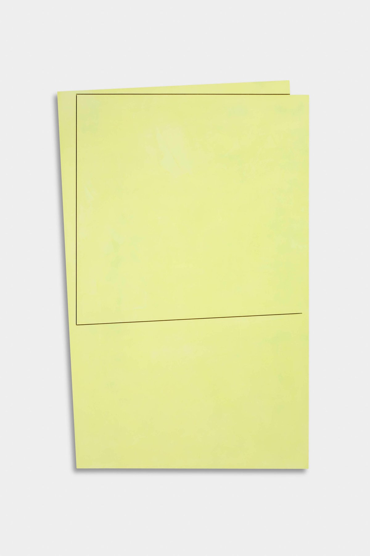
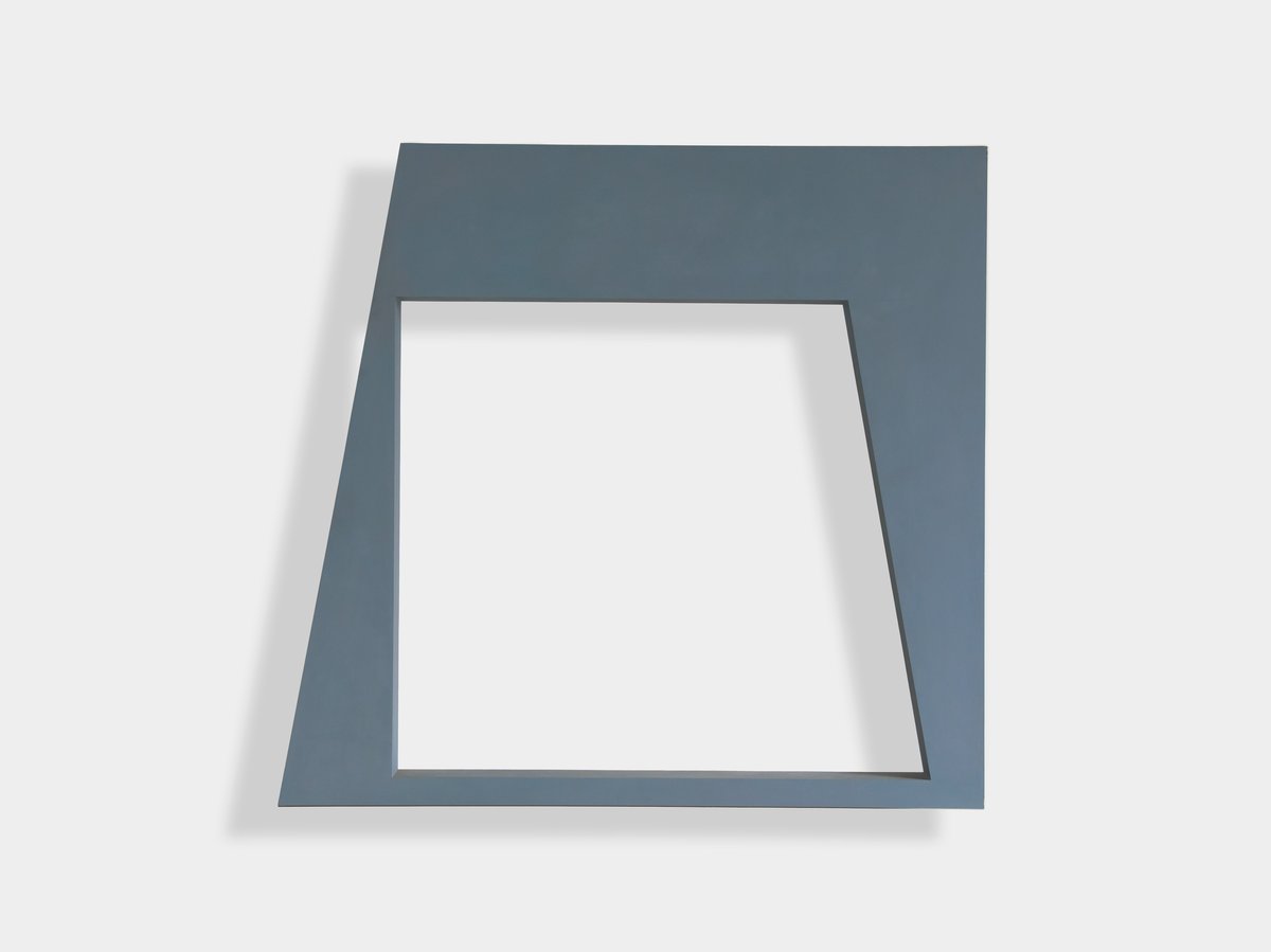
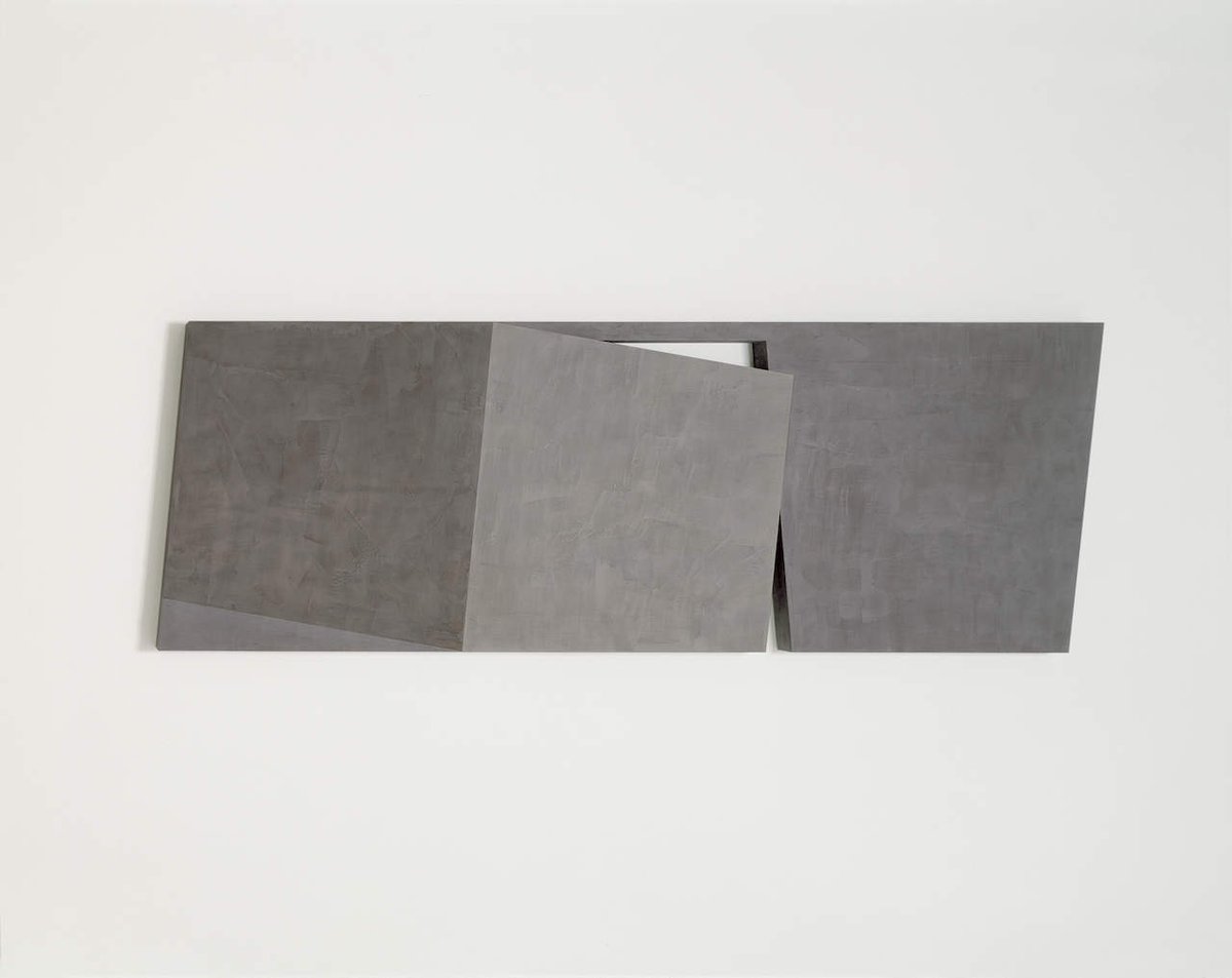
in 1979 i made a group of works entitled "frames" (see fig. 5 & 6). these made strong use of empty or negative shapes. i hoped these shapes would have a power, equivalent to the frame, which contained them. they made the empty shape tangible. these works were in opposite pairs, in which apparent similarities were contrasted.

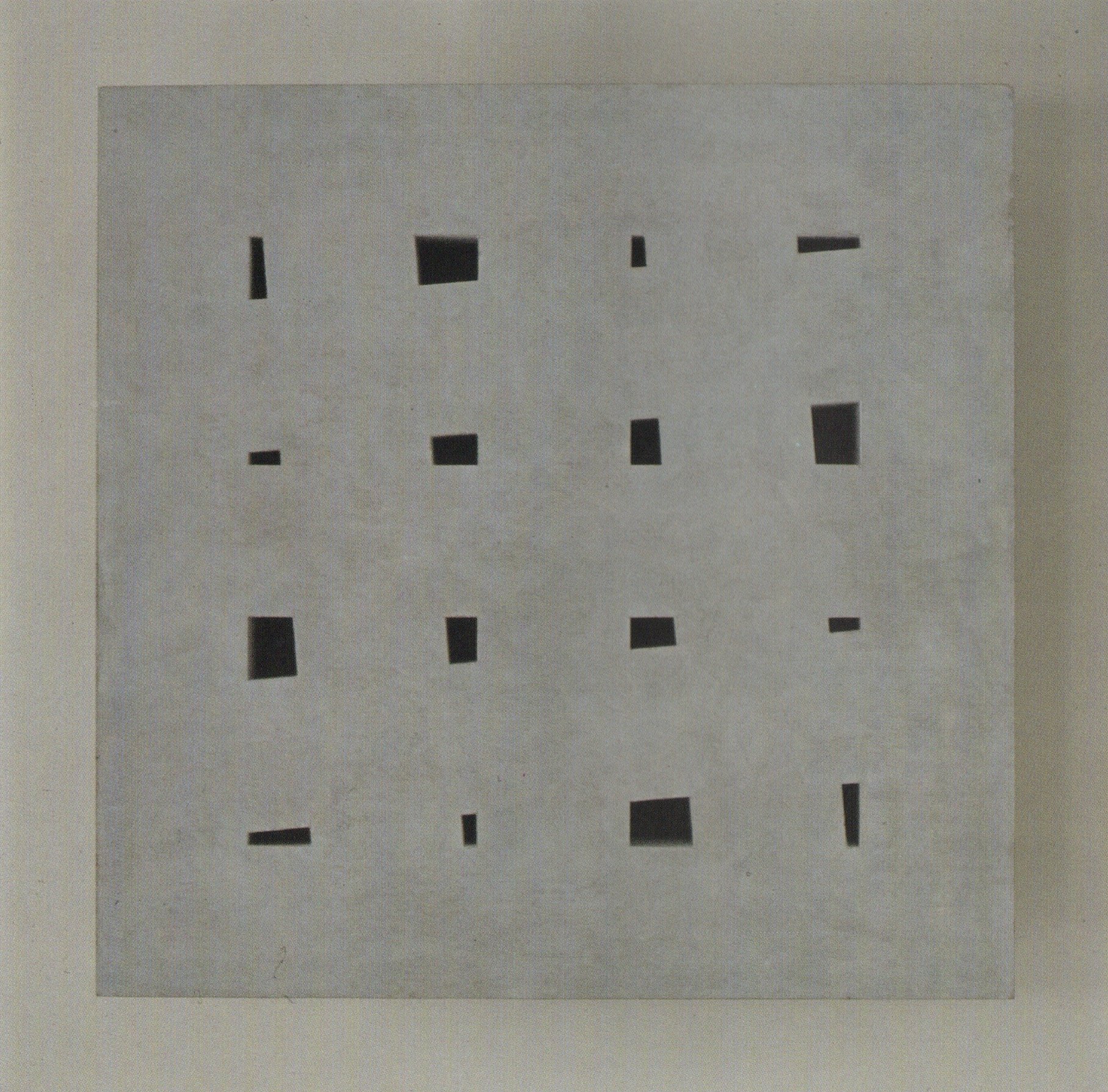
in another work exhibited here "untitled theme: pierced blue square" (1986), the very small holes seem to have a visual power which is as strong as the plane into which they are cut (see fig. 7). you can read this work in two ways, either as bands with holes in between them, or as a square with apparently random holes. another aspect of this work, which i like, is that the holes are "sculpture": they are three dimensional and yet they have a graphic effect. when you first see the work these appear to be painted marks, then as you move closer you realize that they are real holes.
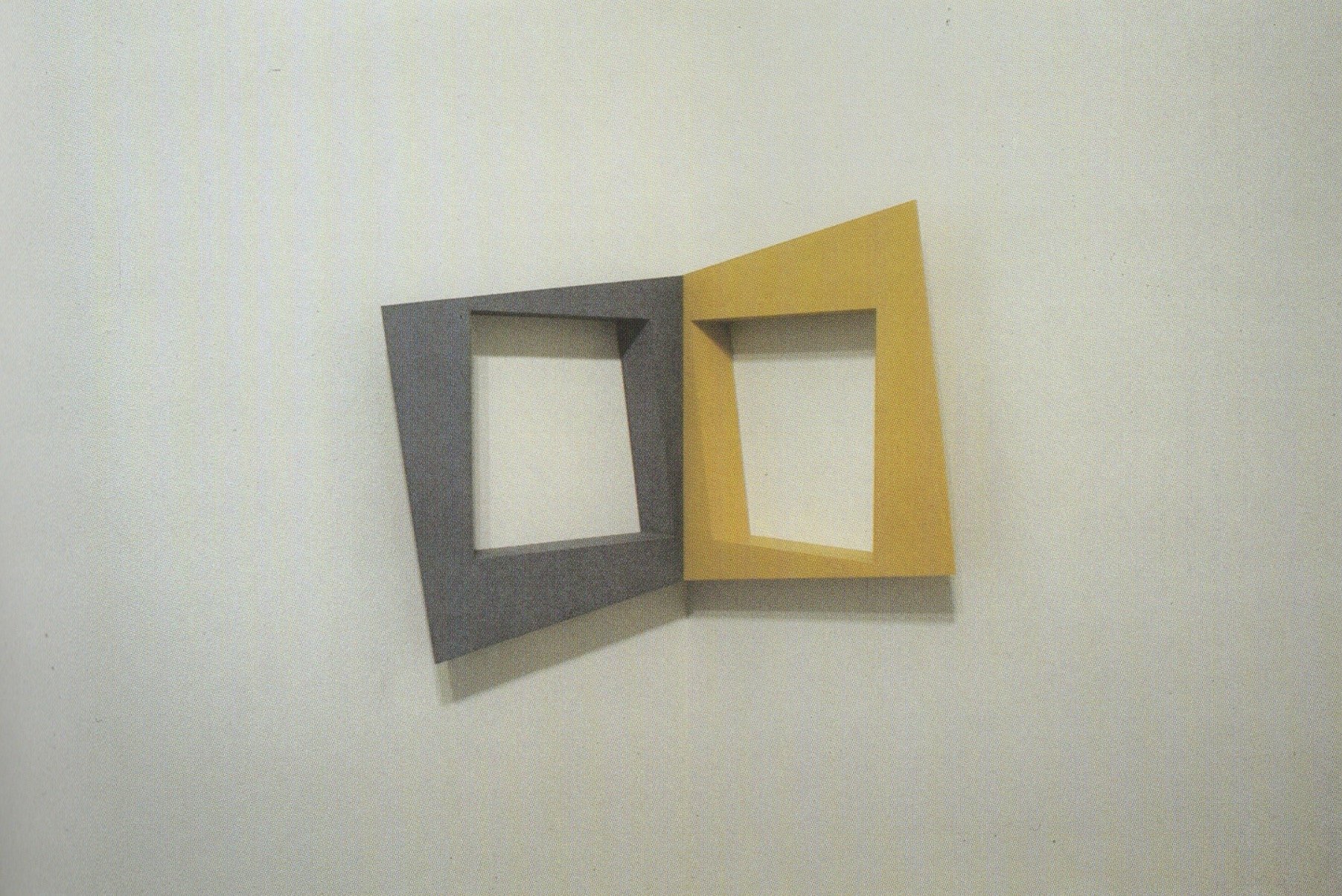
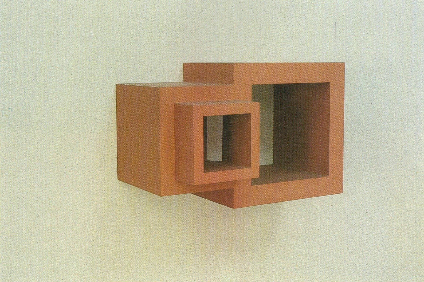
fig. 1: "painted structure: squares" (1983), oil on plywood, 21,5 x 34 cm

fig. 1: "painted structure: squares" (1983), oil on plywood, 21,5 × 34 cm

fig. 2: "assembly of rectangles I" (1981), oil on plywood, 159 x 60 cm

fig. 2: "assembly of rectangles i" (1981), oil on plywood, 159 × 60 cm

fig. 3: "equal areas within a square" (1983), oil on plywood, 120 x 120 cm

fig. 3: "equal areas within a square" (1983), oil on plywood, 120 × 120 cm

klaus staudt

can you say something about the connection between the form and the thickness of your wall-pieces?

john carter

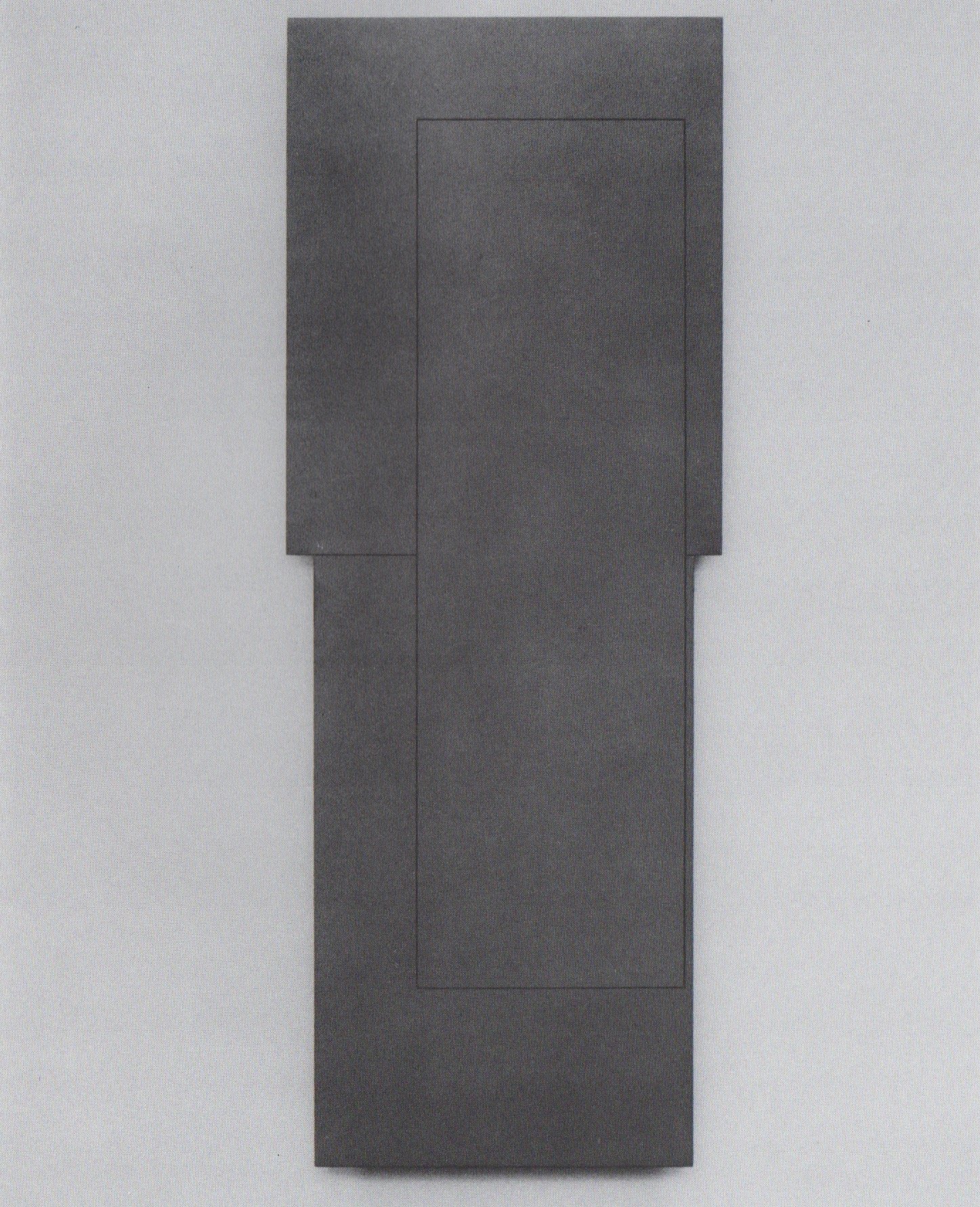
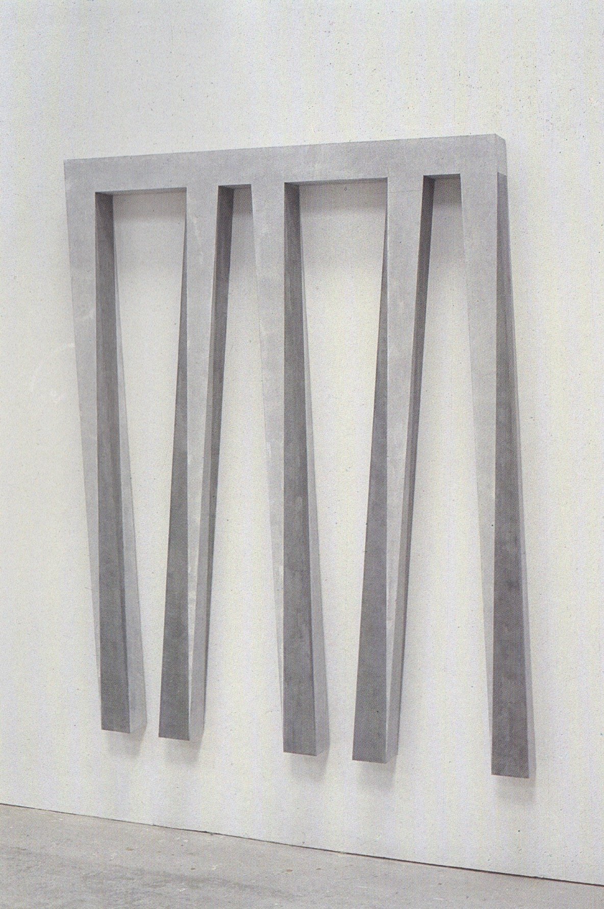
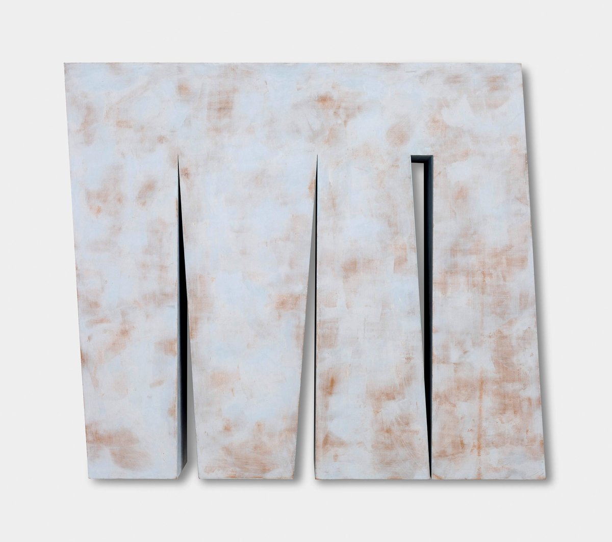
this is a very good question, because it's an area in which i have a lot of doubts and problems. the most normal pattern for determining the thickness of a work is to make the width of the element which is being used the same as the thickness. if i am using a column-like form (see fig. 8) i will make it as thick as it is wide.

now in other instances i might find that this is too thick and it makes the form too heavy. if i find this happening i will change to another system. i may make the thickness half of the width, or as in "untitled theme: progression ii” (1987) a golden section was used to determine the thickness. i began the "untitled theme: pierced blue square" (1986) by using the width of the concealed bands as the thickness of the piece, but then found that i had a work which was much too massive (see fig. 7). so in the process of working i changed the idea: (something which i normally avoid) and made a plane which floated in front of the wall. the remaining section behind then formed a block in which the holes were contained.

ks

the impression, that the planes are floating, is very interesting, because you cannot analyse the position of them. they come forward and go back and go back and come forward. they are really floating. they have different positions in relation to the wall. it is an irritation, an optical irritation. do you want this irritation to occur in your work?

jc

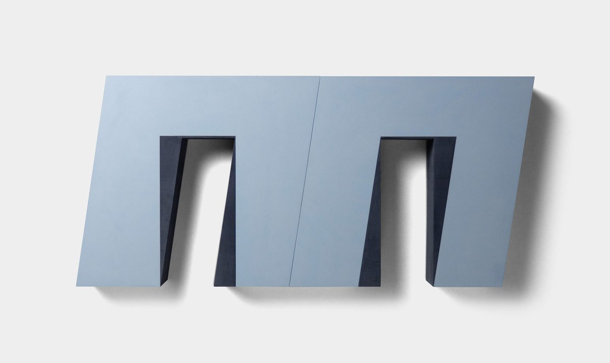
i think i would use the word disturbance, rather then irritation: irritation is something that makes you angry, a disturbance is something more gentle. in "double frame ii" i used squares and parallelograms to create these very subtle angles. i think that this touches on one of the most important aspects of my work, the idea of a stable form in conjunction with one which is very slightly disturbed. set at an angle, perhaps. you are not quite certain what has happened, but you are aware that what you are looking at is not an absolutely regular situation and that some disruption, some disturbance, perhaps very slight is taking place. i think this is something which attracts the spectator's attention and draws him into a dialogue with the work.

fig. 4: "corner – equal areas and spaces" (1985), acrylic on wood, 27 x 30 cm

fig. 4: "corner – equal areas and spaces" (1985), acrylic on wood, 27 × 30 cm

fig. 5: "two frames III" (1979), acrylic on wood, 143 x 56,5 cm

fig. 5: "two frames iii" (1979), acrylic on wood, 143 × 56,5 cm

fig. 6: "two frames II" (1979), acrylic on wood, 72 x 173 cm

fig. 6: "two frames ii" (1979), acrylic on wood, 72 × 173 cm

klaus staudt

albers, you know, wrote about factual fact and actual fact.

john carter

are we speaking about the contrast between an optical effect and a real effect? would this apply to his line-engravings, or are we only speaking about the movement of planes of colour? [...]

ks

colour is very important, i think. can you say something about the colour in your work?

jc

in some of the earlier works, for instance: "untitled theme: two reds” (1984) and the "red cube” (1983), "tall red" (1979), you can see, that i was using flat oil paint (see fig. 1). i also had an idea at that time, that it was important, that the color was quite strong, so i was using pure reds and blues.

but i had also made several works in very pale colours. these had as their source a group of oil pastel drawings, made in the mid-seventies. the colour on these works was still painted in a flat way.

but i think those oil pastel drawings were instrumental in my later realizing the possibilities of the uneven surfaces created by using marble powder. all my works are constructed from plywood which is then painted. the preparation of the surface of the plywood involves the use of filler and sandpaper.

as the coats of paint are applied, the good edges are spoiled . the paint builds-up on them and they become horrible. the precision of the forms is lost under the layers of paint. the flat oil paint forms a skin which hides the surface. it was my discontent with this situation which led to my experiments in search of a more suitable paint medium. since 1985 i have made the surfaces of my work from a compound of acrylic, marble powder and pigment. these surfaces can then be sanded-down to make them flat and good edges maintained. i see this process as a sculptural one. tiny unevenesses in the effect of the sandpapering impart a variable tonality to the surface. at first i found this difficult to accept.

one has a very puritan attitude which dictates that the paint must be flat and perfect, and which does not take into account the fact that normally the eye will range across a surface in search of focal points. it is unable to tolerate blankness and will move out to the boundary of an area if it finds nothing to focus on.

so the textures and variable tonalities of the marble powder serve the purpose of establishing a network of linked focal points across the surface. these not only help to hold the eye within a given area, but also help to enhance the tactility (and hence the reality) of the work.

ks

do you consider your works to be reliefs?

jc

i am glad you brought up this issue, because the works in this exhibition are not reliefs, they are wall-objects, or "cut-outs”. they exist as single or subdivided shapes.

there are no elements stuck onto the surface, nor do any of these works have the type of pictorial space in which elements appear to float against the background.

ks

in german, we call it "figur-grund"

jc

yes, figure-ground, exactly! this is what i hope to have avoided in my work.

ks

another important thing: your structures change in relation to the light, i observed the colour on the planes and in the shadows. it is very interesting to see how these two elements are transformed with the changing light. the temperature of the colour, in these few hours, between evening and the night.

jc

i think, this is an area, in which you are particularly interested in for your own reasons, but for me it is very disturbing.

i prefer the pale shadows of the daytime, perhaps because i work in a studio with skylights. galleries have spotlights which i find always cast dramatic shadows around the work, these are a great problem for me.

i want the sculptural form to be seen as clearly as possible and this is the reason. i prefer daylight.

fig. 7: "untitled theme: pierced blue square" (1986), acrylic and marble on wood, 122 x 122 x 21 cm

fig. 7: "untitled theme: pierced blue square" (1986), acrylic and marble on wood, 122 × 122 × 21 cm

fig. 8: "untitled theme: vertical divisions" (1986), acrylic, marble on wood, 173 x 142 x 10 cm

fig. 8: "untitled theme: vertical divisions" (1986), acrylic, marble on wood, 173 × 142 × 10 cm

klaus staudt

it is not only light which changes the character of the work. as the spectator moves from right to left and left to right, he discovers different aspects of it and through this process the spectator is able to reconstruct the object in his mind.

john carter

you are right. the full understanding of the structure cannot be obtained from any single viewpoint, it has to be reconstructed in the spectators' mind from several viewpoints. in this way i hope to draw him into a dialogue with the work.

friedberg, september 1990

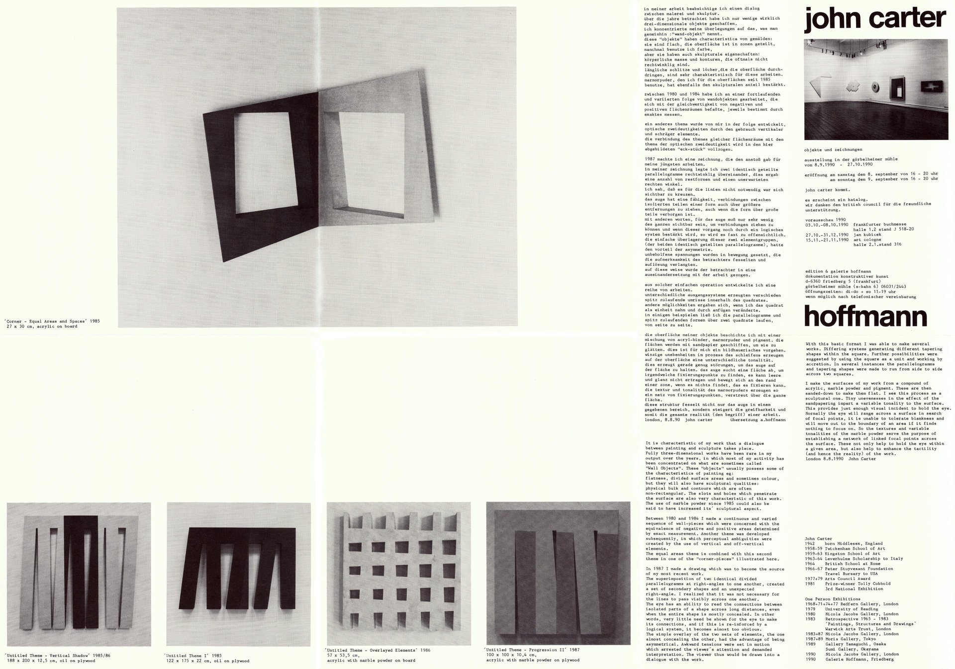
exhibition invitation: "john carter – objekte und zeichnungen" at edition & galerie hoffmann, 1990

exhibition invitation: "john carter – objekte und zeichnungen" at edition & galerie hoffmann, 1990

works

slip line iii

john carter

slip line iii

1997

pigment and acrylic on plywood

34 × 32 × 4.4 cm
1′ 1 616″ × 1′ 24″ ×  1 1216

inquire

arena

john carter

arena

1980

oil with aluminiumpuder on plywood

133.7 × 126 cm
4′ 4 1016″ × 4′ 1 1016

inquire

triple forms

john carter

triple forms

2002

pigment and acrylic on plywood

214 × 75 × 9.4 cm
7′ 14″ × 2′ 5 816″ ×  3 68

inquire

supported by the federal minister for culture and media, neustart kultur and stiftung kunstfonds

Gefördert von der Beauftragten der Bundesregierung für Kultur und Medien
Gefördert durch Neustart Kultur
Gefördert von der Stiftung Kunstfonds