kunibert fritz
to make the problem of perception as simple as question and answer visible, to let it become visible, is an advantage of concrete art. for this purpose, it often limits the focus of our possibilities to the last polarity. but basically, it circumscribes the core question of perception; namely, to put the object of interest in the center without fixing its fleeting appearance there as well—which would be boring sensory work.
as is well known, josef albers reversed this process after achieving the formal concentric solution in the square within the square within the square—after many years of bipolar preliminary work—by using color as the "most relative medium" quasi as an opposing system and thereby also creating a polarization.
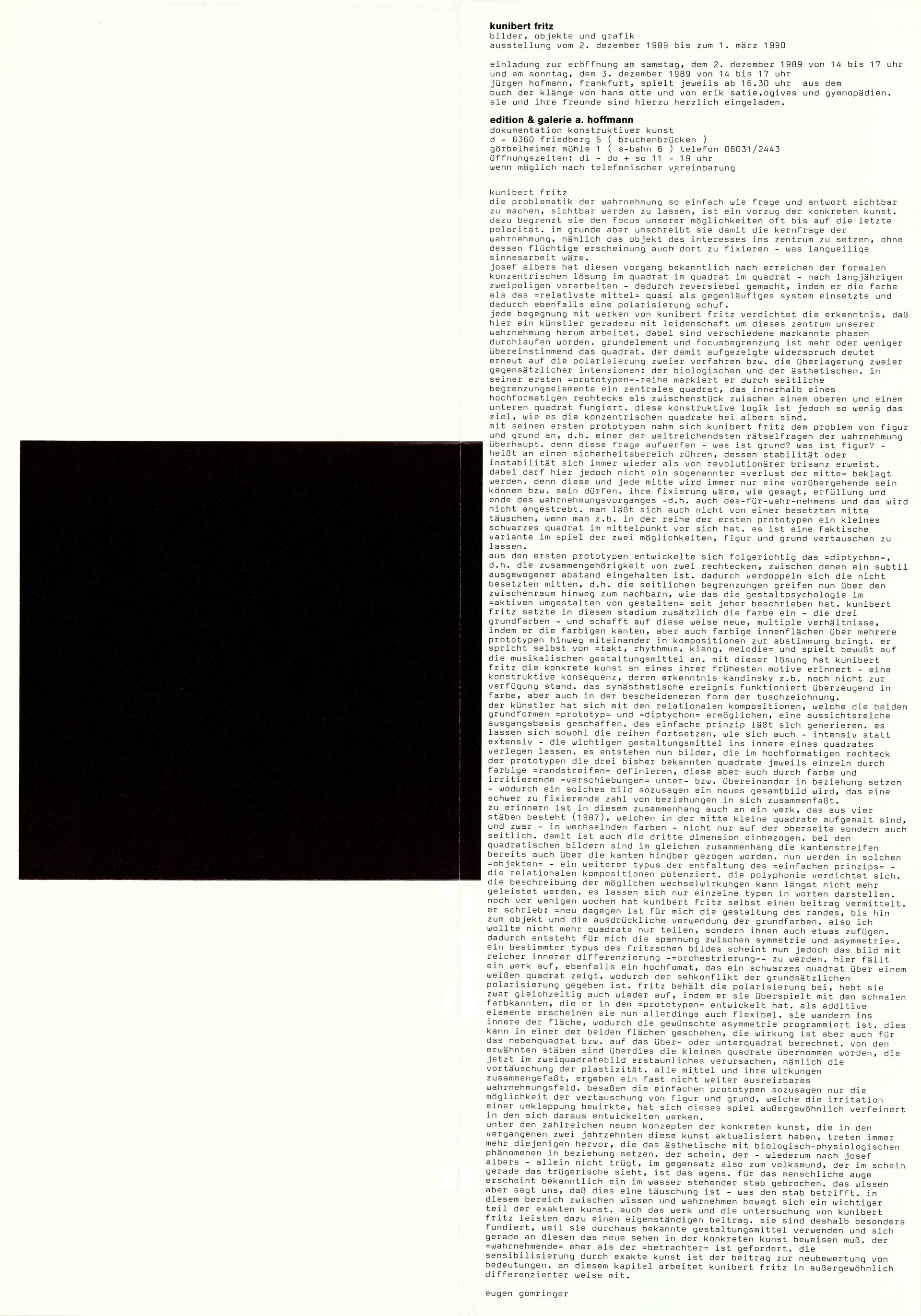
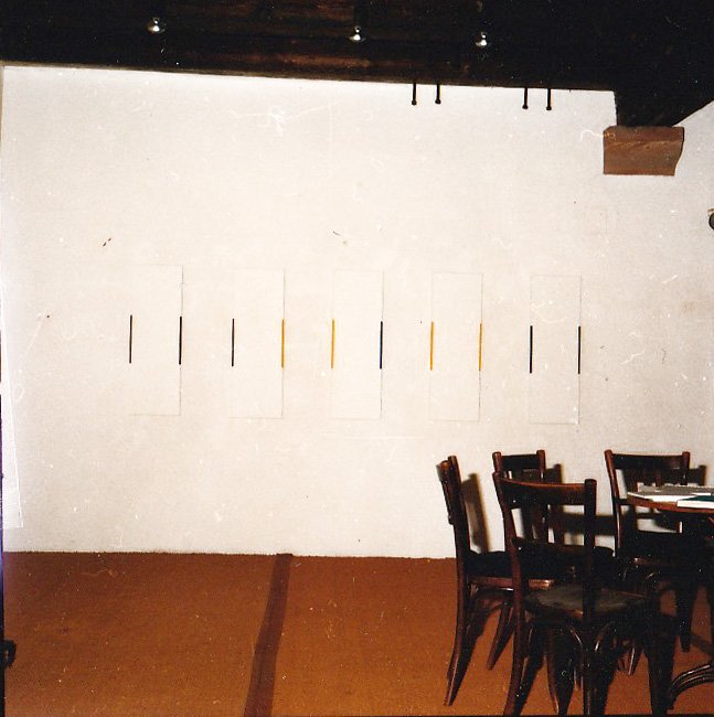
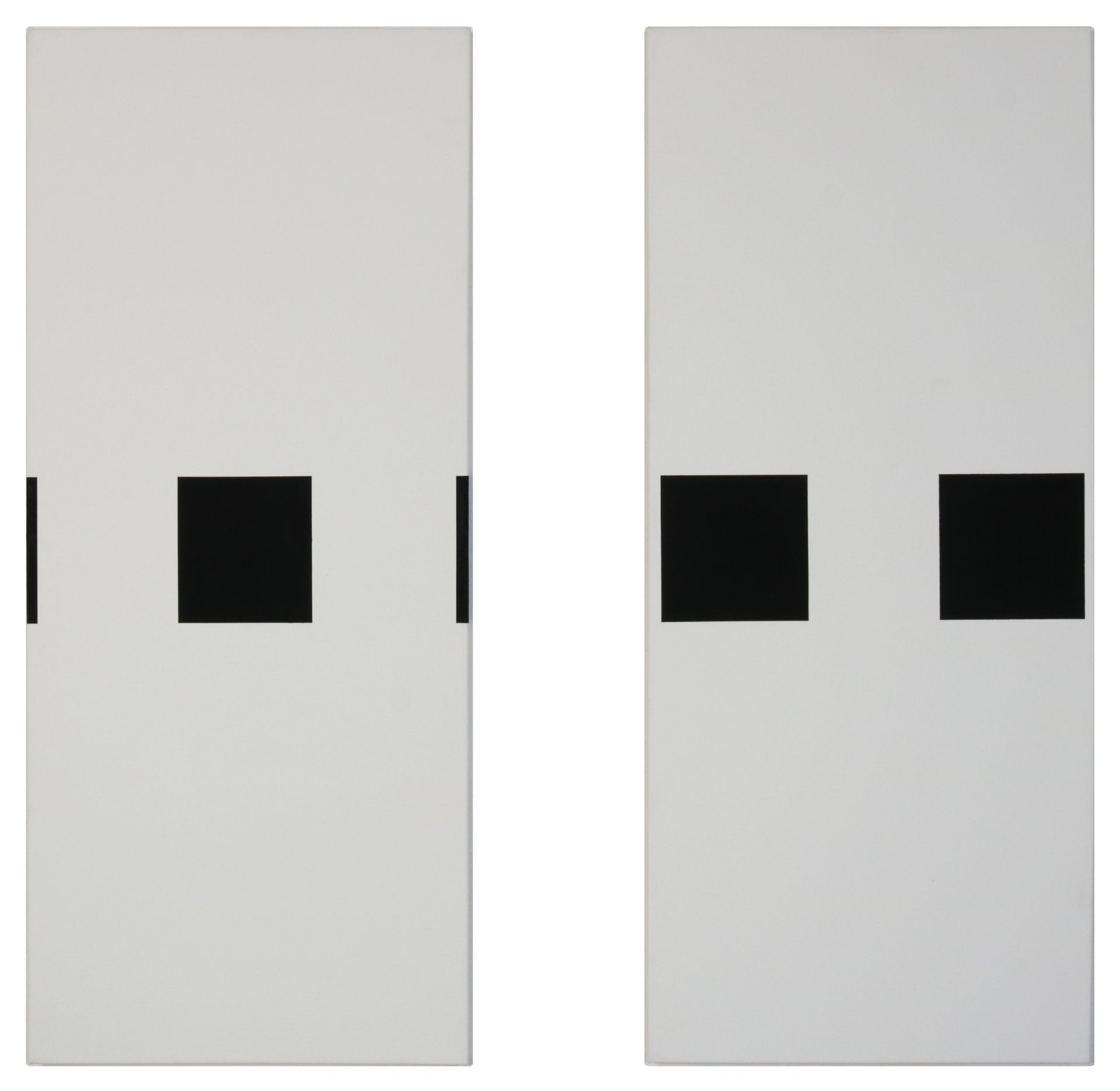
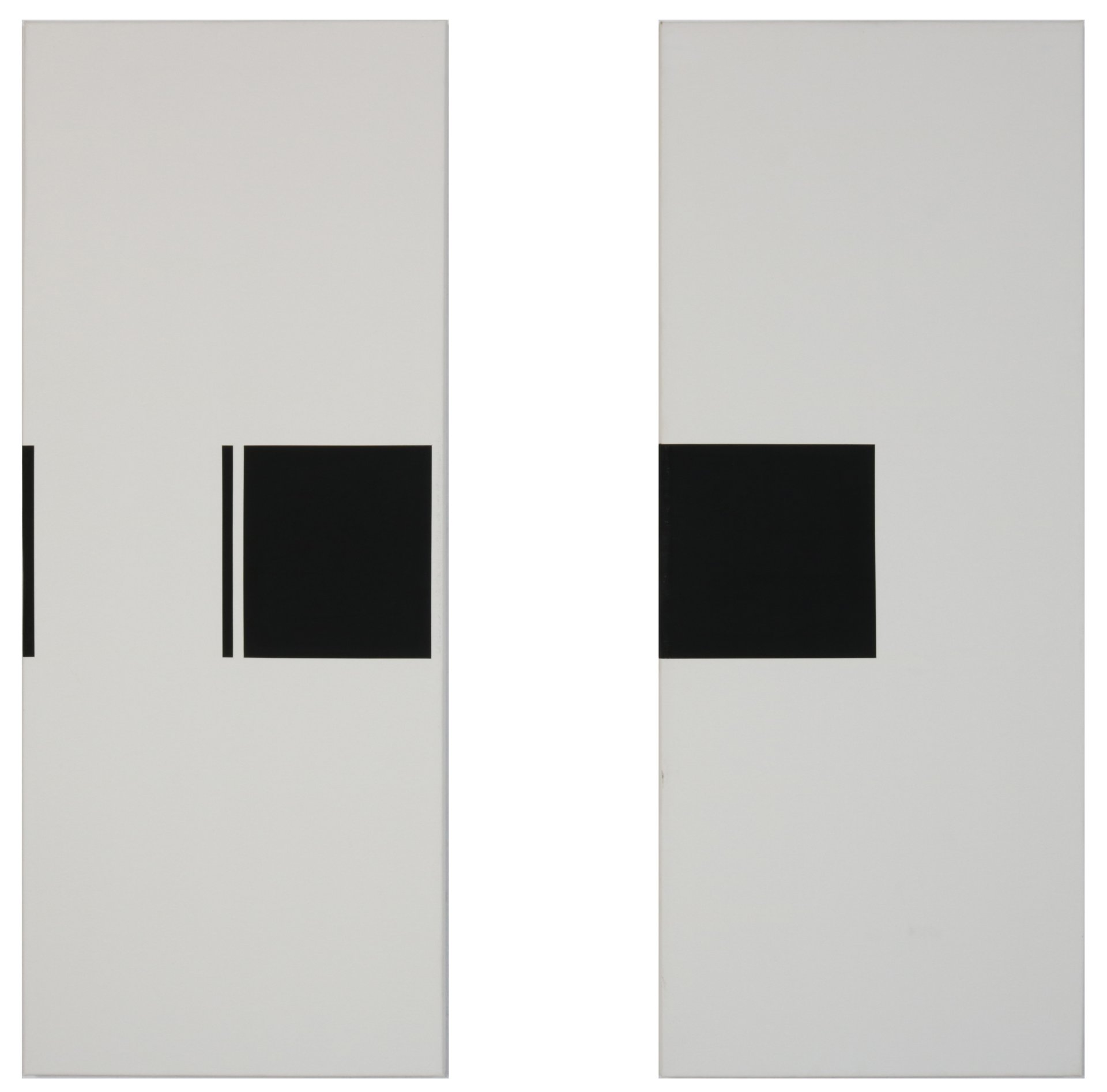
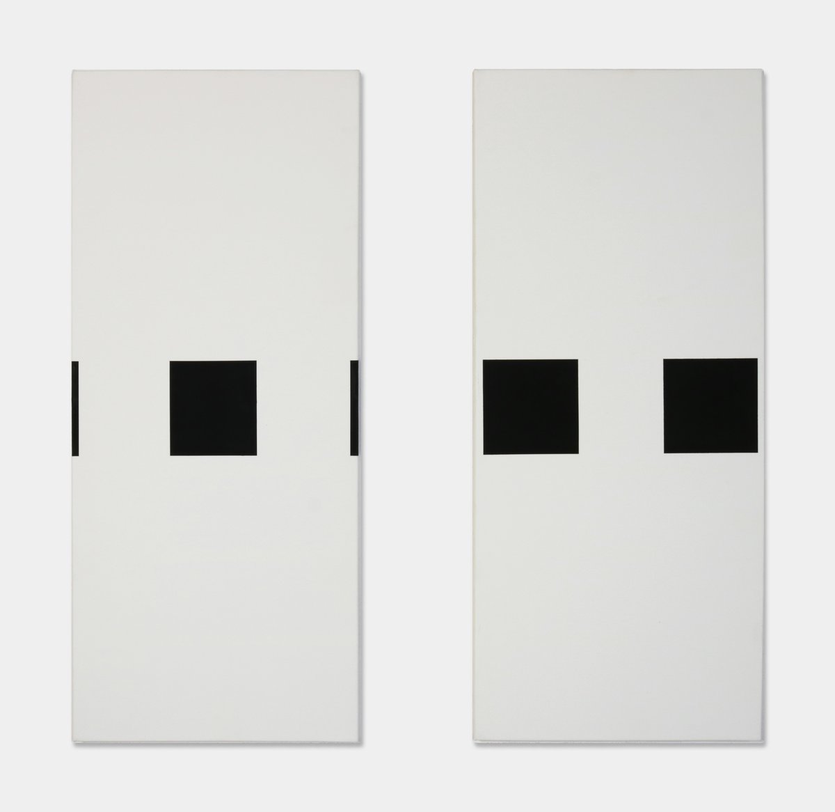
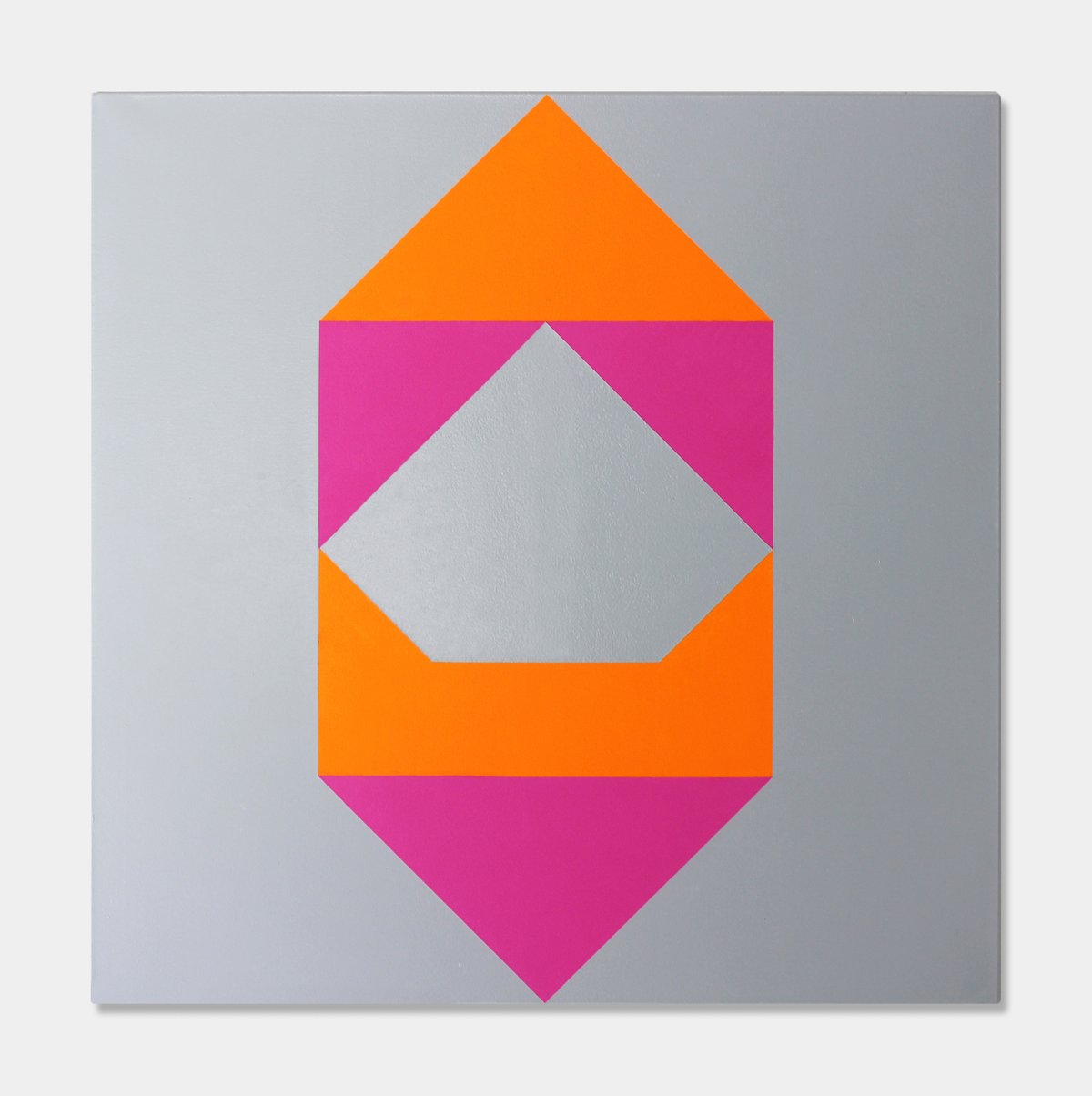
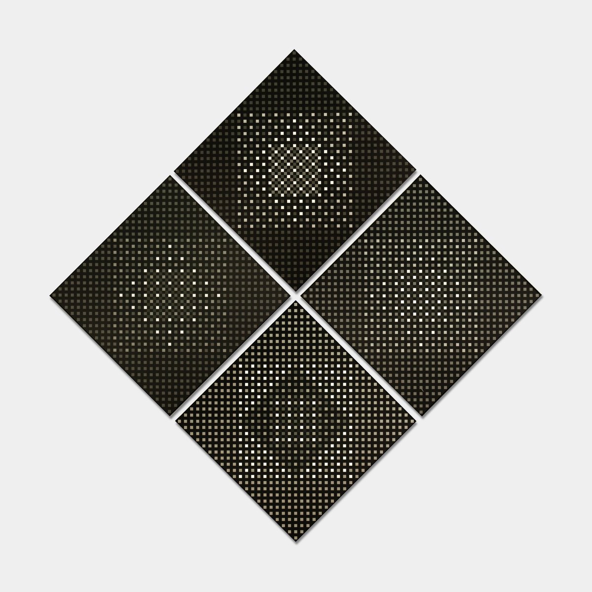
every encounter with works by kunibert fritz condenses the realization that here an artist works almost passionately around this center of our perception. in the process, various distinctive phases have been passed through. the basic element and focus limitation is more or less unanimously the square. the contradiction thus revealed points once again to the polarization of two processes or rather the superimposition of two opposing intensions: the biological and the aesthetic. in his first "prototype" series, he marks a central square by means of lateral boundary elements, which functions within an upright rectangle as an intermediate piece between an upper and a lower square. this constructive logic, however, is as little the goal as the concentric squares are in albers.
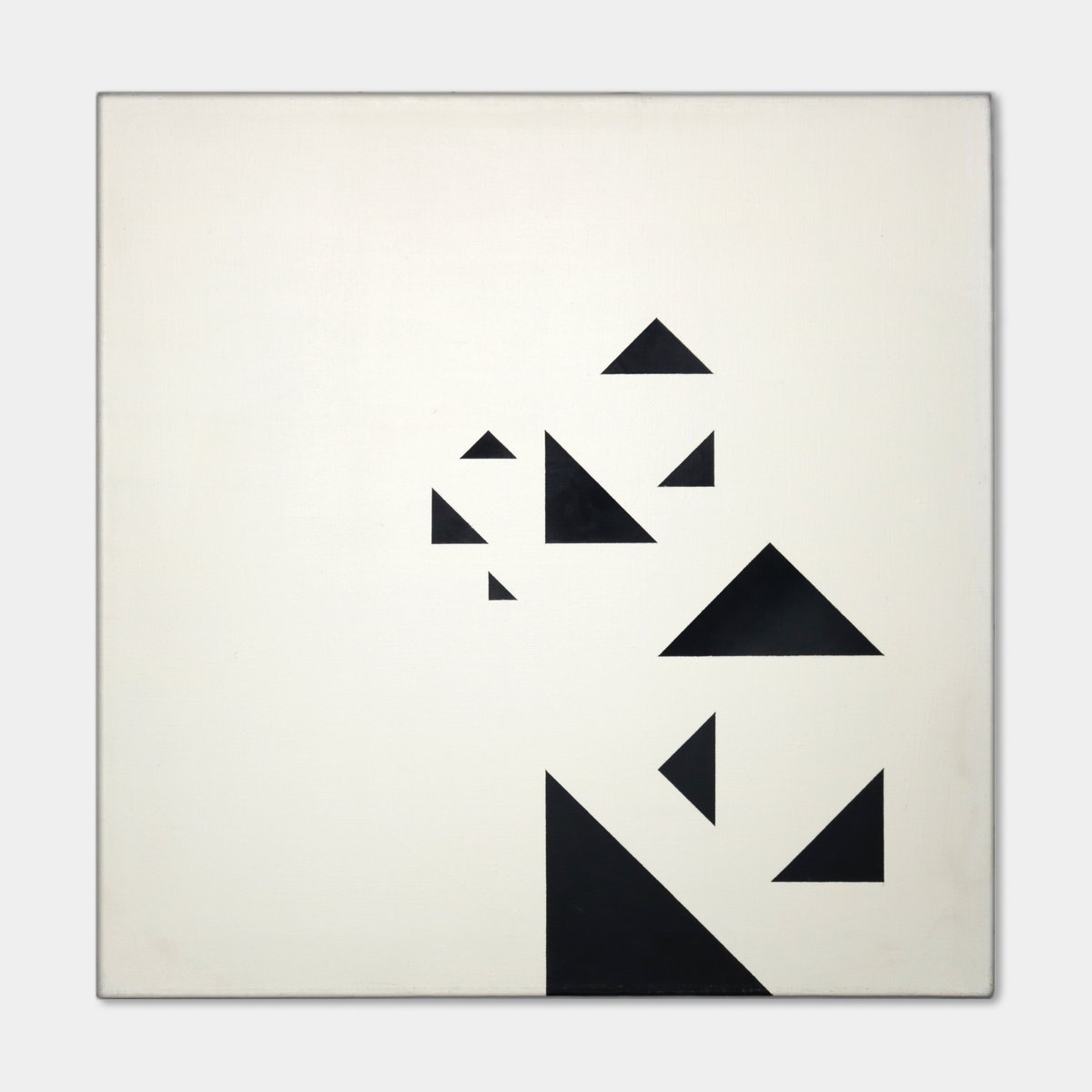
with his first prototypes, kunibert fritz tackled the figure-ground problem, i.e. one of the most far-reaching puzzles of perception ever. because raising this question—what is qround? what is figure?—means touching on an area whose stability or instability proves again and again to be of revolutionary explosiveness. in doing so, however, a so-called "loss of the middle" must not be lamented here. for this and every middle will always only be able to be, or be allowed to be, a temporary one. its fixing would be, as said, fulfillment and end of the process of perception—i.e. also the 'perception-as-reality' ( “für-wahr-nehmens”), which should't be the goal. one is also not deceived by an occupied center, if, for example, in the row of the first prototypes one has a small black square in the center in front of oneself. it is a factual variant in the game of the two possibilities to let figure and ground interchange.
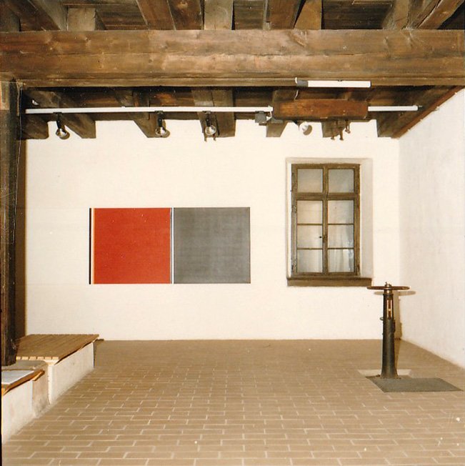
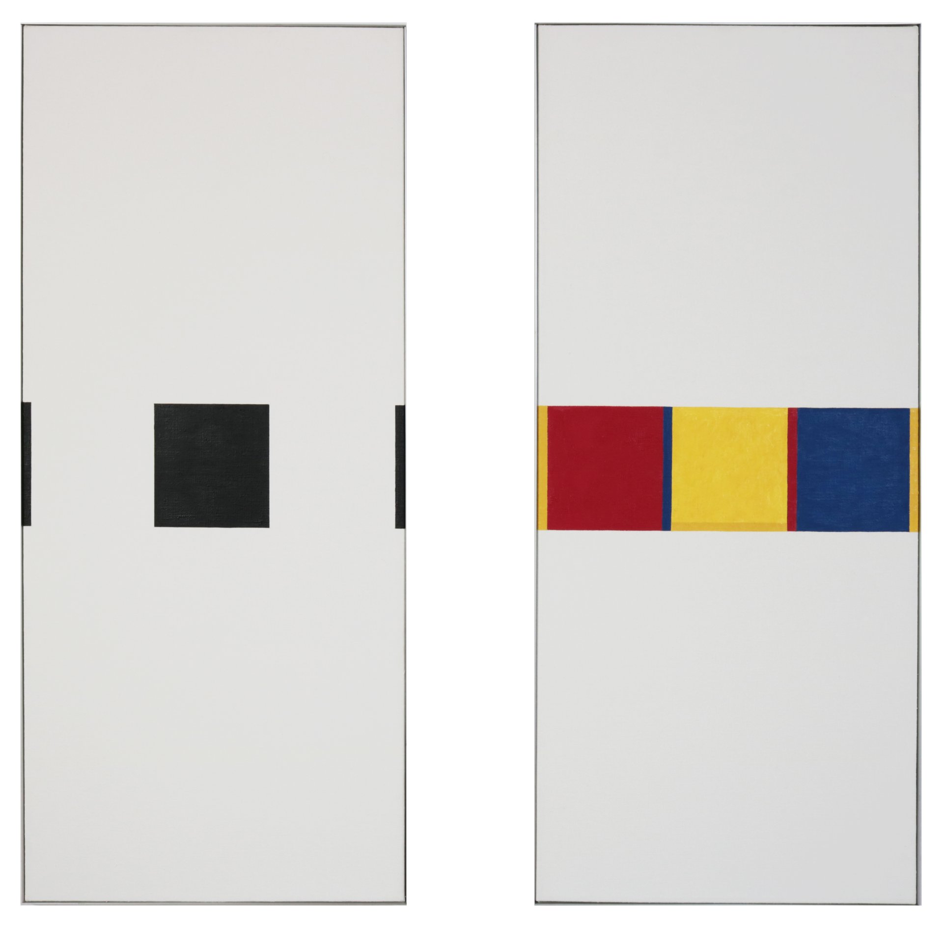
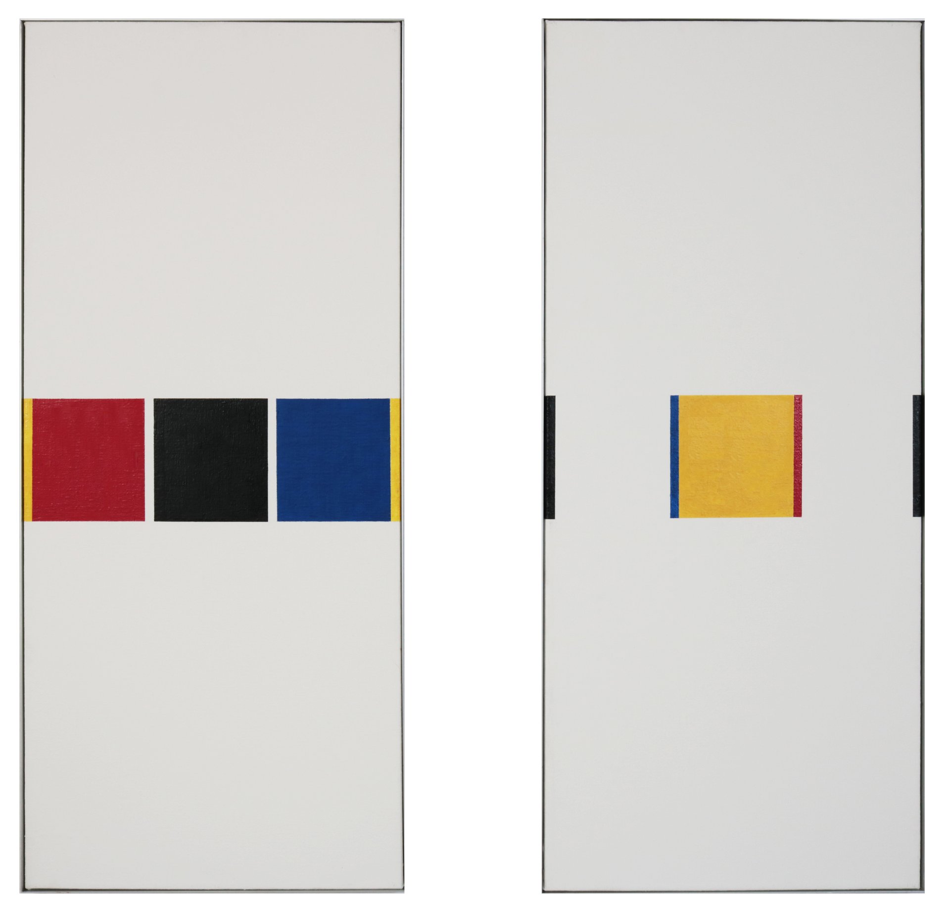
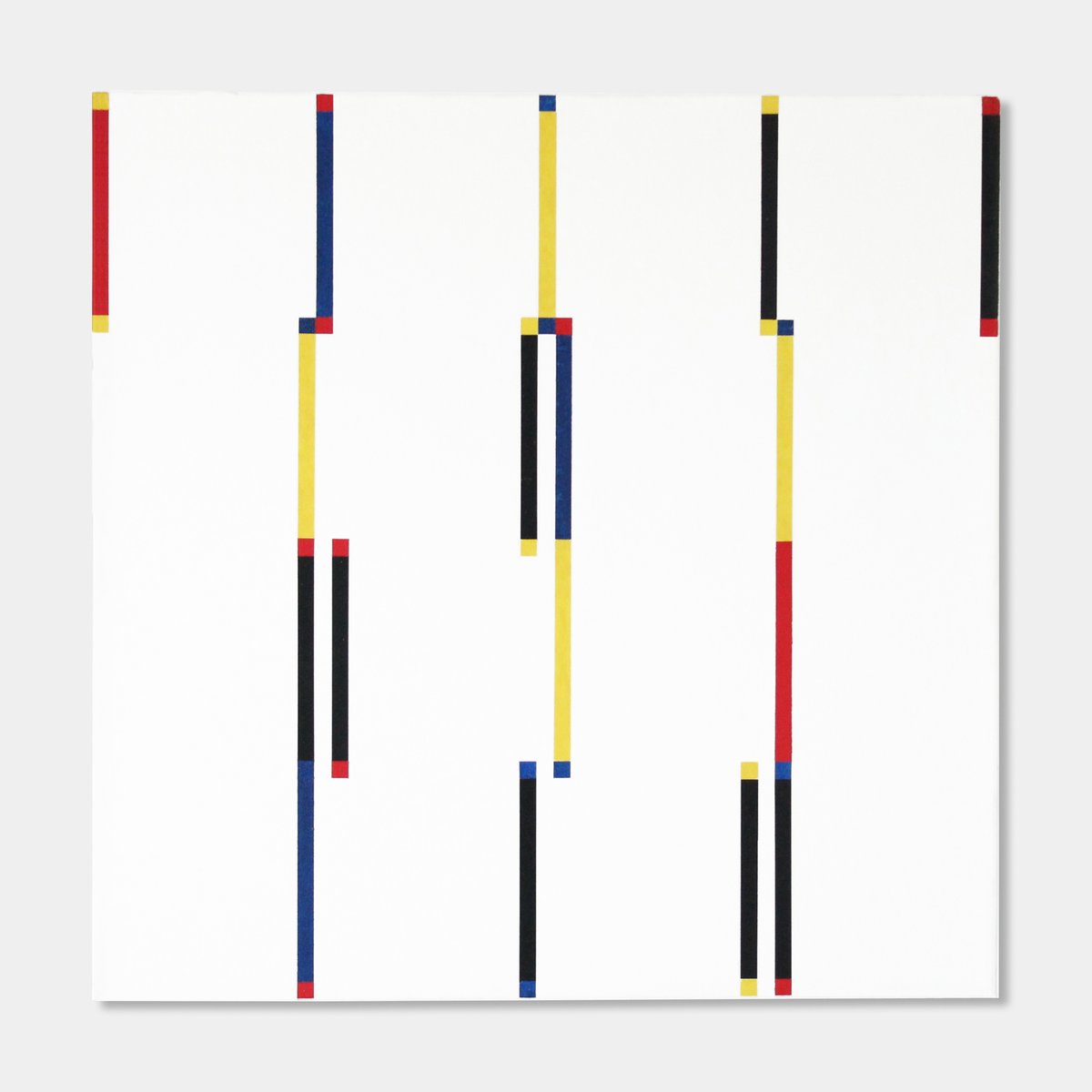
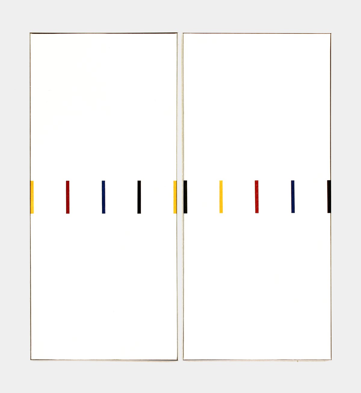
from the first prototypes, the "diptych" consequently developed, i.e., the affiliation of two rectangles, between which a subtly balanced distance is maintained. thus, the unoccupied centers are doubled, i.e., the lateral boundaries now reach out to the neighbor across the intervening space, as gestalt psychology has always described it in the 'active reshaping of shapes' (“im aktiven umgestalten von gestalten”). at this stage, kunibert fritz also used color—the three basic colors—and in this way creates new, multiple relationships by bringing the colored edges, but also colored interior surfaces, into harmony with one another in compositions across several prototypes. he himself speaks of "beat, rhythm, sound, melody" and consciously alludes to the musical means of design. with this solution, kunibert fritz has reminded concrete art of one of its earliest motifs—a constructive consequence whose insight was not yet available to kandinsky, for example. the synesthetic event works convincingly in color, but also in the more modest form of an ink drawing.
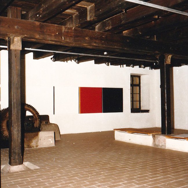
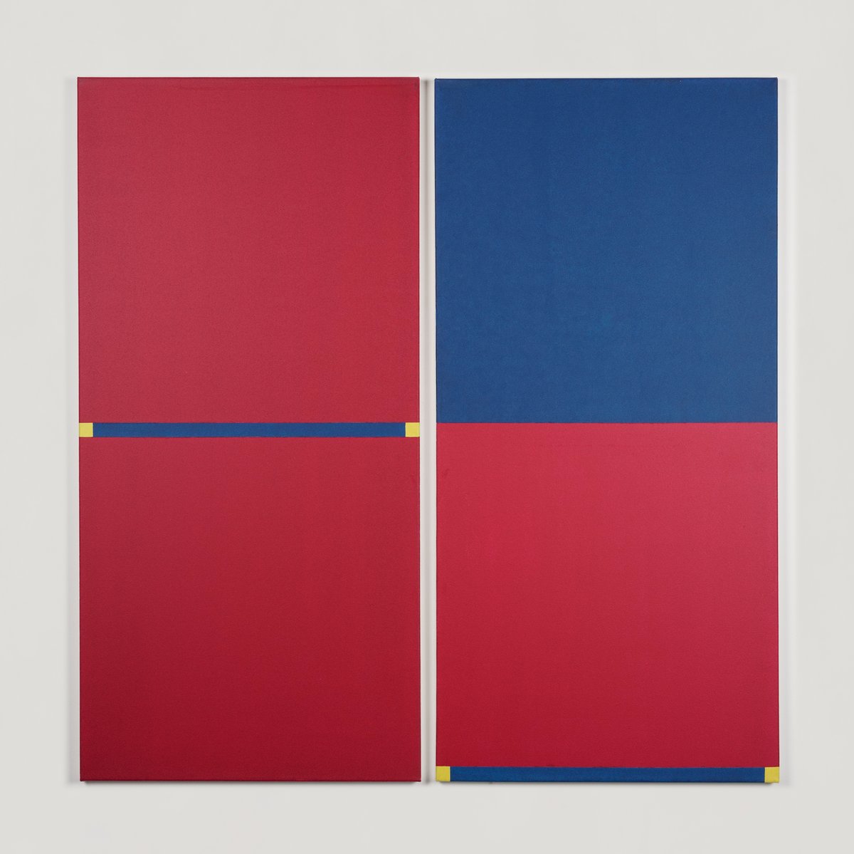
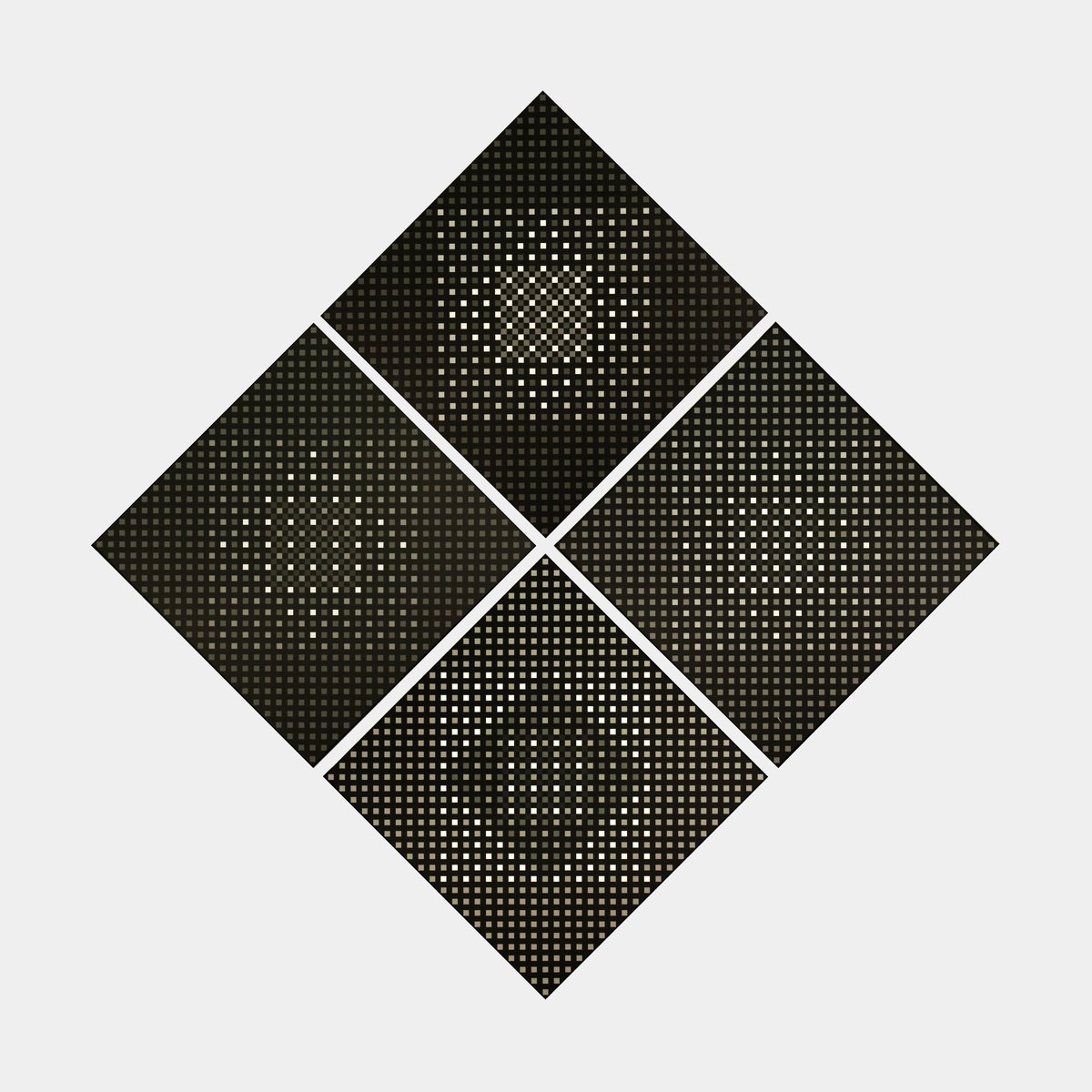
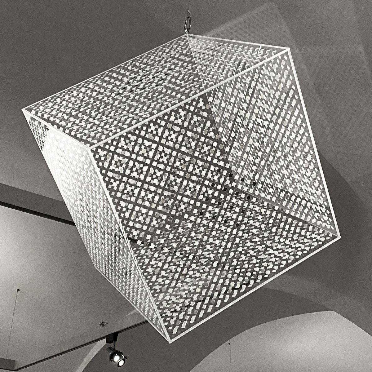
the artist has created a promising starting point for himself with the relational compositions that the two basic forms "prototype" and "diptych" make possible. the simple principle can be generated. both the rows can be continued and—intensively instead of extensively—the important design elements can be moved into the interior of a square. now pictures are created, which define the three so far known squares in the vertical format rectangle of the prototypes, each individually by colored "edge stripes", but also put them in relation to each other by color and irritating "shifts" under or over each other—whereby such a picture becomes, so to speak, a new overall picture, which summarizes a number of relations in itself, which is difficult to fix. in this context, it is also worth remembering a work consisting of four rods (1987), on which small squares are painted in the middle—in changing colors—not only on the upper side but also on the sides. thus, the third dimension is also included. in the square pictures, the edge stripes have already been drawn over the edges in the same context. now, in such "obiects"—another type of unfolding of the "simple principle"—the relational compositions are potentiated. the polyphony condenses. the description of the possible interactions cannot be done for a long time. only single types can be represented in words. only a few weeks ago, kunibert fritz himself conveyed a contribution. he wrote: "new for me, on the other hand, is the design of the edge, up to the object and the explicit use of the basic colors. so i no longer wanted to only divide squares, but also add something to them. for me, this creates the tension between symmetry and asymmetry".
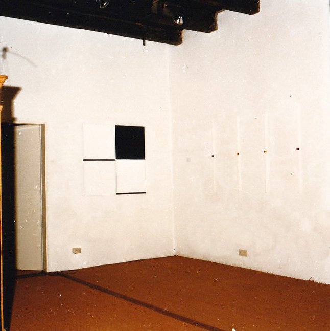
a certain type of fritz's picture, however, seems to become the picture with rich inner differentiation—"orchestration"—. here, a work stands out, also a high format, which shows a black square above a white square, whereby the visual conflict of the fundamental polarization is given. fritz retains the polarization, but at the same time cancels it out by playing over it with the narrow color borders he developed in the "prototypes." as additive elements, however, they now also appear flexible. they move into the interior of the surface, programming the desired asymmetry. this can happen in one of the two surfaces, but the effect is also calculated for the adjacent square, or on the upper or lower square. moreover, the small squares have been taken over from the mentioned bars, which now cause amazing things in the two-square picture, namely the feigning of plasticity. all means and their effects together result in a field of perception that is almost impossible to expand. while the simple prototypes possessed, so to speak, only the possibility of interchanging figure and ground, which caused the irritation of a folding over, this play has become extraordinarily refined in the works that have developed from it.
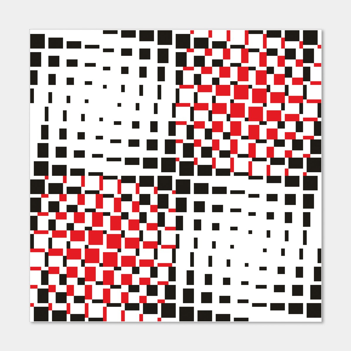
among the numerous new concepts of concrete art that have updated this art in the past two decades, those that relate the aesthetic to biological-physiological phenomena are becoming more and more prominent. the appearance, which—again according to josef albers—alone is not deceptive, in contrast to the vernacular, which sees the deceptive in the appearance, is the agent (“agens”). for the human eye, as is well known, a stick standing in water appears broken. however, knowledge tells us that this is a deception—as far as the stick is concerned. an important part of exact art moves in this area between knowledge and perception. the work and the investigation of kunibert fritz also make an independent contribution to this. they are particularly well-founded because they use quite familiar means of design and it is precisely on these that the new seeing in concrete art must prove itself. the "perceiver" rather than the "beholder" is challenged. sensitization through exact art is the contribution to the re-evaluation of meanings. kunibert fritz works on this chapter in an extraordinarily differentiated way.
eugen gomringer, 1989
