lars erik falk 2008 über seine arbeit anlässlich der veröffentlichung des katalogs "leben/kunst" im carlsson bokförlag, stockholm.
wie viele andere künstler*innen meiner generation wurde ich während meiner studienzeit in den 1940er jahren von karl isakson, cézanne und den frühen kubisten inspiriert. daher war es für mich selbstverständlich, mich der nicht-figurativen kunst zuzuwenden und bilder ohne referenzfunktion zu schaffen. die erkenntnis, dass kunst sich ganz auf ihre eigenen attribute wie farbe, form, rhythmus, bewegung, usw. stützen kann, empfand ich als sehr befreiend.
schon in jungen jahren fühlte ich mich von der bauhaus-idee angezogen, dass die verschiedenen bildenden künste – architektur, malerei, bildhauerei und kunsthandwerk – unter einem dach koexistieren könnten. dies führte dazu, dass ich mich in den 1950er jahren mit malerei und bildhauerei sowie mit textilmustern und grafikdesign beschäftigte. neben dem bauhaus gehörten auch die niederländische de-stijl-gruppe und die russische konstruktivistische avantgarde zu den künstlerischen einflüssen auf meine arbeit. und so fühlte ich mich künstlern wie olle baertling und eric h. olson näher als dem breiteren strom der schwedischen konkreten kunst.
gegen ende der 1970er jahre kam ich zu dem schluss, dass die bildhauerei meinen ausdrucksbedürfnissen am besten entsprach. und so arbeitete ich im darauffolgenden jahrzehnt ausschließlich mit plastischen objekten. während dieser zeit veränderte sich meine arbeit stilistisch stark. ein eher ausgewogener oder statischer ansatz entwickelte sich zu einem dynamischeren, bewegungsorientierten ausdruck. das material für diese “expressionistischen” skulpturen war gebogenes blech. anlässlich mehrerer gelegenheiten konnte ich in einem monumentalen maßstab arbeiten.
1970 schuf ich eine installation, bei der eine skulpturengruppe mit dem ausstellungsraum interagierte und so ein ganzes bildete. die skulptur unterbrach die vertikalen/horizontalen aspekte der architektur und des raums. ich arbeitete mit einer diagonale, die weder statisch noch fallend war. diese balance (etwa 73 grad) tauchte auch in meinen gemälden aus den 1950er jahren auf, aber erst in den 1970er jahren und danach entwickelte sie sich zu einem zentralen thema.
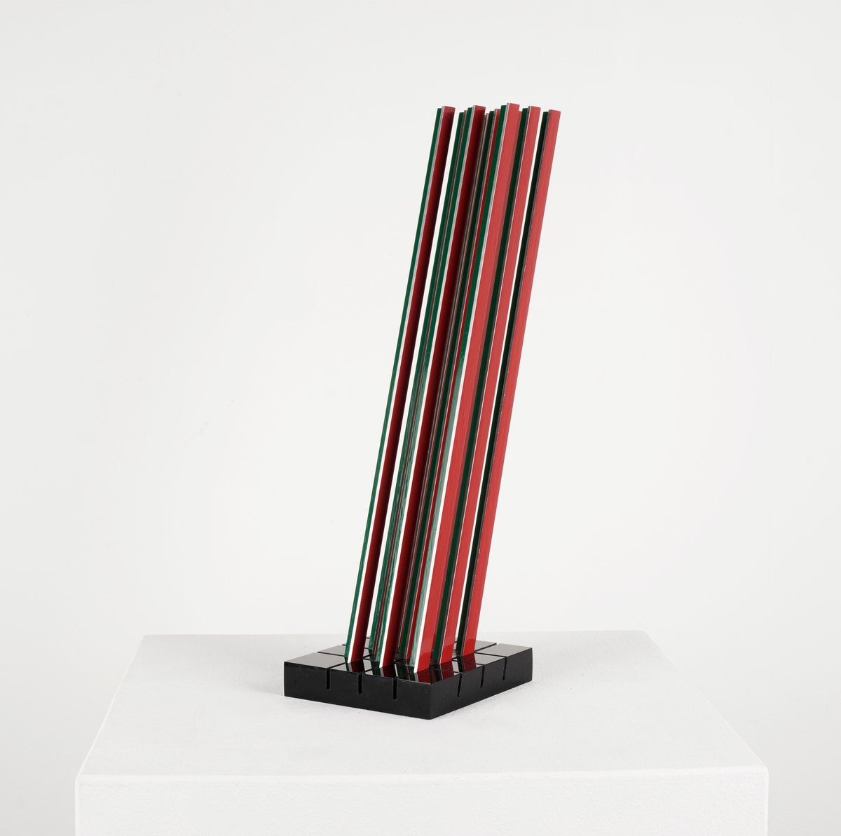
lars erik falk, "modulskulptur - sketch" (2002), aluminium, lacquer, acrylic glass, 35 × 18.5 × 10.3 cm
die verwendung dieses festen winkels als zentrales kompositionselement eröffnete mir enorme möglichkeiten, den rhythmus, die balance und die dynamik meiner skulpturen zu variieren. ich begann, mit winkelprofilen als eine art module zu arbeiten, und die metallprofile konnten auch zur herstellung von reliefs verwendet werden. in den 1970er jahren nahm ich auch die siebdrucktechnik wieder auf, da dieses medium es mir ermöglichte, meine künstlerischen ideen über das modul als kleinsten “baustein” in kompositionen umzusetzen.
seit ende der 1970er jahre habe ich einige internationale kontakte geknüpft, vor allem in die schweiz und nach deutschland, wo die konstruktive kunst eine stärkere position einnimmt. diese kontakte waren für meine arbeit wichtig. ich habe auch aufträge für die herstellung monumentaler skulpturen für öffentliche plätze erhalten. dazu gehören die u-bahn-station im stockholmer vorort kista und eine farbige säule am lindhagensplan in stockholm. die interaktion mit der architektur ist ein wichtiger aspekt der gesamten idee der konstruktiven kunst.
karin radoys schaffen ist dem “verhältnis zwischen farbe und form im raum” gewidmet (1). dabei ist der dialog wohl das konstituierende moment – ihre kunstwerke manifestieren den dialog zwischen malerei und skulptur, farbe und form, oberfläche und volumen, in ihrer spezifischen rhythmisierung auch zwischen dem ganzen und seinen teilen, natürlich auch zwischen kunstwerk und raum und wandfläche und nicht zuletzt zwischen objekt und betrachter*in.
in karin radoys arbeiten stehen malerei und skulptur in einem so engen dialog, dass sie als beides zugleich gelten müssen – “farbkörper mit großer sinnlicher präsenz”(2). die künstlerin kommt von der klassischen malerei her. ihr element ist die farbe und ihre erscheinung, das ausloten von “gegensatz, zusammenspiel, steigerung und gegenseitige(r) beeinflussung von farberscheinung und bildraum”(3). ihr bildnerisches anliegen definiert sie selbst als “nicht die bedeutung oder funktion der farbe [...], sondern ihre wirkung im wechselspiel von figur und grund, die tiefenstaffelung, die ordnung erzeugt und sie wieder in frage stellt. kontraste bilden sich: hell zu dunkel, warm zu kalt; simultanität. farbe hält das auge in bewegung, geprägt von autonomie und intensität. es entsteht bewegung, in der fläche zu raum und farbe zu licht werden.”(4)
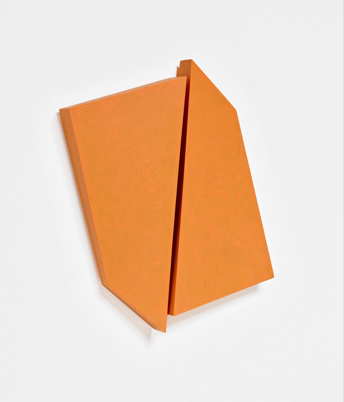
karin radoy, "indian yellow" (2024), acrylic paint on wood, 37 × 50 × 5 cm
diese dialoge von farbwerten untereinander, aber auch farbigkeit und (zwei-dimensionaler) form sowie farbe, fläche und raum zeichnen karin radoys werk im allgemeinen und im besonderen ihre malerischen arbeiten auf papier aus. die farbfelder entstehen aus mehreren übereinander gelegten farbschichten, die sich im auge mischen und dennoch – zumindest teilweise – in ihren bestandteilen nachvollziehbar bleiben.
karin radoy ist malerin, aber der malerei zuliebe ist sie auch bildhauerin: eigens für ihre malereien baut sie aus dünnen, biegsamen holzplatten optimale bildträger, die aber von außerordentlicher räumlicher sensibilität zeugen. sie sind voluminös, wenn auch sie eher einansichtig bleiben, eher auf die vorderseite konzentriert. [sie] entwickelte diese plastischen, rundherum bemalten(5) und flexibel zu platzierenden – sogar drehbaren – bildträger aus der fragestellung nach der positionierung ihrer malereien im raum: wie können sie präsentiert werden, welches verhältnis zur wand (und damit auch zum raum) können und sollen sie eingehen, werden sie gerahmt, gehängt, gestellt?
es sind, möchte man einen begriff dafür finden, wohl wandobjekte, d.h. objekte, die wie die klassische tafelmalerei oft in erster linie eine viereckige fläche präsentieren und im engen zusammenhang mit der wand stehen (nämlich hängen), die aber dennoch eine besondere körperhafte qualität und gestaltende, modifizierende kraft im räumlichen sinne haben. sie stehen im dialog mit der wand als teil des raums.
eine gekürzte fassung juliane rogges text “dialog”, der 2019 im katalog “karin radoy: dialog” anlässlich der gleichnamigen ausstellung in der carlernst kürten-stiftung, unna erschien.
(1-4) johannes brümmer, schicht für schicht. anmerkungen zu karin radoys künstlerischem schaffen, in: karin radoy: schicht für schicht, ausstellungskat. galerie großkinsky & brümmer, karlsruhe 1997, s. 5. (5) brümmer (wie anm. 1), weist auf die tradition des all-over des abstrakten expressionismus und auch auf die tradition des shaped canvas hin. karin radoys position ist aber auch in hinblick auf diese wurzeln eine sehr konsequent eigenständige – sowohl hinsichtlich des zwecks als auch der umsetzung.
lars erik falk on his work in 2008 on the occasion of the publication of the catalogue "life/art" by carlsson bokförlag, stockholm.
like many other artists of my generation, during my student years in the 1940s i was inspired by karl isakson, cézanne and the early cubists. and so it came naturally to me to align myself with non-figurative art and to create pictures without a referential function. the realization that art could rely entirely on its own attributes of colour, form, rhythm, movement, etc., i found very liberating.
from an early age i was attracted to the bauhaus notion that the various visual arts – architecture, painting, sculpture and crafts – could co-exist under the same roof. this led me, in the 1950s, to work with painting and sculpture as well as textile patterns and graphic design. besides the bauhaus, my artistic heritage took in the dutch, de stijl group and the russian constructivist avant-garde. and so i found a closer affinity with artists like olle baertling and eric h. olson than with the broader stream of swedish concrete art.
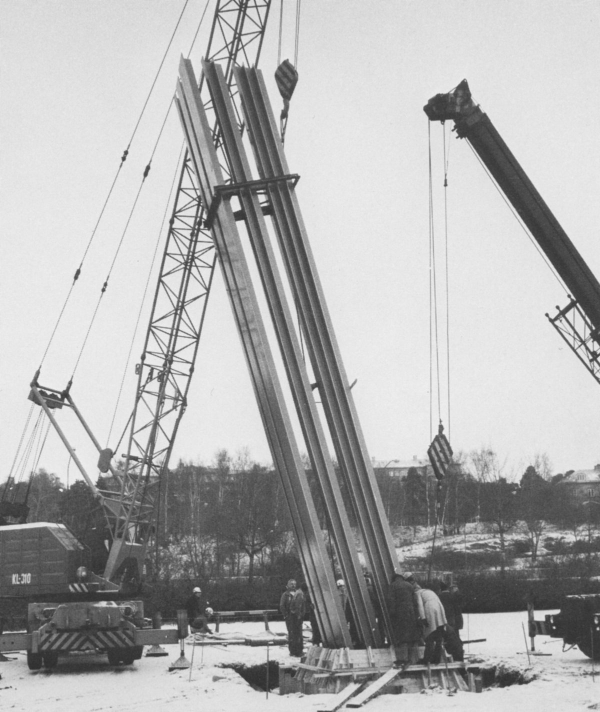
lars erik falk, "farbturm" (1981), lindhagensplan, stockholm, h 12 m
towards the end of the 1970s i decided that it was, after all, sculpture that best suited my expressive needs. and so, for the ensuing decade, i worked exclusively with plastic objects.
during this period my work changed a good deal stylistically. a rather balanced or static approach developed towards a more dynamic, movement-oriented expression. the material for these "expressionist" sculptures was bent sheet metal and, on a number of occasions, i was able to work on a monumental scale.
in 1970 i created an installation in which a sculptural group interacted with the exhibition space to create a whole. the sculpture interrupted the vertical/horizontal aspects of the architecture and the room. i worked with a diagonal that was neither static nor falling. this balance (about 73 degrees) also appeared in my paintings from the 1950s but it was not until the 1970s and onwards that it developed into a central theme.
using this fixed angle as a central compositional element gave me enormous opportunities for varying the rhythm, balance and dynamics of my sculptures. i began to work with angle profiles as a species of modules and the metal profiles could also be used to produce reliefs. during the 1970s i also took up serigraphy again as the medium allowed me to exploit my artistic ideas about the module as the smallest "brick" in compositions.
since the end of the 1970s i have enjoyed some international contacts, primarily with switzerland and germany, where constructivist art has a stronger position. these contacts have been important to my work. i have also received commissions to produce monumental sculptures for public places. these include the subway station in the stockholm suburb of kista and a coloured pillar at lindhagens plan in stockholm. interaction with architecture is an important aspect of the whole idea of constructivist art.
karin radoy's work is dedicated to the “relationship between color and form in space” (1). dialogue is arguably the constitutive moment here – her artworks manifest the dialogue between painting and sculpture, color and form, surface and volume, in their specific rhythm also between the whole and its parts, and of course between the artwork and the space and the wall surface and, not least, between the object and the viewer.
karin radoy, "darklight" (2024), acrylic paint on wood, 37 × 50 × 5 cm
in karin radoy's works, painting and sculpture engage in such a close dialogue that they have to be considered both at once – “'farbkörper' with great sensual presence”(2). the artist comes from a background in classical painting. her element is color and its appearance, the exploration of “contrast, interplay, intensification and mutual influence of color appearance and pictorial space”(3). she defines her artistic concern as “not the meaning or function of color [...] but its effect in the interplay of figure and ground, the staggering of depth, which creates order and then questions it again. contrasts arise: light and dark, warm and cold; simultaneity. color keeps the eye in motion, characterized by autonomy and intensity. movement arises, in the surface, becoming space, and color, becoming light."(4)
these dialogues between color values, but also between color and (two-dimensional) form, as well as color, surface and space, characterize karin radoy's work in general and in particular her painterly works on paper. color fields are created by superimposing several layers of paint, which mix in the eye and yet – at least partially – remain traceable in their components.
karin radoy is a painter, but she is also a sculptor for the sake of painting: she builds support media out of thin, flexible wooden panels especially for her paintings, but they bear witness to spatial sensitivity. they are voluminous, even if they tend to remain single-sided, concentrated on the front. she developed these sculptural, three-dimensionally painted(5) and flexibly placeable – even rotatable – image carriers from the question of how to position her paintings in space: how can they be presented, what relationship to the wall (and thus also to the room) can and should they have, are they framed, hung, placed?
if one wants to find a term for them, they are probably wall objects, i.e. objects that, like classical panel painting, often primarily present a square surface and are closely related to the wall (namely hanging), but which nevertheless have a special physical quality and a formative, modifying power in the spatial sense. they are in dialogue with the wall as part of the room.
an abridged version of juliane rogge's text dialog, which appeared in the 2019 catalog karin radoy: dialog on the occasion of the eponymous exhibition at the carlernst kürten-stiftung, unna.
(1-4) johannes brümmer, schicht für schicht. notes on karin radoy's artistic work, in: karin radoy: schicht für schicht [layer by layer], exhibition cat. galerie großkinsky & brümmer, karlsruhe 1997, p. 5. (5) brümmer (see footnote 1) points to the all-over tradition of abstract expressionism as well as to the tradition of shaped canvases. karin radoy's position is consistently independent with regard to these roots – both in terms of purpose and implementation.
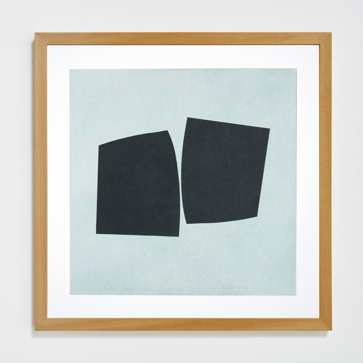
karin radoy, "nähe" (2016), oil crayon on paper on cardboard, 40 × 40 cm
aktuelle und kommende termine / current and forthcoming dates