the following text by friedhelm häring accompanies a collaborative artists' portfolio with works by verena loewensberg, frank badur, matti kujasalo and mario ballocco. it was produced and curated by edition hoffmann and published by kunstverein friedberg (art association friedberg) in 1977. alongside reproductions of four original serigraphies from "4 x concrete" and a selection of unique works by verena loewensberg and matti kujasalo, short statements by all artists are featured in this viewing room:
“4 x concrete” is the title of this portfolio. four artists are presented each with an original serigraphy. they are subtle, non-figurative compositions. the reason this portfolio then has the word “concrete” in its title, which is generally synonymous with what can really be grasped, derives from the opposite word. the opposite of concrete is abstract. however, when looking at these works, one cannot assume an abstraction process.
the prints make form-phenomena and perceptual phenomena clear. such visual impressions are characteristic of every art, including abstract art. in concrete art they are objectified. the argument is not based on mood, spontaneous gesture, subjective tension. the work is constructive.
just as the term realism is flexible, so is that of abstraction everywhere and nowhere. theo von duesburg therefore suggested the term “concrete art,” underpinning the theories about working methods and definition. ideas, artists and works of art prevail.
the long tradition of concrete art, within the abundance of current art movements, preserves its charisma. geometric, non-figurative elements are posed against breaks, dissolutions, and psychologizing. they fit into a program which leaves its decisive mark on proportion, symmetry, and order. available colors, shapes and elements are combined in their diverse possibilities. in addition, permutations and variations arise. the essence of constructivist order gains its strength and importance, its consistency, from the restriction of its elementary expressions to line, color, surface, volume, and space.
if those responsible for our widely damaged environment had instead attended the school of concrete art, the contradictions in urban planning, traffic, and the environment would not be so dramatic. the loss of proportions that can be observed in those areas of society could be regained from the work of the constructive, leading to a new mode of acting in our world.
friedhelm häring, 1977
verena loewensberg
verena loewensberg painted her first concrete pictures in 1936: combinations of geometric shapes with dominating angles. later she dealt with the sequencing of the same elements, the gradation of elements on different levels and with the centering of the image field while preserving the edge zones.
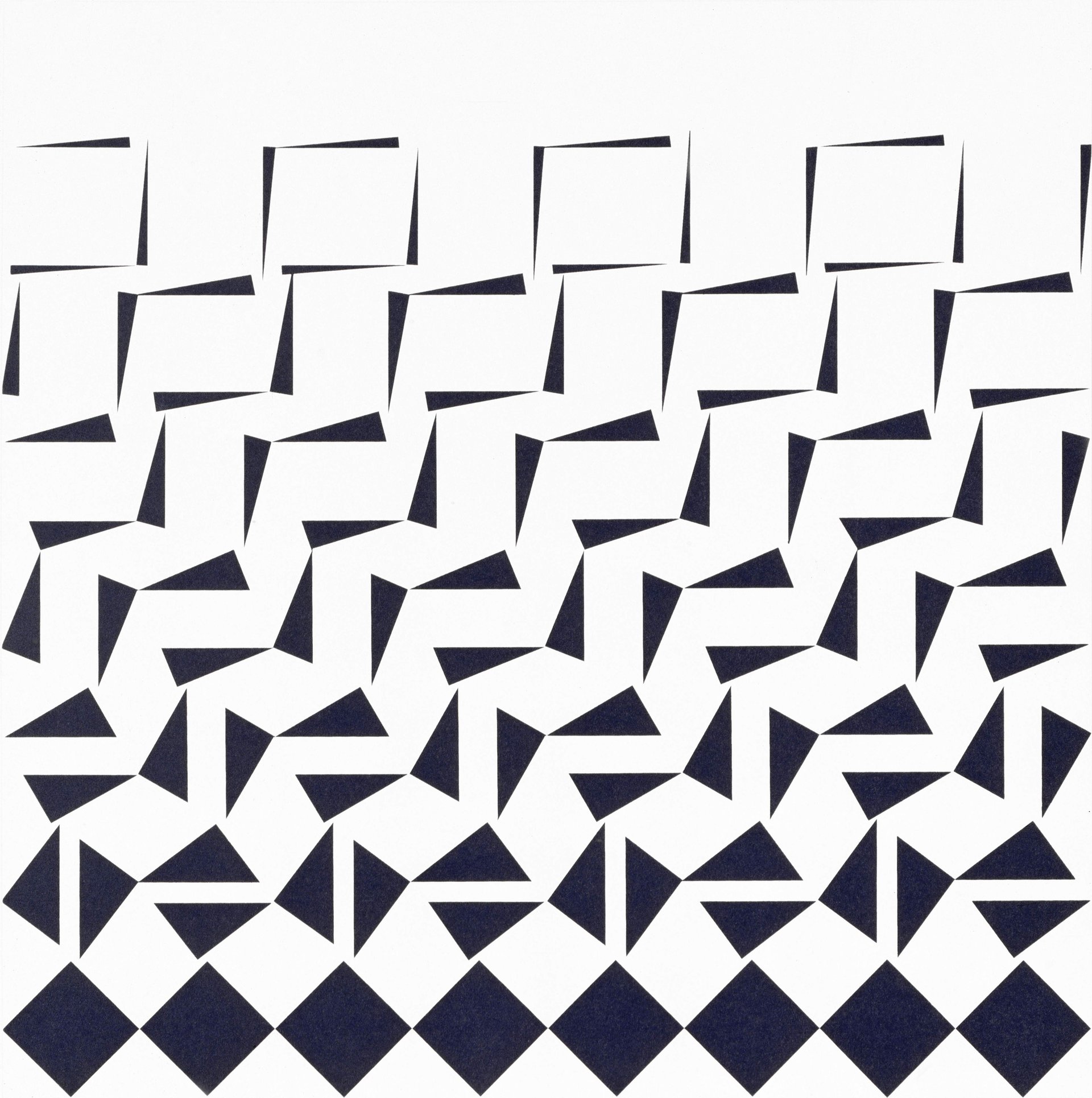
matti kujasalo
"the ‘wandering’ square is my main theme, the starting point is the immovable, straight standing square in which is described a slanted square, whose corners are touching the sides of the stationary square.
[...] the composition is usually systematic and open, as if it were part of an unlimited surface. the viewer's vision is expanded when they see the different shapes the picture takes on.
a system is not an end in itself, but it is a means used to make logical and well-reasoned decisions."
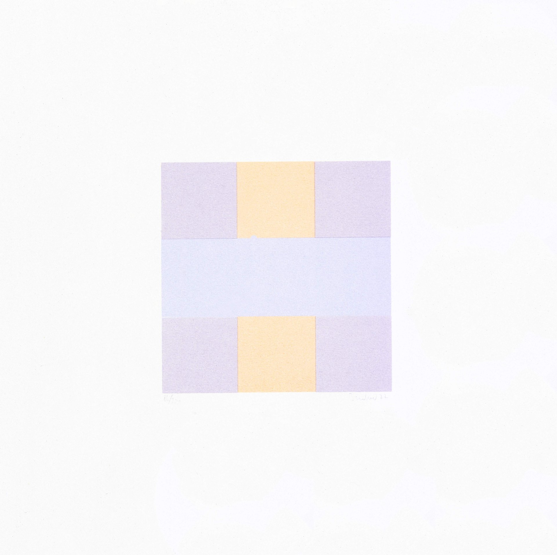
frank badur
"color is essential for my painting, it determines the overall impression of the picture, the elements of the geometry serve as aids for orientation, for the organization of the picture surface. color and shape are the idea behind the picture. both elements determine each other in order to make the picture function as a whole. the design method itself is transparent, becomes controllable. there are no coincidences. this painting only means itself, beyond description and significance or meaning".
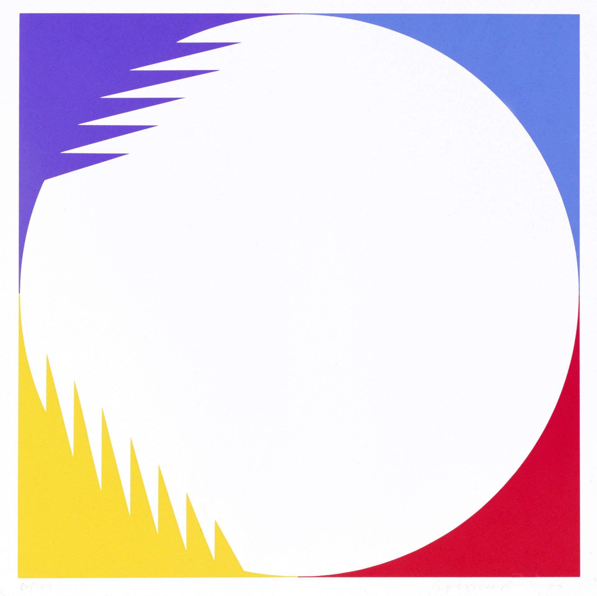
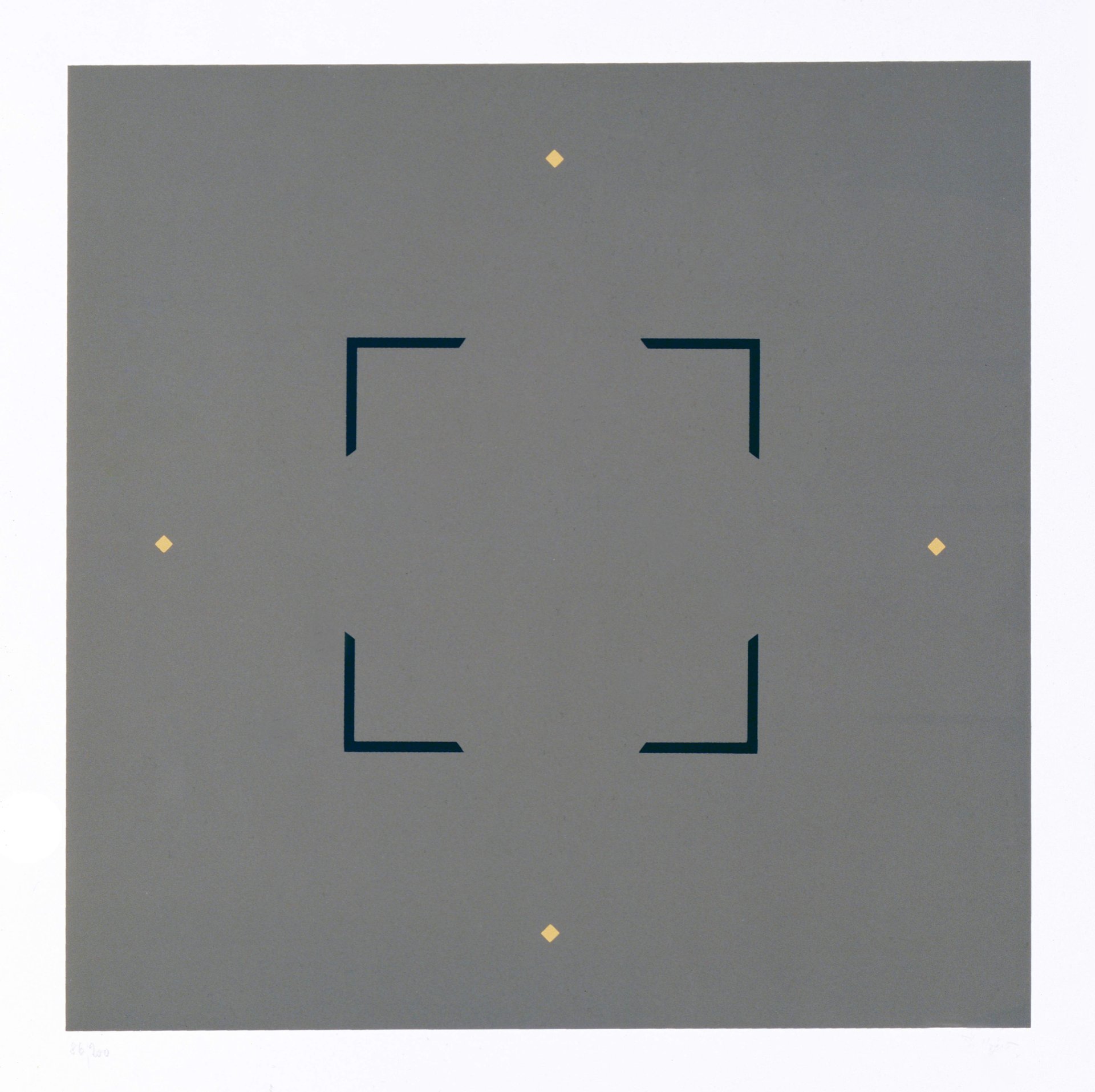
mario ballocco
in this picture, the essentials appear in a merely imagined layering. the square with the horizontal base, which is suggested by the four black angles, is preceded by another, larger square, with curved outlines, a diagonal square that is indicated by the four ocher points.